Artistic Packaging Design: Devangari Art
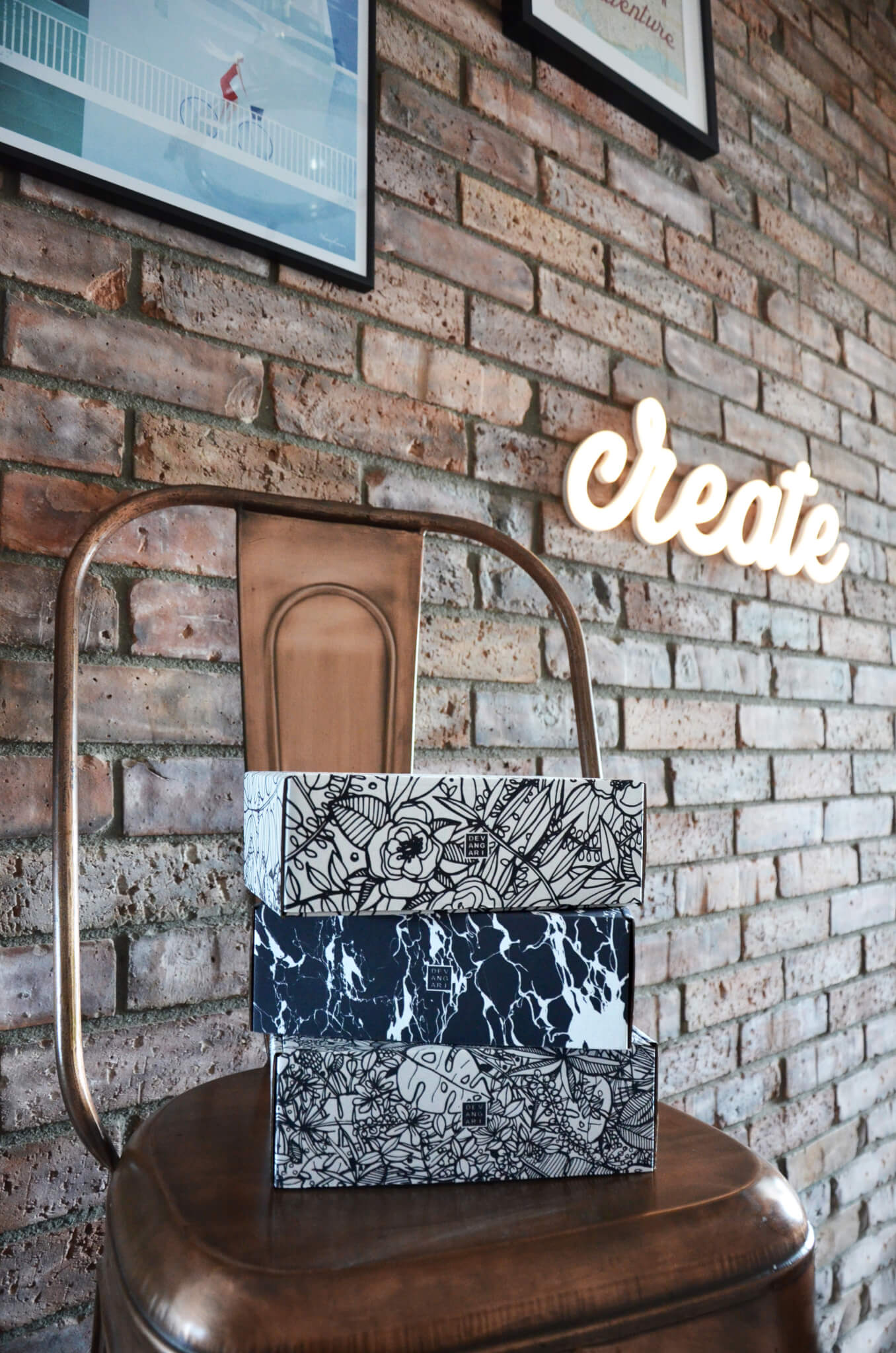
The founder of Devangari Art, Agnieszka Cichecka, shared the story about her artistic brand. Her mailer boxes accompany the artsy notepads in the shipping process. These lovely boxes capture the tremendous range of possibilities of Eco White variant. Even though the majority is used for minimalistic designs, Devangari Art shows an entirely different approach.

Paper in the technology-oriented era
When Kindle was first introduced, many forecasted the fall of books in their traditional form. Who would want to carry heavy books if you can download them all onto your handy device?
Time has proven that analog solutions will not die so easily. Books are still bought everywhere, even if the sales decreased. It's a similar situation that Devangari Art faces - a product that was already digitalized, but not everyone likes to accept it.
This is how the idea of notepads first popped in the mind of Agnieszka Cichecka. She loved drawing and painting since she was a kid. The lovely, unusual designs are the symbol of Devangari's product. The notepads can be bought separately or as en entire gift box too.
"Devangari Art is a paper company, which joins together the love for art and need for organizing time management. I've been looking for years for a notepad that I could use on a daily basis, but which would also have a lovely design. This is why I decided to create them myself! The frontpage in every notepad is based on my sketches and paintings. I wanted them to be truly one of a kind and engage my customers."

E-commerce art
The packaging of Devangari Art boldly draws from the abstract nature of the product's design.
All of the three projects we showcase in the gallery here are heavily inspired by abstract modern art. The imprints are based on multiple shapes (some inspired by flowers), creating an intricate, detailed painting of sorts.
That approach is a reflection of what the box is supposed to do. While Devangari Art sells the boxes as a solo product too, they are used for shipping as well. The unprecedented design is a lovely addition to the product inside.
"The packaging project is also my very own design. Each box was supposed to complement my artistic idea. Each box is based on linear patterns, created in black and white, so that my customers can colour them on their own too. This is my suggestion of personalising them. Furthermore, they can be used to store other products for my e-shop."

Eco White - not only for minimalism
Devangari Art is also an example of not following the popular trends.
Black and white is a mix that's most profoundly used in minimalism. Many of the Eco White designs are following this trend nowadays. Bearing that in mind, it's even more surprising to see the bold, unusual idea of Agnieszka. This is a proof that cardboard boxes offer a truly remarkable variety of possibilities.
Agnieszka has also shared her opinion about the collaboration with Packhelp.
"I decided to trust Packhelp, because I really liked the range of possible finishing variants and sizes of the products. The online editor is also a great tool. I could see the project in 3D, which really helped me when creating more complex designs."

Don’t miss out – get 15% off your first order when you join the newsletter. It’s fast, free, and kinda smart.
You're now subscribed!


