6 Tips On How To Use Printing Space In Your Boxes

- 200+ templates & patterns
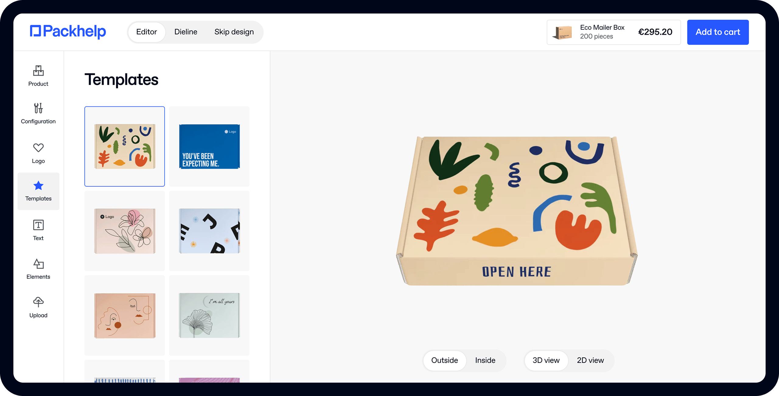
- Real time 3D packaging preview
- Upload logo and choose brand colours

Subscribe now! Receive 15% discount.
Don’t miss out – get 15% off your first order when you join the newsletter. It’s fast, free, and kinda smart.
You're now subscribed!
We guarantee that after reading this short guide, you will no longer have doubts about your logo in the design.
In this post, we want to show you 6 simple ways to use the printing space on your box in a smart way.
With these few tips, you will have a better understanding of our online editor.
#1 Utilize the top side
When your customers receive your products, the first thing they notice is the imprint on the top side of the box.
There’s no way around it. The top side of your packaging is the ice-breaker, the welcoming element of your box.
As a retailer, you should also understand its value from the point of selling. Packaging can be a great boost to your sales - only if used correctly.
A good practice is therefore choosing to place your logo on the top side. It’s easily achievable in our online editor. Once you choose your product - let’s say a Full Color Mailer Box - you simply click on the top side of your box. Just like we did in the picture below, using ur Packhelp logo.
Note: If you are having trouble with adding your images or logo, we recommend to get acquainted with our short guide to using the online box editor.

We’ve seen it work really great in many examples from our clients. The logo placed in the central part of the box looks truly fantastic. See the example of the minimalist design by Biotika.

Obviously, the more creative you get, the more interesting your design will be. Since you can edit your project in our editor as much as you want, add and remove graphics, try various variants.
#2 Avoid corners
Moving your logo or other important graphics to the corner is not the best idea for two main reasons.
Most importantly, it diminishes the chance that your customer will notice the logo as the first thing.
Furthermore, you might be tempted to add a cool graphic on the top and therefore move your logo somewhere to the corner. Once you do that, your logo will lose importance in the entire design.

And one last thing - adding elements too close to the edge is risky. The printing machine might move the cardboard layer up to 5 mm in each side, which can cut your graphics if they are too close to the edges.
As you can see in the picture above, a pop-up will show up if you move your graphics too close to the edge.
Eager to see your logo on one of our products? Get a quote!
#3 Create A Chain With Your Logo
If you already planned a mesmerizing graphic to spruce up your packaging bundles, don’t worry. You can still use your logo and be sure that it brings attention.
Place it on the horizontal walls and form a kind of “branded chain”. It’s a very simple way to use the space that is hard to “govern”.

#4 Be Sure To Include Your Social Media
Every brand wants to be visible in social media. And even if it seems like a far-fetched idea, your packaging can actually help in boosting this visibility.
Adding an information about all the social media networks you use is a good practice in many packaging designs. If you don’t believe us, see the example of Fensismensi below.
The company used one of the sides to print #fensismensiunboxing - an ideal call to action to share on Instagram.

Even though it doesn’t “virtually” convert, it gives people a clue concerning your presence on Instagram or Facebook.
#5 Use Texts
Packhelp’s client Cukrowka has designed an Eco White Mailer Box where a witty text is what the customer sees first. The imprinted sentence means “Oh, how sweet!” - it’s a reference to the product, which is a creamy, sweet fudge.


#6 Embrace An Entire Experience
A logo on a back side of the box, a graphic on the bottom and a text on top - it’s all great. However, it’s even better if it all creates a whole experience.
If we stick to our example of an Full Color Mailer Box, we first added the intriguing message on the front side of the box.

When you turn it upside down, you see that it includes a space for “personalization”. If you create an onboarding box, you might use that idea to give your new employees something that they use on their desks.
If you are wondering what we mean by onboarding, read our short introduction to welcoming employees by giving them packages.

This is a solution that can be used for your customers too. Allowing people to play with the design by themselves is great. Especially if your target includes kids - they will love a box which they can paint.
Best Practices End Here - Your Fun Begins
There you go - our 6 good design practices. With these few simple steps, you can create a very engaging box and be sure that all of your space is used correctly.
Need more information about designing in our editor? Check out these articles:


