Top 10 Most Inspiring Black Packaging Designs For You

- 200+ templates & patterns
- Real time 3D packaging preview
- Upload logo and choose brand colours

Subscribe now! Receive 15% discount.
Don’t miss out – get 15% off your first order when you join the newsletter. It’s fast, free, and kinda smart.
You're now subscribed!
In this article:
- What is the symbolism of the black colour?
- #1 Olive Poem - Matt & Black
- #2 No.Thirty-Three - Subtlety of gold
- #3 Barneys New York - Stunning minimalism
- #4 Kemptown Red Roaster Coffee - Retail product
- #5 Distilled London - Black inside
- #6 Soy Candles - Black label
- #7 Guinness - Owners of black
- #8 Sapfo - black & natural cardboard
- #9 Algorithm - Add an unexpected colour
- #10 Hint - Wood blends with black
Are you looking for a natural winner fraction in your packaging? Try the colour of elegance - black.
Packaging design is a broad term. It includes the shape of your box, its unique features, special printing techniques etc. One of the most important parts, however, is choosing your colour.
On the surface, it couldn’t be easier. Why not choose your favourite colour?
You can do that, but more often than not, choosing a random colour result in a communication & branding mess.
It’s one of the sins that packaging designers commit as well. When they are given too much freedom, their creations can be blinding. Or just straight-up wasteful.
Colours are important for many reasons.
- Each one of them has a particular influence on your customer. It’s not a hoax. White symbolizes innocence and purity, while purple is often associated with creativity.
- They communicate your values
- They provoke certain reactions in your customer's mind
What is the symbolism of the black colour?
It is naturally associated with the word premium. Black premium packaging invokes a feeling of class, elegance, like the little black dress or elegant tuxedo.
It’s associated with elegance and works perfectly with gold, silver and white cardboard boxes. Let’s be honest, it’s sexy and fresh. While many brands are still afraid to reach for it, black is exclusive.
It’s a powerful choice and we will exhibit it in the 10 following examples.
#1 Olive Poem - Matt & Black
Olive Poem is a concept we have found on Behance - it immediately caught our attention. The packaging is designed to showcase the virgin oil bottle. It uses a winning blend of black and gold (which you should also use in your Christmas packaging) too.

How can you get inspired by Olive Poem?
Take a closer look at the texture of the outer packaging. The matt finish embraces an extremely premium character of the product. You can choose such variant in our Full-Color Mailer Boxes too.
Want to learn more about Full Color Mailer Boxes?
Click Here
#2 No.Thirty-Three - Subtlety of gold
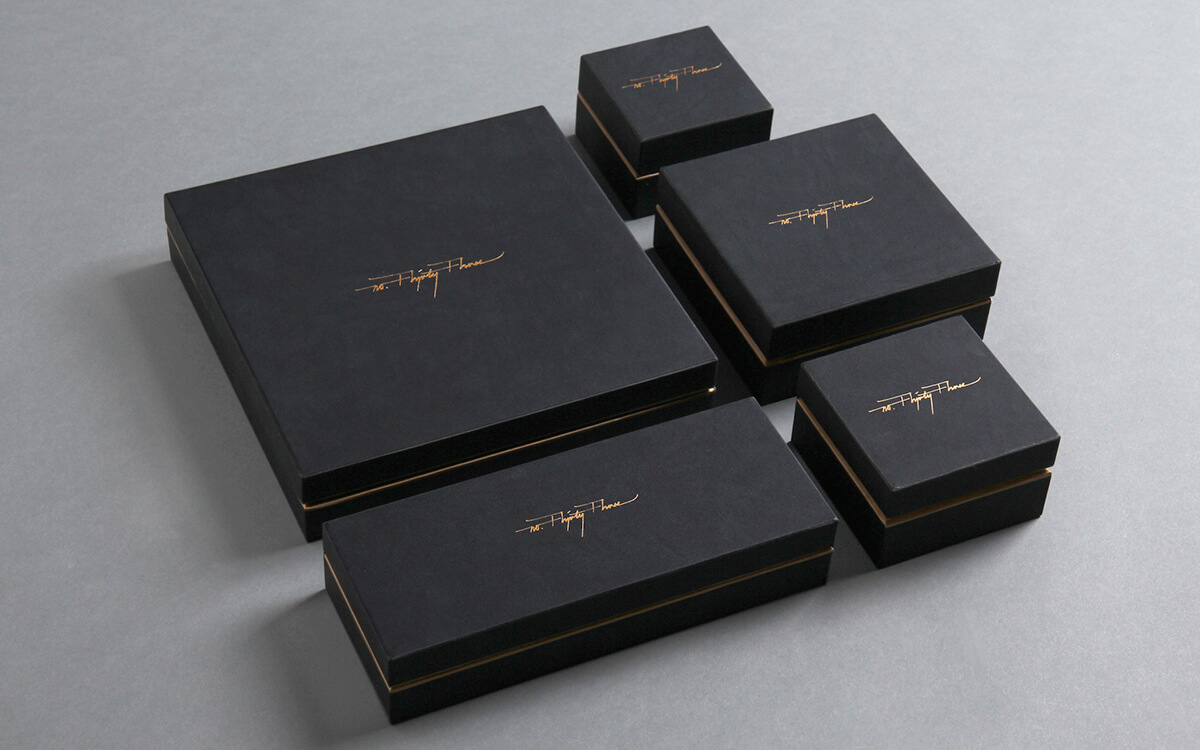
When you choose to print in black, you should remember that there is a vast range of shades. While we usually suggest using one particular “rich black” in packaging, you can look for slight nuances. This packaging by No. Thirty-Three, a design agency from Hong Kong, offers a subtle gold imprint on top of a Two-Piece box.
What’s in it for you?
When designing your packaging, you can use a similar concept of delicate logo element printed in gold. It’s a genuine detail.
#3 Barneys New York - Stunning minimalism
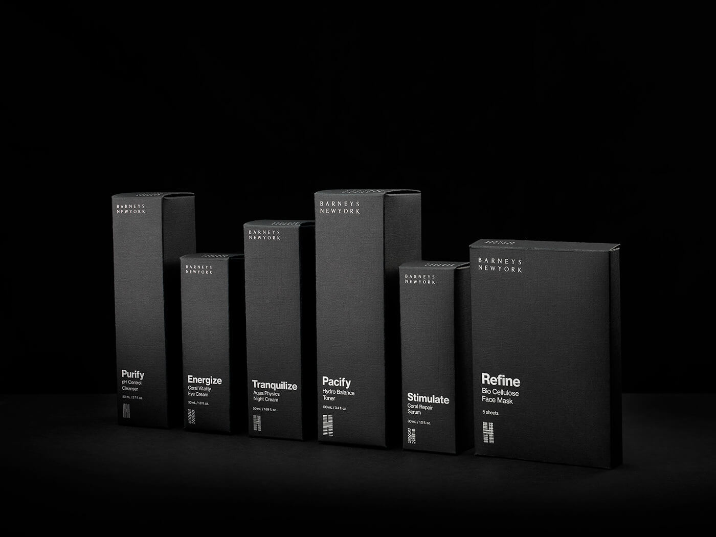
This stunning project is one of our favourites among the dark packaging designs. Its simplicity is captivating and it doesn’t go the easy way. Instead of white or gold, the design mixes hot-stamped silver elements.
Tip: Use hot-stamping in your design as well. This printing technology will allow your logo to do miracles in branding.
#4 Kemptown Red Roaster Coffee - Retail product
Designed by Pop & Pac Studio, this packaging proves that black works successfully in retail products too. The studio created three lines of coffee packaging for Kemptown Red Roaster Coffee - a mellow tone of yellow, light green blend and black.


Tip: You can use Packhelp Pro to create similar, tailor-made packaging. A tube-shaped, cardboard packaging? An extendable part?
#5 Distilled London - Black inside
Tissue paper is often used by clothing eCommerce stores (mostly premium brands). It’s a nice addition to the design and helps to enrich the unboxing experience. Just like in the case of Distilled London - the natural cardboard box looks much more interesting with the black tissue paper.

How can you draw inspiration from Distilled London?
Pretty straightforward - use black tissue paper, print your logo on it and wrap your products for an additional “wow”.
#6 Soy Candles - Black label
A black box will not match every brand. It is a very bold decision to choose this type of branding.
Even if you choose natural cardboard, you can still make black pop in your design. Just like the black label does in this design of soy candles.
You can add a black label (both awesome-looking and informative) and keep your design neat & simple.


#7 Guinness - Owners of black
If there’s one brand that has embraced black, going completely off-mainstream, it’s Guinness. The Irish producer of dark beer has been successfully using black in their branding for years.
What’s in it for your cardboard packaging?
Most importantly, the sheer genius of using strong contrast of black, gold and white. The branding is on fire here.

#8 Sapfo - black & natural cardboard
Sapfo is, just like Olive Poem mentioned above, a virgin olive producer. The packaging is interesting in a way it uses the natural kraft colour and black. Your brand can also benefit from that when creating a cardboard box.
How?
In reverse. Use a black design on an Eco Mailer Box. Make it look stunning.
Eco Mailer Boxes - Click Here

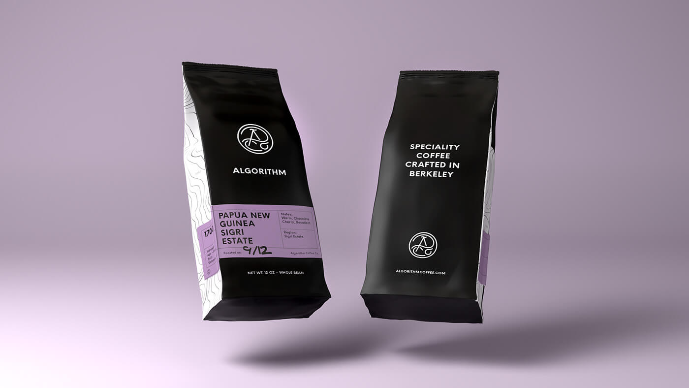
#9 Algorithm - Add an unexpected colour
At the beginning of this article, we mentioned that the black colour is sexy when matched with gold and white. While it makes sense, it’s not the only eye-catching “collaboration”.
Take a look at Algorithm. This coffee producer used purple element in a generally dark design. The result is a nuanced and memorable project.
#10 Hint - Wood blends with black
Wooden elements and inspirations are gaining significance in modern design. One of the reasons is that - just like the black colour - wood is associated with elegance.
This fabulous design by Hint mixes both. The cork and wood elements are incorporated in the mostly dark packaging.
How can your cardboard box use Hint as an inspiration?
Design a dark box and add a sticker or label that imitates wood.


There you go
Give yourself some time, process all of these designs. Think which idea can be used in your brand. And if you need some more lovely packaging designs, read one of the following articles:


