Why your brand needs to use packaging with a logo

- 200+ templates & patterns
- Real time 3D packaging preview
- Upload logo and choose brand colours
Subscribe now! Receive 15% discount.
Don’t miss out – get 15% off your first order when you join the newsletter. It’s fast, free, and kinda smart.
You're now subscribed!
In this article:
Designing logo packaging isn't a complicated process. However, it can be easy to do a good job, but difficult to do an exceptional job. Here’s why.
Cartons, boxes, parcels and packaging
Packaging, in the form of cartons, boxes and parcels, plays an important role in any company that sells a physical product. But there’s a lot more to designing packaging than simply throwing your company’s logo onto a box!
In this article, you’ll see:
- How to design packaging with your brand’s logo
- Tips for designing packaging
- Examples of well-branded packaging
Form vs function in packaging
Whether you’re selling online or in a store, packaging must fulfil two main roles.
Firstly, the packaging needs to keep the product secure - this is its form.
Secondly, it needs to present your product to your customer in a way that adds value to that product - this is its function.
Form is the physical element that makes up your packaging (cardboard, colours, imagery).
Where as Function is the way the box protects and represents your product.
The form/function argument was originally used in architecture.
'The exterior design of a building should represent what happens on the inside'.
What does this have to do with the design of your brand's logo packaging?
Well, it’s simple.
The exterior design of your box should echo what’s inside. In this case, your product. Your boxes need to be a symbol of your brand and everything that your company represents. Told you there was more to it than just adding a logo!
So, how do you design packaging that complements your product?
Designing packaging with a logo
As a small business, you’ve probably spent a bit of time (and money) on your branding development. On designing a logo, yes, but also other visual assets, such as: fonts, colour palettes and any other kind of imagery.
All these things have been created with your brand’s message, morals and your product in mind.
It's no good having the most amazingly well designed product, if the box it comes in doesn't reflect what's inside. You need to show off those branding elements through your packaging.
You’re showing off what’s inside the box - form is following function.
It has never been easier for new businesses to be able to control exactly how they want their packaging to look.

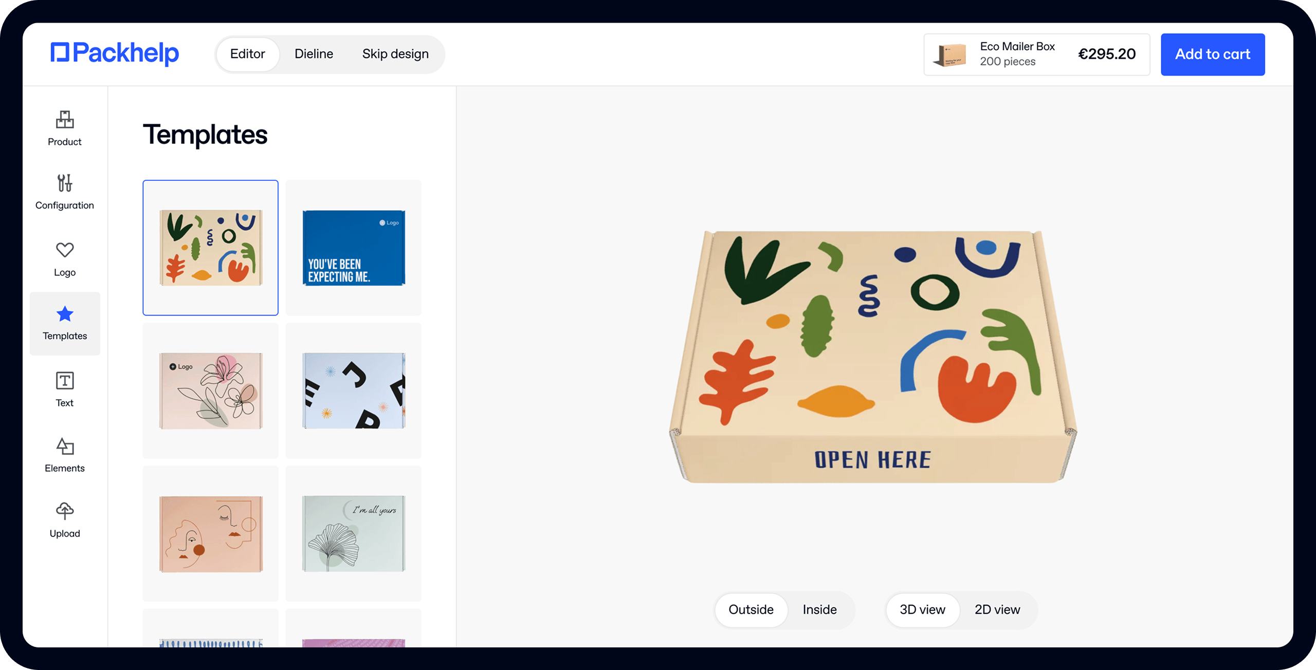
In order to design really effective logo packaging, the best tool to use is something like the Packhelp online editor (pictured above).
It's up to you to decide on the size and type of boxes, and the templates and fonts you would like to use for your design. As well as adding your company's logo of course.
You can use a special logo maker to get it all professional.
If one box design won't cover it, you can always opt for a logo packaging set.
The steps to designing your own packaging are simple:
- Pick the type of box you need
- Upload your logo and other elements
- Drag and drop them where you like them
- Order between 30 and 30,000 pieces!
One of the great things about Packhelp when it comes to small businesses, is the minimum packaging order is only 30 pieces and you can ask for a sample box first. Meaning you don't need to have a thousand boxes made up, before you've even sold your first product!
Click here to start designing your own packaging!
Check out these examples of great logo packaging, designed by small brands just like yours:
Sheyn
Sheyn is an Austrian jewellery company. Here, you can see how they've made their logo so large, that it covers every side of the box. This is a great use of space to break up lines and demand attention.

Asila
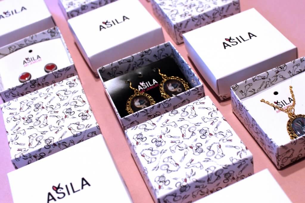
Asila is another jewellery company, but they placed their logo right in the middle of the top surface of the lid on their two-piece product box. The bottom piece is designed around a complex yet cute pattern that's also on their website
Snakehive
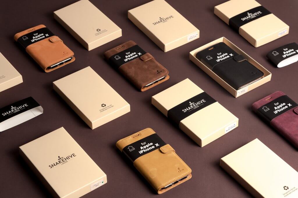
Snakehive are creators of high-end phone cases made of luxurious materials. By using Packhelp, they were able to design luxury product packaging that, when first held, gives the same luxurious feel as their product. Snakehive have also used sleeves to secure the boxes, and show off their logo again.
Now that you've seen some fine examples of packaging with a logo, have a read of some tips to help you fine-tune your creation process!
Different Types of packaging
When it comes to boxes there are tons of different types you could opt for when designing your packaging. You need to think about practicality, as well as the best design to show off your products.
For instance, for Snake Hive (above), it was important that their boxes reflected the size and shape of a phone case. Having a much larger box would be unnecessary and costly. The size and shape of your products will usually dictate the size of the box.
Maybe you want your logo to feature on more than just your product boxes?
Logo Packaging Tape
Custom packing tapes are a great way to show off your brand’s logo on your packaging. Seal up your product boxes with some logo emblazoned packaging tape, to keep your products extra secure; while also adding a little bit of your brand’s own pizazz. Why not?!
Tips for designing packaging with a logo
Designing your logo packaging can be a fun process, and it's a great way to let your creativity soar. You can experiment as much as you want and find a layout that best compliments your brand.
Here are a few tips to help get you started in the designing process:
Textures
Before designing your logo packaging, it’s important to know the kind of canvas you want to print on.
For example, do you want a plain white surface, a solid colour or gradient, a classy leather texture or the simple brown (kraft) texture of cardboard?
Below you can see a great example of using kraft packaging that complements branding:

Slopes & Town is a Dutch, contemporary fashion accessories brand, based in Amsterdam. They used Packhelp's online editor, to design their own two-piece, product box opting for a natural kraft texture. Kraft is often used to reflect brands that focus on being natural, organic and environmentally friendly.
If your brand sells a product that doesn’t compromise on quality and luxury, it can be a good idea to echo this feel on your packaging.
Magnetic boxes that snap shut are a great way to use packaging to deliver a touch of class, but also that feeling of security.
Consider designing bespoke packaging with your logo in an Alaska, Arktika or even a leather-like finish.
In the image below, you can see how a rough texture, and other custom elements like hot-stamping, can add a little class and grandeur to your product packaging.

Start designing your own bespoke packaging. Add your company's logo and create a truly one-of-a-kind box design that really makes your product stand out.
Colours
The colours that you choose will define the look of your brand and how your product will appear to customers.
However certain colours work better on certain textures and this is something to take into account. White on kraft has a very delicate, subtle and elegant look as seen in Polu’s boxes below.

Rather than start with a blank white canvas, consider starting with a black canvas when designing your packaging for products.

Black has always been associated with luxury, elegance and dominance. If your brand is trying to make a lasting impression, consider using a black canvas.
Use the space
When designing packaging, your canvas (your box) is often small in size, so you’re restricted with space.
But sometimes, it’s what you don’t do with that space that makes an impression. Bringing parts of your packaging design closer together can create emphasis and hierarchy.
For example, a slogan in bold can draw attention and make a viewer continue to read 'down':

You can also use the space to showcase your brand's values to your customer. That could be a label related to a cause or social movement that your brand supports. Or maybe you want to add an eco badge to reassure your customer that the packaging is made from sustainable materials.
On the other hand, space on your packaging design can be your best friend. This is true if your branding is more in the 'minimalist' world of design.
Give small, crisp and clean elements, space to make their statement and leave their impression.

If your brand is big and loud and likes to make a splash, space is still important, but it’s used differently - lines can be used to break up space, creating shapes and patterns that demand attention.

Marketing
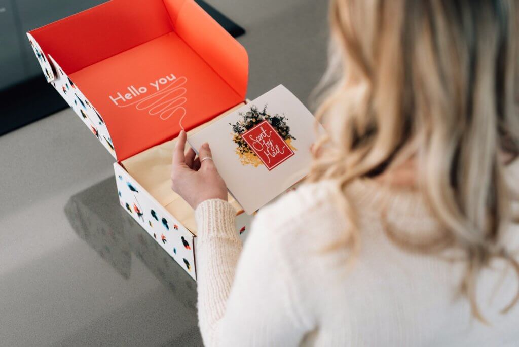
Your packaging is the only marketing material that reaches 100% of your customers. It’s also the first physical interaction that your ecommerce customers have with your brand.
Echoing your brand’s slogan or mission statement on the side of your packaging reminds your customer why they bought from you. This reminds them that buying your product was the best decision they could make.
Conclusion
Designing packaging with your logo is an important way to stand out above your competition and be seen. Packaging that shows off your branding and logo, presents you as a professional business that has put time and effort into your product.
To start designing your logo packaging, head over to the Packhelp shop
It's totally free to design your packaging and you can experiment as much as you want. So play around with colours, fonts and templates until you have a box that pops just the way you want it to. With prices starting from just €0.26 per piece, your brand's new packaging won’t need to bankrupt you before you've even got started either.


