Branding a Clothing Line – Tips, Techniques and Inspiration

- 200+ templates & patterns
- Real time 3D packaging preview
- Upload logo and choose brand colours
Subscribe now! Receive 15% discount.
Don’t miss out – get 15% off your first order when you join the newsletter. It’s fast, free, and kinda smart.
You're now subscribed!
In this article:
What's the "secret sauce" of companies that become successful in the fashion industry? One of the answers is nailing the branding of a clothing line.
Whether you own a clothing line, a bakery business from home or a subscription box company, this question will always plague you:
What can I do to catch up with the best in your league?
And even if you're the top, are there any strategies that can cement your position even more?
One of the key aspects in that matter is your branding.
You see, people will judge your brand from numerous angles. They will look at your website, they will have their opinion on the logo, on your banners, the way you respond to them.
Therefore, branding of a clothing brand is a vast topic. And that's what this article might help you with. I'll try to explain:
- how big brands approach their branding
- what's key to remember about building your branding
- how to adapt your branding to various selling models
- how to use packaging to be an essential part of your branding
Emotional branding of a clothing line
In almost every academic course on consumer behaviour, you will hear the concept of "irrational consumer choice". The logic behind this belief is that most of your clients will make the purchase as a result of an impulse.
Whatever you may think of yourself, let's be honest - we all bought the chocolate bar next to the counter at some point in our lives. Did you need that bar? Probably not. But it was probably damn good.
Buying that chocolate bar was an impulse.
These impulses are strongly related to emotions and feelings that have when seeing a product or a particular brand.
A clothing brand - like many other businesses - is a matter of building emotions around it.
Emotions are often mentioned as key sales and retention factors in many research studies too. Customers become loyal to the brands that they feel bonded with. As found in the research by Forrester from 2017, both behavioural and emotional metrics help growing businesses and constitute driving force in increasing retention.
“Emotion is a key driver of the most profitable customer behaviour, influencing customer spend, loyalty, advocacy and customer lifetime value.” (source)
The best way to understand this pivotal role of emotion-based branding is to learn from the well-established companies that already won the hearts of their customers.
One of my personal favourites is Burberry, the London-based company, which has mastered the "emotional branding" part.

Burberry is a company with a tradition of over a hundred fifty years. Back then, it was focused to craft men-only garments. Burberry's trademark product was the long trench coats, designed for upper-class Londoners.
However, time passed and fashion trends changed along with it.
The luxury clothes became a thing for catwalks, while designers fled the big houses and established their own brands. The changes forced Burberry to adapt its way of thinking about their market.
The natural move was to embrace the feminine aspect of fashion. Burberry turned from a men-only brand to an elegant trendsetter for both masculine and feminine customers. By using their already well-known brand, Burberry transitioned and used its British origins to their favour.
How?
In order to gain more social proof in the eyes of their new customers, Burberry worked with popular British model Kate Moss (below), who helped the brand grow into a more luxurious choice.

Burberry's luxury was very "local", deeply rooted in the tradition of the brand. The British company turned the years of clothing industry expertise into their main asset. Given the fact that the British like to support their own brands, Burberry achieved a unique kind of branding - one that couldn't be easily copied by any other company.
The example of Burberry illustrates that each brand needs an anchor for their branding. It might be the experience of its founder, a particular country of origin or some other unconventional value.
Branding of a clothing line - how to cater to your group?
Burberry knew who their clients were. But this was the result of both the years of expertise and the luxury of having resources to test the market.
Without the tradition to back your brand, you are left with lots of time spent on research. But as scary as it may sound, branding of your own clothing line isn't that difficult.
It just takes a bit of wit and originality.
Before I go into details of branding in a clothing brand, allow me to tell you about the emotional leverage mechanism used by Barack Obama, a former president of the U.S.

His clothes were specifically adjusted to cater to the particular audience. During the speeches for working-class citizens, Obama would roll up his sleeves and wear a shirt with no jacket.
That was his way of communicating the hard-working attitude - a way of becoming closer to his audience (who turned into his voters eventually).
How is this related to the branding of your clothing line?
The point is that your branding needs to appeal to the customer group you have chosen. Clothes really influence the way we feel and how others perceive us. Make sure that you meet the expectations of the group of customers you are targeting.
Here's a great example from the industry - a producer of socks, lingerie and clothing accessories, Happy Socks.

The brand is all about happiness and a cheerful attitude, which is expressed in their designs. Moreover, Happy Socks enjoys a cult following all around the world and became a rock-solid brand in their own part of the clothing industry. The company has also created limited series in collaboration with designers or based on a theme (like The Beatles or Wiz Khalifa).
You can use Happy Socks as a benchmark for branding done right across multiple platforms.
Their branding in social media is ideally crafted to attract people with their own styles. Photos showcase people wearing the colourful socks in the streets, in art galleries, on a basketball pitch. The company uses social media to create an impression that Happy Socks is a lifestyle.

The communication tone is kept in a similar vibe. All of the graphic designs used in advertising are colourful and vivid. What's more, Happy Socks likes to be bold and imaginative.
In one of their campaigns, the Swedish brand expressed that Happy Socks welcomes everyone and is for everyone. The photoshoot below was organized by David La Chapelle and became an intriguing, great statement. And a masterful branding tool.

The company has also leveraged other elements of their branding, like the packaging (which you can see in the photo below). All of their solutions are very lively, consistent as a whole line and perfectly corresponding to the brand's vibe.

Lessons learned from Happy Socks?
The company created a memorable image by embracing the emotional branding part - their customers can easily find themselves in the communication and see that HP products are crafted for them.
Three selling models in a clothing brand
Branding of your clothing line can differ due to the business model you choose. However, in that part of the article, I'll show you the universal strategies that can be used across the three following models:
- an e-commerce shop,
- a retail fashion store and
- both of these combined together.
You can also choose to sell your products in a boutique that promotes many brands in one place, but you will lose the option to control your branding in many ways.
Before I dive into the topic of the key branding components of your clothing line, let's make a recap of these three models.
E-commerce
E-commerce means shipping your products directly to your customers. It’s a great place to start - you don’t have to worry about the store maintenance costs, employee wages etc. Furthermore, you can find plenty of online tools that will help your daily operations.
One such idea is Zalando, the German marketplace for clothing stores. The company ships the products directly to their customers and their only selling point is online. Below is a box they use in the UK.

Retail store
Selling clothes in a showroom is a different story.
You have a range of tools to differentiate yourself right from the start. You can address the range of human senses - sight, smell, sound, touch, and maybe even taste - it's all your leverage.
What's more, you can build your local presence by organizing fashion-related events, meet-ups of designers or even support the local fashion stage.
An example of a retail store is a German brand Monokel, which I have described in a packaging case study. The brand's concept is tailor-made menswear, with a luxurious interior design of the shop, located in the heart of Berlin. Since each customer needs to be treated very personally (tailor-made part), the service couldn't be brought online.

A mix of both
Almost every e-commerce brand looks for its own showroom at some point too. It allows the owners to diversify their sales channels, find new segments of customers and get more quality, first-hand feedback.
Despite the differences between each model, there are universal factors that have a huge impact on branding in the clothing industry. I'll address these most crucial points below.
The elements of your branding strategy
Although the branding strategy might differ from company to company (and on the basis of the business model), there are three core factors that will influence your brand's image.
- your tone of communication with the customers
- your graphics, ads, social media and the challenge of keeping them consistent
- your clothing packaging solutions
The tone of communication in a clothing company
The way you approach your customers is the basis for your branding.
First of all, think about your customer. Start with creating a buyer persona and describing his or her key features. You can answer the following questions:
- How old are they?
- Where do they look for your product?
- What will they value the most in your brand?
- How can you communicate your unique selling point to them?
These few questions will give you a place to begin, a very general idea. The more detailed your approach is, the better. Dig deeper into the analysis.
Once your buyer persona is clear to you, you can think of places to catch their attention and - most importantly - the way to do that.
Most of the modern brands are directly addressing their customers. They try to reduce the distance in between, become a "shopping partner". Just like Happy Socks, which I described earlier.
You should also be focused on reducing the distance. In an e-commerce model, it falls down to nailing copy on your website. The best practices indicate that you should be very concise and direct, encourage your customer to discover your offer and clearly state your business.
I love to come back to the example of Girlfriend Collective when it comes to a self-aware clothing brand and its tone.

It's an American apparel brand that prides itself on sewing clothes made from 100% recycled materials. Their dedication is praiseworthy - even threads used in the packaging pouches are re-made from other materials!
What really catches the attention is that there is no "artificial beauty" in their images. The tone of the brand is down-to-earth and focused on making the visitor feel at home. Girlfriend Collective invites regular women to feel beautiful in their own, natural way.
Additionally, the environmentally-aware attitude is very much in the company's tone. It addresses you directly and finds witty ways to convince you to buy. Like the copy that says:
Old fishing nets look better on you than they do at the bottom of the ocean. Just saying.
Smart and to the point, isn't it?
Tip: See what your customer wish to associate with your brand. Then use that feature or aspect in your communication.
The visual layer of your brand
The visual side of every brand has incredible importance.
You are a proof of that, as well as I am too.
I was never a true fan of H&M logo. I couldn't truly understand why - it's not a design failure of any kind. It just didn't stick with me.
I understood it only after learning about the psychological impact of colours. Red - the leading colour in the logotype - is vibrant, energetic and raw. After thinking about it for a while, I saw that I am much more into darker, more toned colours. It's the reason why Zara's logo which brings elegance and peace to mind.
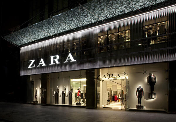
This is just an example, but it's the train of thoughts of your customers too - even though they might not be aware of that.
The colours, fonts and symbols you use on your website, in your store, in your leaflets, tags and fashion packaging - they all have a huge impact.
If you target people, who love hiking and you sew thermo-clothes made from bamboo, red will probably work the best (since it's energetic). However, you will definitely want to avoid grey and minimalism because this is associated with premium products.
The branding in terms of the visual aspect is also the case of using a specific style. Your website can be inspired by pop art or be defined by minimalism. The same refers to all of the other promo materials you will use.
An example from the clothing industry comes from Hien-Le, a popular designer brand from Berlin. Hien-Le wanted his clothes to be timeless and comfortable for everyone.
The Hien-Le branding was meticulously designed - it included very raw packaging design, as well as the showroom's interior and the exposition of the products along with it.

The minimalist approach is visible across all of the platforms too. Here's a screenshot of the Instagram feed of Hien-Le. It sets a certain mood, fitting the brand's visual style.

When designing your visual image, try being as close to the product's concept as possible.
Packaging - the crucial part of your e-commerce branding
A common branding mistake made by clothing brands is to limit their packaging to a simple, non-branded cardboard box.
People care about the product inside the box, right?
Frankly, customers expect more than they used to in the past. In a recent study from 2017 on labels and packaging solutions in the U.S., 59% of surveyed customers claimed that a bad label (boring, non-attractive design etc.) make them choose a different product.
It’s applicable to other markets too. Your customer judges every part of your product. Packaging is your silent salesman and the first physical touchpoint for an e-commerce brand.
In other words - your packaging shows who you are as a brand.
What does your packaging solution say about your clothing brand? Are you minimalist? Creative? Do you like colourful designs?
Your box can tell all these things.
Let's consider a few examples and see how clothing brands approach their packaging design.
Shore is a Polish apparel e-commerce shop that used its packaging to create a witty connection with the name of the company. A calming view of the seashore is printed on the top of the package, which immediately catches your attention. The second design uses a similar idea, but - since the package includes winter clothes - the printed image is a mountain range.
Smart and memorable.
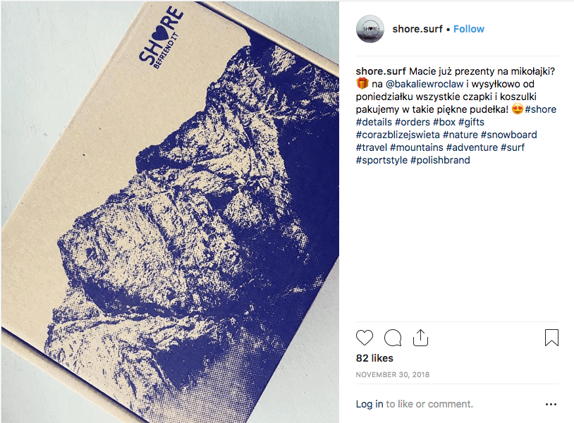
When designing your packaging, think of a theme that will strengthen your branding. If your clothes are very artsy, maybe an inspiration drawn from modern art will be cool?
Tip: You can design packaging like Shore's directly in Packhelp's online box editor. Click here to give it a try.
Furthermore, you can use your packaging to promote your business in social media.
Take photos of your products inside the boxes that you ship to the customers. Emphasize that your packaging is a part of the product and the experience with a brand. Encourage your customers to include photos with the hashtag of your brand or your profile tagged.

Give your followers the reasons to spread the word - apart from the gorgeous garments inside the package. That way, your customers will automatically connect your packaging with a certain quality of the product.
And remember, a more attractive product exposure increases your chance of others sharing the photos of your box.
Seth Hartman, a blogger called My Creative Look, shares photos of menswear and helps brands get their name out. Here’s an example of Urbanebox’s set that was shared on My Creative Look.

Kuyichi, a Dutch organic denim brand, created the concept of "unfashion". Their goal is to fix the clothing industry by not only promoting slow fashion but also rejecting the model of fast trends, linear production and sales.
They opt for circular production, which is why their packaging had to be recyclable, as well.
Here's what Zoé Daemen, Corporate Responsibility Manager at Kuyichi, said about the changing landscape of not only fashion packaging but the fashion industry overall:
It’s your turn now
Shira Sue Carmi from Launch Collective indicated, that
“Fashion is amazing in the way it balances art and commerce, but it’s a business. Don’t start a business because you want to design. Start a business because you want to start a business.”
You could adapt these words to talk about branding - don't think about branding from your own perspective. Instead, see your brand from the perspective of the customer you wish to target. Think which means of communication you will need, what will they value and judge.
You can begin crafting your branding (or strengthen your current strategy) with your branded packaging.


