The Complete Guide to Branding Your Company Using Color Theory

- 200+ templates & patterns
- Real time 3D packaging preview
- Upload logo and choose brand colours
Subscribe now! Receive 15% discount.
Don’t miss out – get 15% off your first order when you join the newsletter. It’s fast, free, and kinda smart.
You're now subscribed!
In this article:
- The basics of color theory
- How To Use Color to Build Your Brands Identity
- 3 Ways to Use Color in Branding
- Different Brands You Should Know And How They Use Color To Stay On Top
- How do you Create Your Own Company’s Colors?
- Deciding What Colors to Use
- Following These Steps Will Help You Create A Stronger Brand For Your Company
The simplest definition of branding is that it is the process of creating an identity and recognizable visual representation.
Different branding elements can be used to build out your brand, such as deciding on an attention-grabbing name, logo, slogan, and color scheme.
Business branding is about developing a consistent brand identity that speaks about who you are and what you do to meet your customer’s needs.
It’s a little like ingraining your company with a personality and a voice so that it is instantly recognizable.
The basics of color theory
It’s also important to understand branding strategies and business branding elements.

In “Foundations of Marketing,” David Jobber and John Fahy suggested the 4 Cs of any branding strategy.
- Clarity: Develop a simple message to describe the value of your brand.
- Consistency: Express this message in all your marketing communications.
- Credibility: Your message should be believable.
- Competitive: Your message should promise more than your competitors.
Here is a quick description of some of the most significant brand elements:
Names
Brand names help people identify a product or service. This is also referred to as its trademarked name. Unique names allow consumers to distinguish between similar products and services.
“eBay,” for example, is a unique name that identifies this auction company from other auction-based websites.
Logos
Brand logos are crucial to the success of any brand since they must be easily recognizable, unique, and appealing to the target audience.
It should also provide a sense of the type of products or services you offer.
Simple, strong, and recognizable symbols are timeless and functional.
A well-known logo is a great way for a company to stay fresh and recognizable in the minds of potential customers.

When we think of the Nike Swoosh, for example, we think of performance and fitness.
Your logo is the entry point of your brand. Your logo belongs on packaging, letterheads, social media, websites, business cards - it goes everywhere your brand goes.
Graphics
Brand graphics contribute significantly to customer experience.
These elements help identify your business and set you apart from your competitors.
Below is a fine example of effective coffee packaging design using the graphic design concept of negative space:

The right use of graphics can help you stand out and communicate more effectively with your audience.
On retail packaging, graphics designed in the form of mascots or familiar shapes help catch the eyes of passers-by.
High-quality graphic designs communicate the value of a company’s products or services visually.
Colour, sounds & movements
- A brand color can set the tone for your brand and evoke certain emotions in your audience.
- A brand sound can be anything from a product demonstration to a short video that gives potential customers an overview of what you offer.
- A brand movement reflects the culture of any company. It boosts company morale, customer loyalty, and engagement.
Fonts
Fonts are an often overlooked part of branding and brand psychology. Using Nike again as an example, they're a loud, in-your-face, active brands that demand your attention.
Their font follows suit.

Font's play a huge role in the way we perceive the words we read.
Just remember, no one likes comic sans.

The purpose of this article is to introduce you to the basics of color theory (or 'colour theory') and different ways to implement your brand through colors.
You will develop a deep understanding of how to build your retail, supply chain, high-end, or designer brand using color theory.
How To Use Color to Build Your Brands Identity
A company's success is no longer determined by the quality of the products it sells or the services it offers.
Corporate success is also about how well a company reaches out to customers and captures their interest in its products or services.
Color is one way of reaching out to connect with customers because various colors can influence consumer decisions.
In fact, choosing the right color combination can often create a desired psychological reaction.

For example, the above image, consisting of black and gold, exudes a sensation of class, luxury and elegance. You don't know if it's wine, oil or whiskey, but you know it's 'nice'.
Colors not only help connect with consumers emotionally but also reinforce a brand’s identity.
By applying color theory basics, you can make your business appear more cohesive and professional to your target audience.

Learn more about Hemp Juice and its calming branding
Since color is an important element of any visual identity, color psychologists consider the psychological effects of color when designing campaigns for brands.
Some things to keep in mind:
- Colors can evoke certain emotions in consumers.
- Color can help set the mood.
- Colors can trigger memories.
Branding is heavily influenced by color psychology marketing, which is the study of how to use color in branding.
A product's color can have a significant impact on how consumers perceive the company and how they feel about the product.

Green, as above, can make people feel calm and at ease whereas bright bold reds can excite, as seen in the craft beer branding below:

3 Ways to Use Color in Branding
Colors play a vital role in our lives. They can affect our mood and influence our decisions.

A company's brand identity can be enhanced with colors that make it easier for customers to remember your company. Branding colors are divided into three categories: monochromatic colors, analogous colors, and complementary colors.
1. The Benefits of Using Monochromatic Colors
The color you choose for your brand needs to be the right one.
It needs to make perfect sense in the context of your business. A single color is the most popular choice for brands.

A lot of companies will choose just one color to represent them and use it in their logo, social media posts, website, newsletters, etc.
Some popular monochromatic colors are blue, orange, green, and red.
Sometimes, however, a brand may have to be flexible in its use of monochromatic color.
For instance, McDonald’s arches are usually a bright yellow, which psychologically evokes a feeling of playfulness and happiness.

However, the first McDonald’s in Sedona, built in 1993, had to use turquoise arches so that they would harmonize with the red rocks in the background.

2. The Benefits of Using Analogous Colors
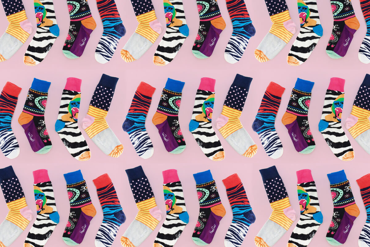
Colors that are next to one another on the color wheel have a natural relationship because they have similar hues, saturation, and lightness levels.
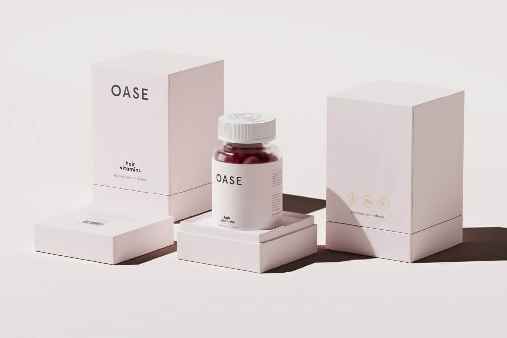
Learn more about Oase and their branding
3. The Benefits of Using Complementary Colors
Although the color wheel is often used when people design their logo's colors, not many people realize that colors opposite one another can also work well together.
On the color wheel, complementary colors are opposites of one another. Combining these colors creates a sense of balance that may be more appealing to customers.
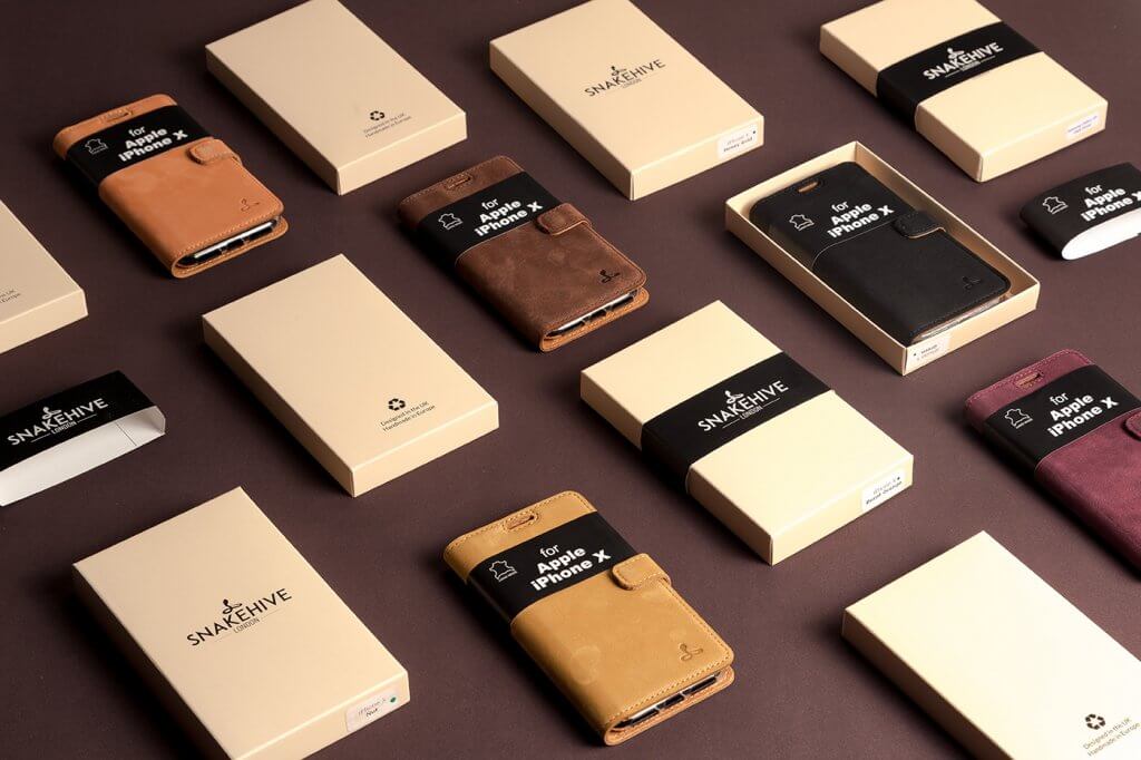
Learn more about Snakehive and their brand design
If you're not using monochrome color, then you should carefully consider what colors work together as a whole.
One common branding mistake that marketers make is selecting several colors that don't go together well. They choose colors that are neither analogous nor contrasting.
Different Brands You Should Know And How They Use Color To Stay On Top
Persuasion is a huge part of color psychology. In addition to evoking emotions and feelings in consumers, they can also be used to differentiate between brands.
After all, when you’re in a store with thousands of products, it's important to distinguish between them easily.
The color of a product helps customers distinguish one brand from another.
Here are some well-known brands using color psychology in marketing:
Companies Using Purple
Purple is one of the most expensive colors to produce, with a low pigment yield.

Due to the difficulty of manufacturing this color in large quantities, it is only available in limited quantities. This makes it a popular choice in the luxury and beauty industries.
Purple is Asprey's signature color.
This company is known for its luxury items, with roots dating back to the 18th century.
When it started, Asprey sold luxury goods to European nobles in 1775 and now does so globally.
Companies Using Blue
Pursuing a blue brands marketing strategy is popular among financial companies.
Blue is associated with money and financial stability.
It is considered calming, dependable, and trustworthy.

Blue also represents safety and security.

Financial companies use this color because it has been shown to make people feel more comfortable when doing business with credit cards, banks, or insurance companies.
Some well-known businesses that use blue branding elements are American Express, JP Morgan. Progressive, and Allstate.
Companies Using Red
Because red is passionate, exciting, and stimulating, it is the most popular color in the marketing world.
It is not only aesthetically pleasing but also offers numerous psychological benefits.
Red stimulates us to act and makes us feel more confident.

Coca-Cola, which markets zest for life, has used red since 1890.

Another brand that uses red is Target. Its red bull's-eye logo grabs our attention no matter where we see it, whether at a strip mall or on a billboard.
Although the company’s name was originally written in the center, the bull's eye symbol became so popular that this major retailer no longer needed to identify itself.
Companies Using Yellow
Yellow is one of the most recognizable colors in the world.

Even in low light, it can be seen clearly. Moreover, it is one of the friendliest colors, representing cheerfulness, optimism, and happiness.

Yellow can improve moods and reduce stress by giving tired or stressed-out people an energetic boost.
Among the companies that use yellow are Ikea, Amazon, Subway, Best Brands, and Snapchat.
Companies Using Several Primary Colors
The color wheel is a circle of colors that has three primary colors, blue, red, and yellow.
These primary colors can be mixed to create other colors such as green or purple.

Blue, red, and yellow are the three primary colors used by big brands such as Procter and Gamble (P&G) and Unilever.
Meanwhile, Microsoft and Google prefer blue, red, and green.
How do you Create Your Own Company’s Colors?
Several tools--such as RGB color code, Hexadecimal codes, a color wheel, or a Pantone color chart--are available when trying to figure out how to create your own company’s colors.
These tools are useful for planning your company logo colors marketing strategy.
The RGB Color Code
RGB color codes are created by taking three numbers that represent the intensity or brightness of each of the three primary colors, red, green, and blue.
As an example, 00FF00 contains the three primary colors and is therefore pure yellow on an RGB color wheel.
The Hexadecimal Color Code
If you want more specificity with your company's colors than the RGB color code allows, you can use hexadecimal coding, which represents all 16 million different colors in any intensity.

Gradients can also be made using this method, including black-to-white, white-to-black, black-to-gray, gray-to-black, as well as variations of colors.
The Color Wheel
The color wheel is useful for understanding how colors relate to each other.
You can use it to determine analogous or complementary colors. The vertical axis represents the purity of a color, while its horizontal axis represents its hue.
The Pantone Color Chart
Pantone has created a color scale that reflects character traits such as fashion, nature, energy, and more.
Colors such as these should be considered when marketing your company's role in an industry, whether it be happiness, calmness, eco-friendliness, or otherwise.
Deciding What Colors to Use
Choose the colors of your company logo based on the message you want to communicate about your brand.
The psychology involved in colors is very complex.
However, there are two basic rules to keep in mind when choosing colors for your brand or product.
Use the right selection of colors in your logos because these are the most important part of establishing your company’s identity.
Colors can convey specific meanings to consumers.
You need to consider what message you want to convey and how you want your audience to feel about your brand.
Colors have different meanings and can have a huge effect on how people perceive your company.
Following These Steps Will Help You Create A Stronger Brand For Your Company
The only way to win in the marketplace is by having a strong brand identity.
Color is one of the most powerful marketing tools available because it can be used to help enhance emotional connections with consumers, increase brand awareness, and attract more attention.
The right color scheme can set the mood for your company’s message, increase conversion rates on your website, and even affect people’s moods.
As a design and marketing tool, color can be used to influence the viewer's feelings and emotions.
It can also influence the mood and behavior of a person, which is often measured through things like attention span, memory retention and increased desire.
About the author:

Since 2003, Chris Makara has developed a broad digital marketing background with a focus on SEO, Social Media, Automation and Analytics. He is the founder of Bulkly, a social media automation tool for individuals and small businesses.


