


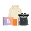
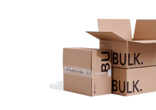


Better Logo Placement on Product Packaging

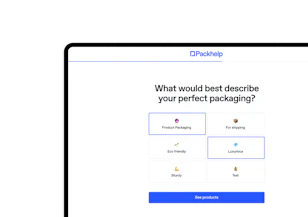
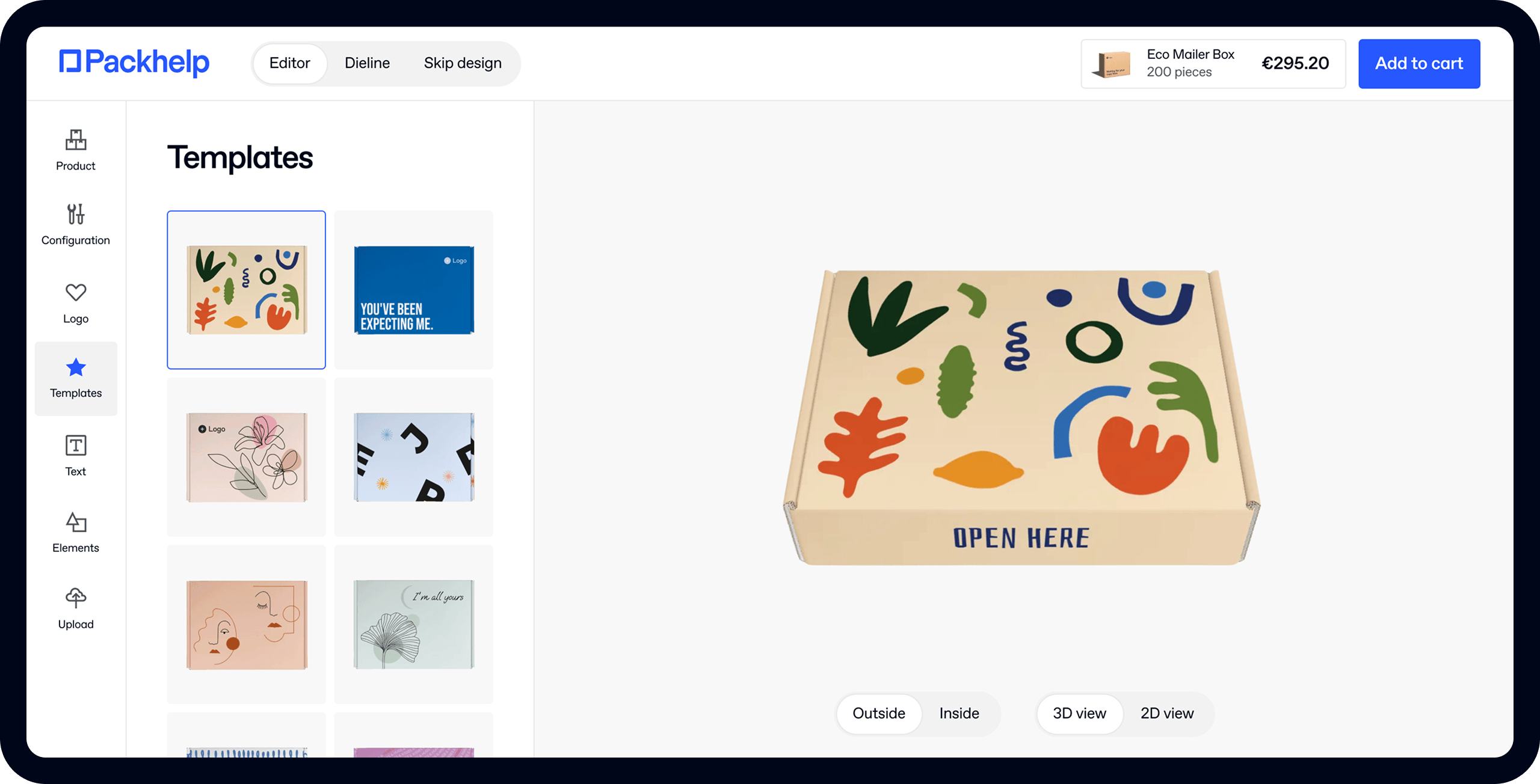
- 200+ templates & patterns
- Real time 3D packaging preview
- Upload logo and choose brand colours
Subscribe now! Receive 15% discount.
Don’t miss out – get 15% off your first order when you join the newsletter. It’s fast, free, and kinda smart.

You're now subscribed!
In this article:
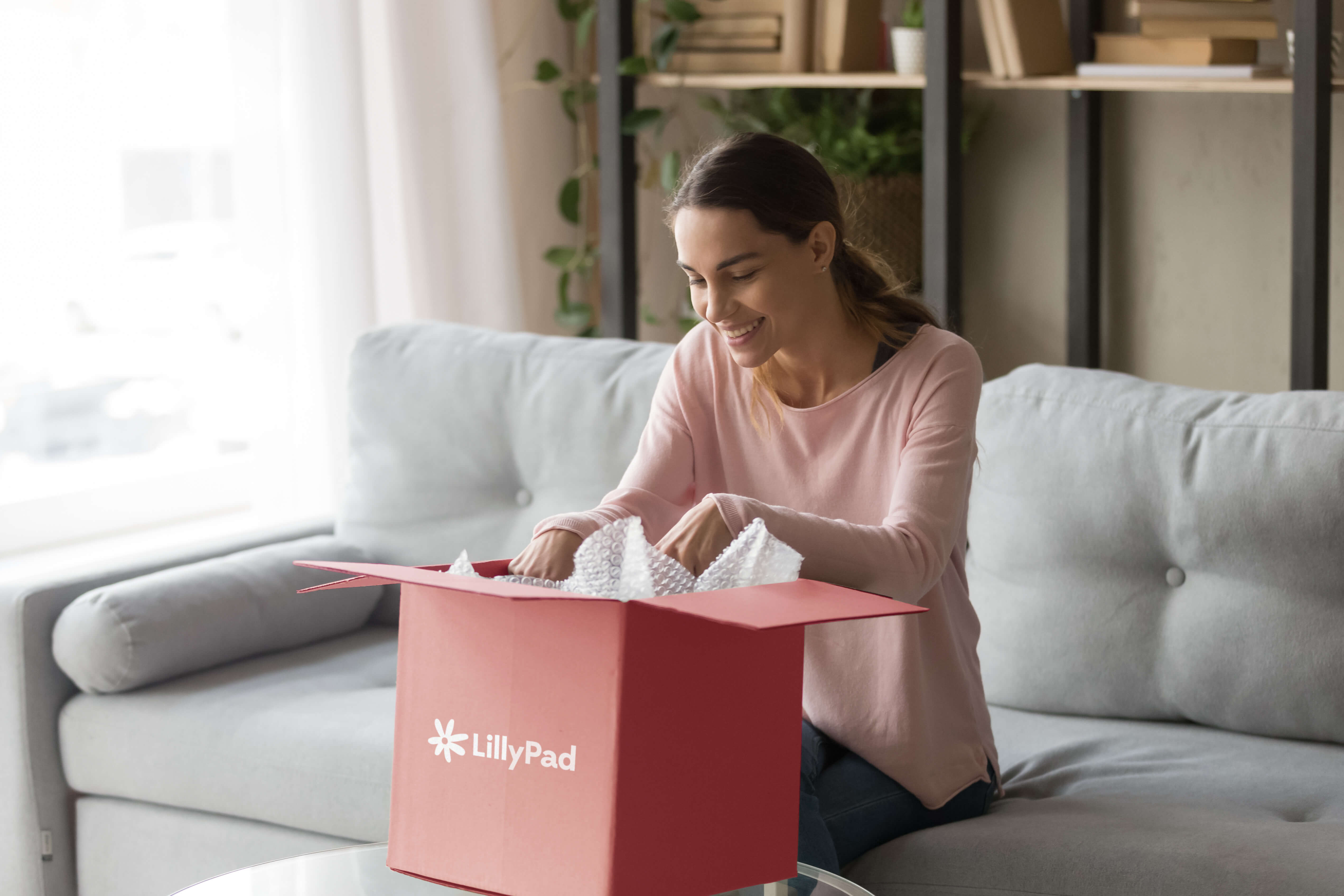
If you’re selling products online, you already know how important packaging is for making sure your goods arrive in one piece (or at all).
But product packaging is more than just a way to make the journey from warehouse to your customer’s house safer. It’s also a chance to create a lasting impression of your brand.
So, how can you start using packaging to boost your brand recognition and loyalty with customers? By incorporating your brand’s logo into your product packaging design.
But branding your ecommerce or retail packaging is a little more complicated than just slapping your logo on a square cardboard box and calling it a day.
In this article, we’re exploring what makes for good logo placement on product packaging and how the right placement goes beyond boosting brand visibility—to support brand identity.
The basics of logo placement
Your logo is your brand’s signature.
Like a signature, your logo’s value comes from its consistency.
If you want your customers to remember your brand, you need to set standards for how you use your logo—including where you place your logo.
One of the most common ways that companies create consistency for their logos is through logo guidelines.
What are logo guidelines?
Logo guidelines are usually a part of a larger set of brand guidelines. They offer direction for how your logo should and shouldn’t be used.
If you’re hiring a designer to design your packaging and logo, you can ask that they include logo guidelines with your logo files.
If you’re using an online logo maker, check to see if they provide advice for logo use with your purchase.
When you’re ready to start incorporating your logo into your ecommerce packaging design, you’ll want to consider these guidelines:
Logo elements
These are the components make up your logo (whether wordmark, symbol or both). If you have more space on your product packaging, you might choose your wordmark, but if space is tight your symbol might be a better fit.

Colour variations
Typically, this includes the primary version of your logo, black and white variations, and any other options you might need for special occasions or special cases.
When you’re considering printed materials like boxes or bags, some colour variations might be easier for printers to match, while others might show up off-colour (and off-brand).
Unacceptable uses
Let’s talk about what you don’t want to be done to your logo. For many brands, this includes requirements for colour, transparency, rotation, and scale. Across all mediums, these rules keep your brand from being diluted by variation. While there’s nothing wrong with experimenting with creative packaging design, having some no-gos for your logo and its location will help to direct your creativity.

Clear space
If you want your logo to be seen, you need to give it space.
Clear space guidelines tell you how much space needs to be maintained around your logo at all times.
Also known as the safety zone, exclusion zone, or padding, clear space is the most important area of your logo guidelines for logo placement, so we’ll break this one out more fully.
Logos can come in all shapes and sizes, but they all follow the same basic recommendation for clear space. Whether you’re putting your logo on product packaging, a business card, or a retail sign, you should aim to maintain a border of 10% of the total width of your logo at all times.
So, if you wanted to put a 10-centimetre version of your logo onto a box, you’d need to make sure the box had at least 1 centimetre of empty space around all sides of your logo.

But when you’re deciding on logo placement for your product packaging, you can’t just use the packaging’s dimensions to calculate clear space.
Remember to take into account the space taken up by box edges, bag handles, postage, and packing tape—all of which can intrude on your logo’s safety zone.
Clear space and consistent use make it easy for customers to see and remember your logo. With a little help from your logo guidelines, you’ll be able to build a stronger impression of your brand every time a customer gets their order.
The psychology behind logo placement and package design
Once you’ve got the basics of logo placement covered, you can start exploring different packaging designs. To boost the chances of your product packaging standing out from other ecommerce purchases your customers are making, try tapping into the psychology of different logo locations.

Depending on what message you want your brand to send, where you put your logo can either work with or against your brand identity. Here are a few placement options and associations to consider during the design process:
Center placement
People love symmetry, which is why it’s one of the basic principles of good design. An easy way to create symmetry in your product packaging is to have your logo in the centre of your packaging. This balanced look is pleasing to the eye and easy to spot, making it a no-brainer when you’re looking to leave an impression with your logo.
High placement vs low placement
Customers tend to see brands with logos at the top of their product packaging as more powerful than brands with logos at the bottom of their packaging. But higher isn’t always better since customers prefer lower logo placement for brands they already see as less powerful. Depending on the impression you’re looking to leave customers with—exclusive and authoritative vs accessible and affordable—you might want to adjust your logo’s height.
Left placement vs right placement
Here you can take a page out of web design’s logo placement rule book. On the whole, web designers have found that users are more likely to remember logos on the left side of the webpage than the right—likely due to users reading their screens from left-to-right. For product packaging, you can use this memory quirk to boost your brand’s impact by leaning left with logo placement.
Other placement associations
Depending on the style and shape of your logo, different logo locations can have different associations. For instance:
- A wordmark logo in the top centre of your packaging might remind customers of a document title.
- A wordmark logo is done in a script font, placing it in the bottom left will look more like a signature.
- Square logos on the top right can look like stamps.
- Circular logos in the centre middle can look like letter seals.
Depending on what associations support your brand’s identity, some packaging placements can do double duty for your brand.
Wherever you end up placing your logo, knowing the psychology behind different locations can help you translate your brand more effectively—to leave customers with the impression you’re looking to create.
Getting creative with product packaging
Once you’ve made sure that your logo is placed somewhere visible and memorable, you can start to get creative with your product packaging.
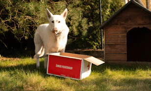
Below, you can see how April + The Bear take their branding onto packing paper.

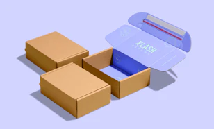
Show off your brand’s personality by including your logo somewhere unexpected, as an Easter egg for knowing fans. Buyers are greeted with the Ahimsa Collective logo as soon as they open their mailer boxes.

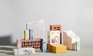
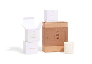
Try turning your logo into a pattern and printing it on tissue paper, packing paper or using logo packing tape, to add an extra bit of brand presence to your product packaging. Below, you can see the 90's-esque imagery of Deb McNaughton copied onto custom tissue paper.

Creative packaging and logo placement can inspire delight for customers opening their orders, but they can risk going unseen. Unless you’re already a globally recognized brand, you’ll want to use these in addition to your primary logo location, rather than instead.
Conclusion
Whether you’re experimenting with unexpected logo locations, dabbling in customer psychology, or just sticking to your logo guidelines, including your logo on product packaging will help your customers to recognize, remember, and repurchase your brand.
With the right logo placement, you can turn product packaging from a necessity of running a retail or ecommerce business into an unforgettable brand experience.
This article is a guest post by Christine Glossop at Looka.


