


How To Choose Fonts For Graphic Design

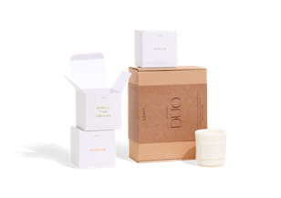
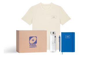
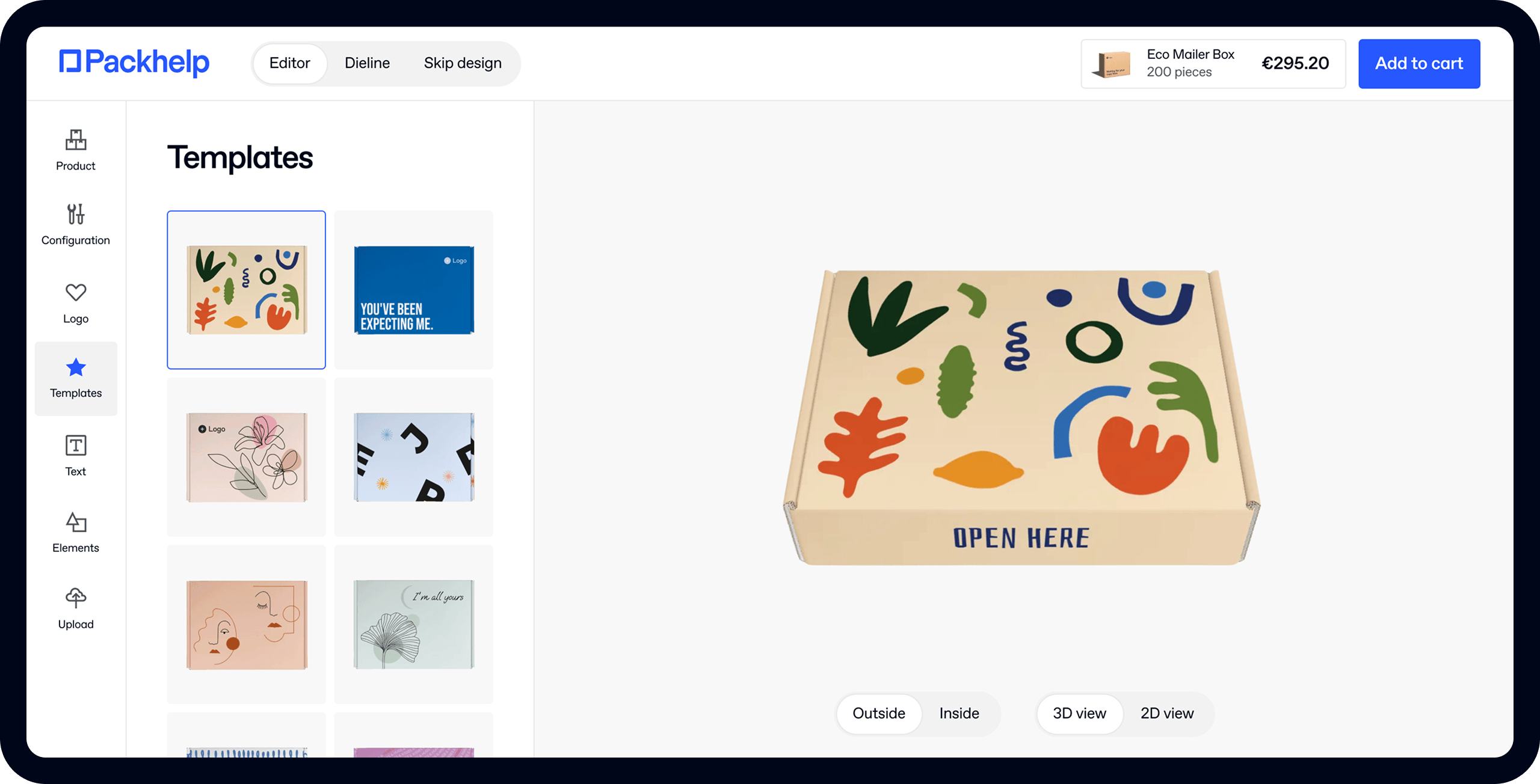
- 200+ templates & patterns
- Real time 3D packaging preview
- Upload logo and choose brand colours
Subscribe now! Receive 15% discount.
Don’t miss out – get 15% off your first order when you join the newsletter. It’s fast, free, and kinda smart.

You're now subscribed!
In this article:
Graphic designers know that there are some fonts that you just do not use.
Packaging design is tightly-knit with branding, shipping or distribution management. These are crucial business aspects. However, what we often forget is that there are a plethora of other elements. Elements like fonts used in the graphic design.
In an article about the worst mistakes made in packaging design, we have mentioned a particular concept, which makes the blood of every graphic designer boil.

When thinking about fonts, it’s impossible to avoid the infamous drama of Comic Sans. It has become the scapegoat of the graphic design, the root of all evil. But covering the topic of fonts in terms of packaging design is not limited to saying
Avoid Comic Sans at all costs.
Hence, in this article we will:
- Provide you with a bunch of great fonts for your box design
- List resources with thousands of free fonts
- Explain what makes Comic Sans and Papyrus the worst nightmares of every graphic designer
Microsoft Made History
This infamous font was firstly introduced in 1994, as a part of the Microsoft Word package in Windows 95. The creator of Comic Sans was Vincent Connare, a designer, who had experience with comic-book graphics.
Even the initial reception was calamitous.
Comic Sans was lousy, lacked order and it seemed like a cheesy reference to the comic book stylistics. Surprisingly, Microsoft did not eradicate the font from the library but continued to support it in the following versions of Windows and Word.
Quickly, Comic Sans became a nightmare for every person, who had a taste in design. The mocking didn’t stop either - here’s a “reinvention” of globally known logotypes with Comic Sans.

Not only has Comic Sans prevailed, but it actually made some infamous appearances.
One of them was landing in a printed version of the Wall Street Journal. See the image below.

A Brother of Comic Sans - Papyrus
Another example is the entirety of materials promoting… “Avatar”, the film by James Cameron. The font used in the posters and key visuals was Papyrus. It is not Comic Sans, but it still generated quite a buzz and what’s most interesting - only recently.
It happened so due to an SNL sketch, which mocked the usage of Papyrus. The thing grew to the level, where the creator of this particular font needed to comment upon his artwork. As he simply stated, “Papyrus is.. overused”.
Why Does A Font Matter Anyway?
You might wonder why do we mention fonts in terms of packaging. Does it matter?
A font can change a lot in any design. There are thousands of thousands of fonts and they can be used to create a very unique brand design. From contemporary ones to fonts inspired by calligraphy and more unusual shapes, they imbue any artwork or design with a soul.
When choosing fonts, it is highly recommended to define your brand's mood. If you are minimalist and upscale, you will not use a brushstroke type. Ideally, you would go with slick letter style,
Moon
Free Sariff Type is a category of more elegant, classic fonts. Check out “Moon”, designed by Jack Harvatt - it's round on the edges, smooth and very good for an organic imprint.

Reis
If you want to have a “poster” feeling to your image, go with Reis. It's inspired by a brushstroke and gives an instant novelty and freshness to every design. Urban legend has it that this is the favorite among many designers!

Yellowtail
A resemblance to the handwritten text is popular as well. Yellowtail, supported by Google, is a great choice to imitate a note, printed on the inside part of the packaging.

Selima Free
This font can be particularly effective when used as a logotype. It’s a brushy, modern type of font, perfect as a black imprint on natural cardboard.

Polya
Every letter in this font is an intricate design on its own. It’s a perfect choice to create a logo and have it printed. An eye-catching guarantee of success.

Where Can You Find Great Fonts?
There are numerous places online, which offer free font libraries. Moreover, we added some good places to read more about the use of fonts.
It’s a big (and constantly growing) library of fonts from all around the world. It’s easy to navigate here, especially thanks to the numerous categories. You can find fonts in categories like “Script”, “Foreign Look” or even “Gothic”.
DaFont is a great place to start when thinking about your company’s logo. There is also a very easy way to install the font of your choice.
Another great library of fonts. The categories are a bit different than in DaFont. 1001 Fonts can be a better choice for graphic designers and artists.
When we last checked, FontSpace had more than 36,000 fonts to choose from. Moreover, the website writes a blog on design, which can help out in choosing the right one. The browsing system is also very complex and you can really find a certain niche.
- Creative Bloq
The bible of every designer. Creative Bloq has written a lot of great content about choosing fonts, but probably their best article to start is a comprehensive look at 70 best fonts for graphic designers.
- Awwawards
The website gives awards to the most innovative, design-friendly creations on the Internet. Awwawards also curate a gallery of free fonts, which you can find here.
Conclusion
There is a reason that Comic Sans became the most hated font out there (it’s also the reason why you can’t find it on our online editor).
There are many great libraries of fonts online, which can truly spruce up any packaging design. If you choose to use a font like that, download our die-cut template and add it to your pattern. Make these boxes pop with creativity!
See Our Shop
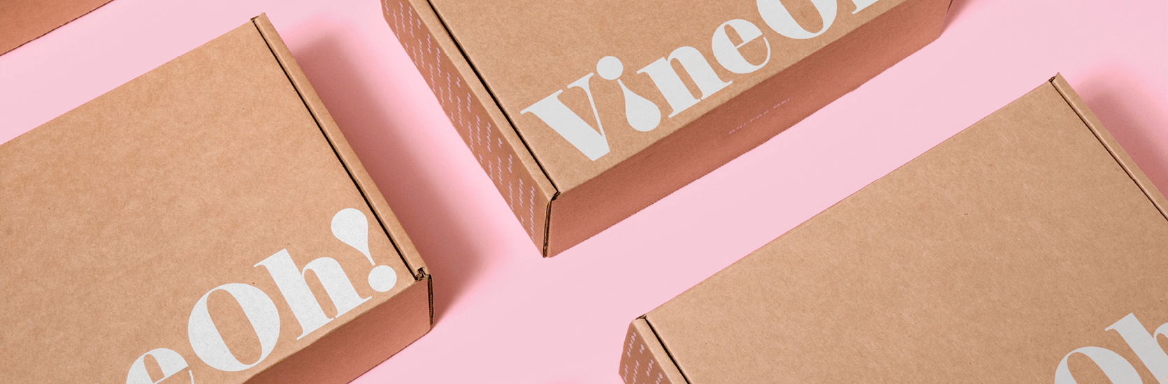
The header image is a VineOh! project by Morgan Stephens.


