


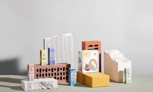


Business Card Design: Killer Examples & Ideas

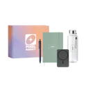
- 200+ templates & patterns
- Real time 3D packaging preview
- Upload logo and choose brand colours
Subscribe now! Receive 15% discount.
Don’t miss out – get 15% off your first order when you join the newsletter. It’s fast, free, and kinda smart.

You're now subscribed!
In this article:
The key to good business card design is to look at it like a fresh, crisp suit or a little black dress.
It’s the most crucial part of making an excellent first impression. And you know what they say about good first impressions - you only get one.
In a world becoming more and more digitised, business cards still play an increasingly important role.
With virtual kickoff meetings and online networking events becoming the norm, physical interaction with potential business partners, new clients and people, in general, are becoming less apparent.
So, when business cards do exchange hands, they leave more of an impression.
And the design of that business card is vital to capitalising on that impression.
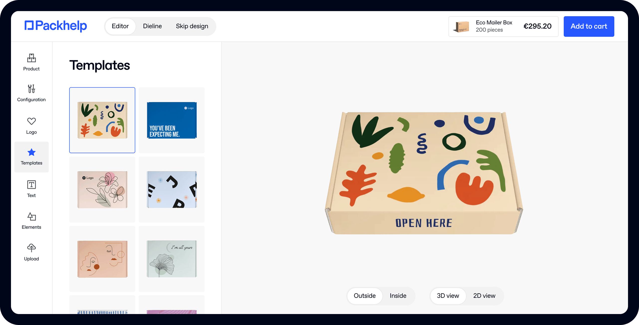
Click here to start designing your business cards with Packhelp's online editor

In this article, we’ll go over everything you need to know about business card design, including inspiration, business card ideas, printing methods and much, much more.
We'll also be sprinkling some fantastic business card examples throughout. By the end of this blog, you'll be feeling truly inspired to design your business cards!
What is - or isn’t - a business card?
Most of us know what a business card is.
But business card design isn’t limited by the sizes or shapes that many of us are accustomed to.
Consider the following elements when throwing around ideas about your business card design:
Square business cards are becoming more popular as they not only take up less space.

They’re also a simple way to create a card that’s a little different without having to reinvent, well, the wheel.
Your card doesn’t have to be designed in landscape or horizontally either. Your business card design can be a little different by designing it vertically or in portrait orientation.
Business ‘cards’ don’t have to be a thick paper card stock, either. Plastic, metal, wood - they’re all textures and materials that help you make a better impression.
Before you start designing:
Before you sit down with your business card design software or a pen and paper, there are a few things that you need to have perfected.
Is it for you personally, or are you representing a business?
As an employee of Packhelp, my business cards fall under Packhelp’s design system. It has my contact information, but the layout, colours and design stick with Packhelp’s brand book.
If I were creating business cards for me to help my personal brand, they would be designed according to another set of design criteria - my own.

Therefore you must know for whom these business cards are representing.
Logos
The best business cards use their logos go-to focal point.
That is to say; if there’s one thing you should remember from the business card, it’s the logo.
To be honest, the same applies to the logo on your packaging, too.
The logo of your business often has a massive bearing on the overall design of your business card.
That’s why it’s imperative that you have the logo on hand before you start designing your business card.
Brand book
For business card design, your brand book is important but most important is your colour palette.

Before starting the design of your card, you must have decided on which colours and what shapes will be used. Go on step further and commit to the type of font that you’ll use on your card, too.
How to design business cards
You’ve got your logo, you’ve got your colours, it’s time to get the creative juices flowing! If you don’t have the slightest idea how you want your business card to look, you will by the end of this section.
Shapes
The shape of your business card can be a fickle thing. So you have a typical rectangular business card?
Great!
But square or rounded edges? If round, what’s the radius?
If you’re adamant about using a unique shape, you’re in luck!

Most paper products are die-cut - for example, die-cut boxes are the go-to packaging solution.
As technology and innovation progress, as does the shapes that can be die-cut.
Experiment with shapes - consider cutting your card into the shape of your product - a shirt, for a clothing brand, for example.
If your logo is simple enough, consider cutting the shape out of the card itself, much like MoonSling have done with their custom packaging:

Explore Packhelp's range of mailer boxes
The shape of your business card is a great place to reflect the tone and image of your brand.
Rounded corners and a monochrome colour palette work well together for luxury brands trying to convey a sense of elegance and opulence.
Business card designs that use photos are best suited to square corners as they give a slightly large sense of space. This concept helps the image be perceived as a little bigger, thus giving the entire card a little more room.
Sizes
Business card sizes are an exciting concept - the standard is based on your geographical location. And then there’s the final size of your card, the size of the card it’s printed on, and the final ‘safe’ size.
In terms of physical size, there are three main options
- North American standard card size: 88.9 × 50.8 mm (3.5 × 2 in.)
- European standard card size: 85 × 55 mm (3.346 × 2.165 in.)
- Oceania standard card size: 90 × 55 mm (3.54 × 2.165 in.)
For the 80% of the earth’s population that lives outside those areas, you’ve got a choice on what size you use.
For those in Oceania, North America or Europe, it’s best to stick to the standardised size of your region. This ensures that you stand out for the right reasons - not because your card is too big.
The next thing to think about is margins.
Many designers, be it amateur or professional, often forget about these lines, meaning their cards don’t end up looking the way they’re intended.
Consider the following:
The bleed line is the outermost section of the card. Usually several pixels wide, or less than 5mm, it’s the part of the business card that’s always going to be cut off. Patterns, gradients, and similar elements can continue into this area, but be aware that it won’t be seen in the final design.
Trim lines are the lines that the die cutting machine aims to cut along. In other words, it’s the trim lines that are the standard sizes of business cards.
The safety margin is precisely what it sounds like. Don’t put text, images or logos past this line, as there’s a tiny chance that it may be cut off or at least affect the card’s layout.
Here’s a simple image to give you an idea of the safe areas and lines to follow:

Pro tip: Don’t want to do the math when designing your business card?
Solve all these problems by putting all essential parts of your business card a minimum of 8mm away from the edge of the card.
Business card textures
Patrick Bateman knows the importance of a business card’s texture. Embossing and UV print are finishes and ‘extras’ that affect touch (more on them later), but what about the texture of the card itself?
Touch is a crucial yet often overlooked sense when it comes to designing your business cards.
What feelings and emotions do you want the holder of your card to physically feel when they touch your card? Soft touch can invoke a sense of luxury, while a rough texture gives a sense of quality and durability.
Does your business have a showroom or physical address that people can visit?
If so, what textures are there? Wooden walls, a polished concrete floor?

What are the textures of your products? A natural woollen texture to complement your sweaters?
Eggshell, Linen, Nube, Tinto, Pearl - these all invoke slightly different emotions when touched and help convey another type of brand.
Business card logo and imagery
As mentioned earlier, it’s your logo that plays the most prominent role in your business card design.
It takes centre stage and announces your brand to the cardholder. Complementary graphics and imagery, such as social media icons, mascots or other imagery, can add another sense of dimension.

As these are often the most prominent and most integral parts of your design, it pays to get them onto paper (or card) as soon as possible.
Remember the following:
- Business cards have two sides - use them.
- If you’re going minimalist, go minimalist. Logo and contact information, nothing more
- Experiment with lighter shades (that still suit your colour palette) of your primary colours
- Remember touch and size, design elements that can’t be represented on screen
Texts
Text is your card’s call to action.
Directly or indirectly, it tells what the cardholder to do next.
That CTA will vary depending on your business model (freelancer, subscription box company, ecommerce brand, D2C brand, agency etc.).

There are several necessities that a business card must-have.
Your name is one of them, as is the name of your business unless you’re a freelancer operating under your own name.
The second is that CTA. The point of a business card is to get someone to do something, and after your name(s), this is where you tell the holder what to do.
Here are your options:
- Visit your website
- Call you
- Visit your showroom/store
- Email you
- Scan a QR code
- Visit your social media pages
Business card fonts & typography
Fonts would have to be one of the most fun parts of business card design. That’s because the typography you use can say so much on a subliminal level.

That’s why getting it right is really important.

There’s a difference between the words’ font’ and ‘typography’ for those new to design.
- Fonts are sets of characters with similar design motifs.
- Typography is the art of using fonts, colour and general graphic design to make words fit into your overall design.
But it would be best if you didn’t go overboard with your fonts. They’re used to present the words you want to communicate, so they need to be legible, no matter what.
Font, colours, sizing and space all need to be considered when designing your business cards. Keep fonts at a minimum of 8pt, so they stay readable. Remember to make important stuff like your name even more prominent.
When picking a font, consider your existing website or the font used in any other branded content. The key is consistency. If you want a new font, consider complementary fonts - two different fonts that ‘work’ well together.

In terms of colours for your typography, again, stay on brand.
Look at your existing colour palette and the colours that are already being used in your business card design. Work to these standards.
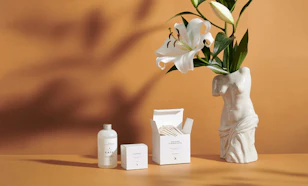
Business card finishes & extras
Once you’re happy with the overall design of your business card, it’s time to consider the finishing touches.
It’s these little extra details that take your business card (and your first impression) from ‘nice’ to ‘niiiiice’.
Embossing and debossing add depth to your design by pressing a shape into the card. That shape can be your logo; it can be text or anything you like. Embossing and debossing are great ways to engage the sense of touch into your business card design.
Go one step further and add ink to the embossed or debossed sections of your card, or emboss a border around the edge of your business card, creating a type of frame.
A spot UV coating is a common finish in luxury packaging and looks just as good on a business card.
It’s a simple varnish added to specific areas of your design, making some parts shiny.

It’s often used on logos or business names and looks fantastic against a matte print.
Foil stamping is another common practice on custom boxes and again looks great on cards.

It’s a shiny foil that’s pressed onto your card in a specific shape. This foil can be a solid colour, but it can also be a rainbow, holographic or just about any other kind of texture you can think of.
These finishing touches are great but don’t go overboard.
It’s important to note that good business card design uses these features, but memorable business card design is based on these features.
Design your own business cards
There are loads of tools on the market to design your own custom business cards.
If you’re familiar with Photoshop, that’s a fantastic tool to help you create the ideal business card. Design templates are readily available and it's not hard too to get the hang of if you have the time.
However, if you’re not that advanced, it might pay to start with a tool like Packhelp and their business card printing services.

You can use Packhelp’s online software to design a simple yet professional business card.
Yes, Packhelp is a leading supplier of custom packaging, but you can also use our software to design business cards, thank you cards and other packaging accessories.
Click here to start designing your business cards with Packhelp's editor
The simple drag-and-drop design process makes it easy to add brand logos, text and other design assets to your business card design.
When ready, you can have it printed in any volume you like at a very competitive price - and most importantly, have it delivered quickly!
The best business card examples out there
You’ve seen the process of designing business cards, but now let’s take a look at some of the best business card ideas.

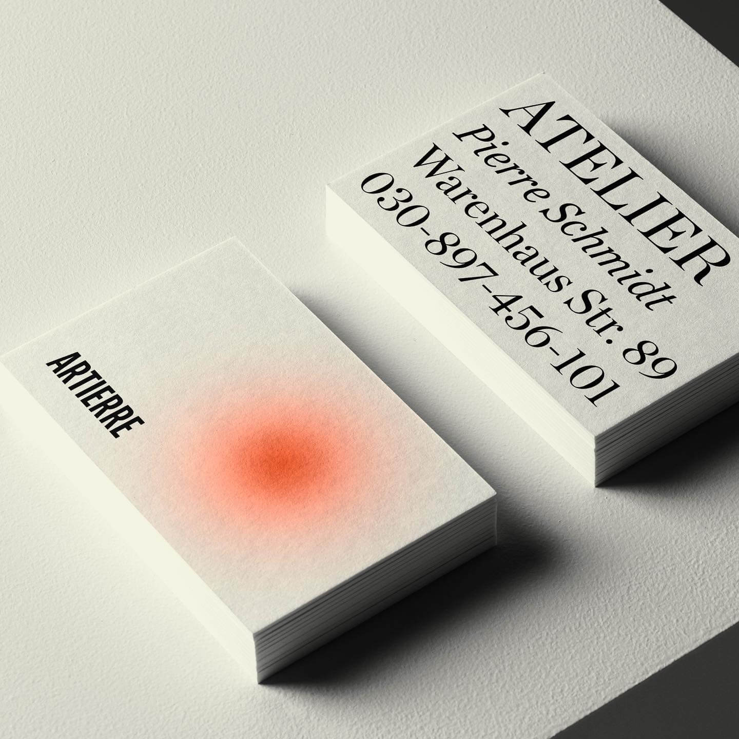
Embossing a shape and having an image printed on that sunken shape is a great way to draw a viewers eye and appeal to their sense of touch.
This is called letterpress, and the example above is complemented with the same colour on the edge of the card.

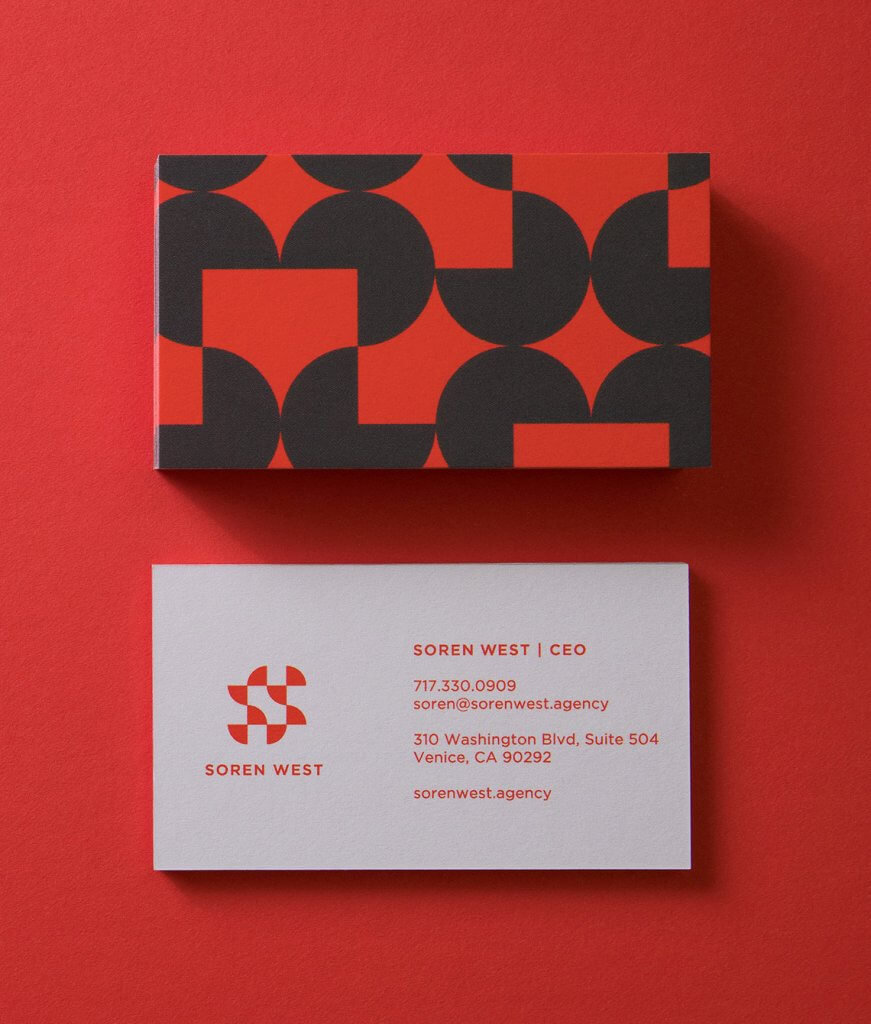
A fantastic example of colour use. There are only 3 colours in this business card design. The only colour used on both sides is the gold of the text, which pulls both sides of the card together.

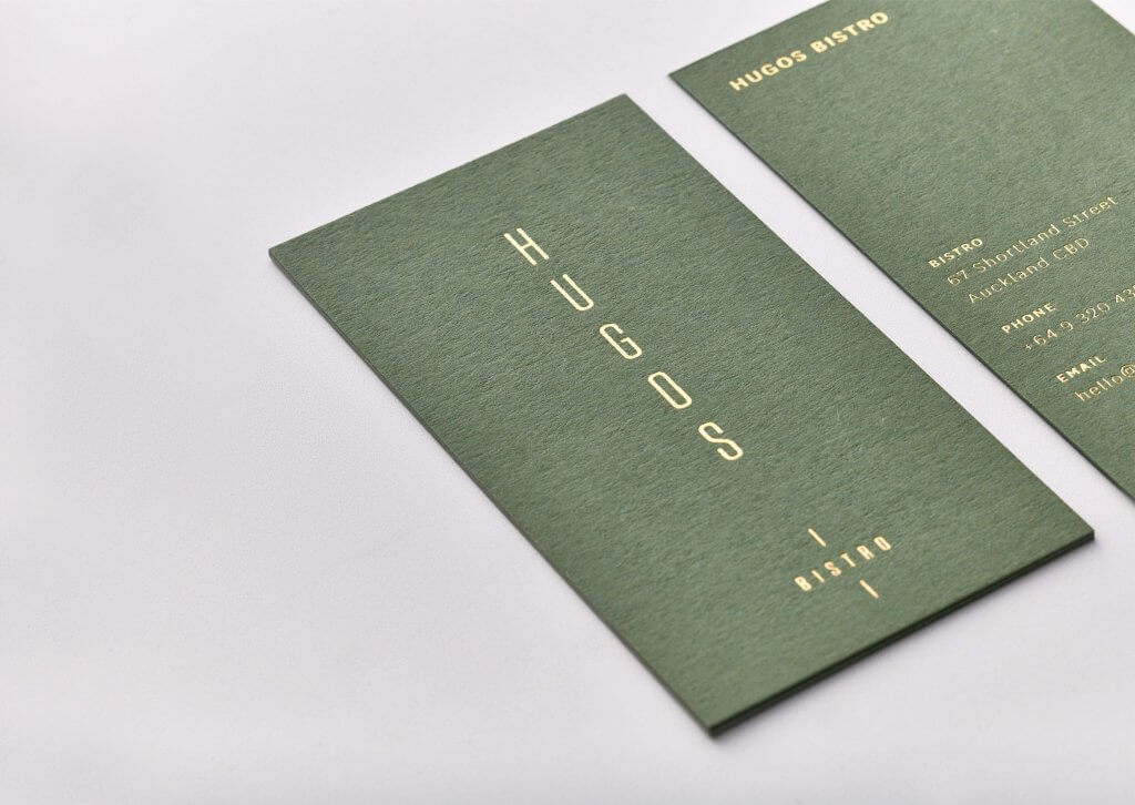
We love this design because it's minimalist in a different way. All the relevant information is here, but printed around the edges.
Right in the middle is the designer's logo, but rather small. It's the use of space that makes all the elements so memorable.

This is a fantastic example of a colourful foil print. Foil print doesn't have to just be in one colour.
The black card makes the rainbow colour and the shimmering texture of the foil pop even more.

No frills here, yet the card still does the job.
And it does that by simply saying hi.
Whether it's saying hi, saying thanks or saying bye, courteous copy can make an impact just as much as the boldest colours or striking finishes.
Your brand’s hood ornament
Your business card is the visual representation of your brand - not unlike a cars hood ornament.
Business cards need to echo your business branding and contain all the pertinent information for the holder of your card to find out more.
Whether you design the card yourself or hire a professional, the process can be quite an enjoyable one, as long as you have just a vague idea of what you do and don’t like.


