How To Create An Unboxing Experience in 2023

- 200+ templates & patterns
- Real time 3D packaging preview
- Upload logo and choose brand colours
Subscribe now! Receive 15% discount.
Don’t miss out – get 15% off your first order when you join the newsletter. It’s fast, free, and kinda smart.
You're now subscribed!
In this article:
American subscription box brand Chasin' Unicorns prides itself on its unboxing experience.

The company has no physical retail store yet makes its customers feel like they're holding something truly important when they receive their order.
It does this by knowing its customers, the problem that its product solves for its customers, and leveraging careful packaging design.
Brahmaki is a Swedish brand that sells unisex loungewear inspired by the middle east and Asia from its Stockholm retail storefront
View this post on Instagram
In-store customers receive their product in custom packaging that's the foundation of an unboxing experience so that the 'in-shop' experience is carried home.
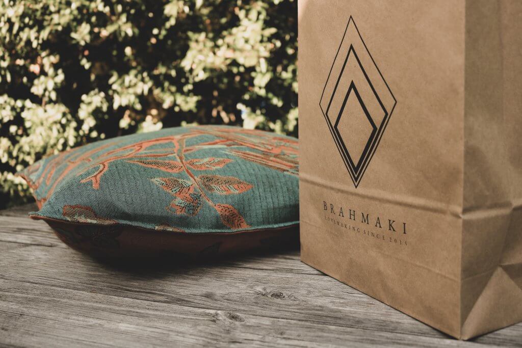
By doing this, the in-store experience is continued right through to the moment you wear your gown at home.
Unboxing experiences have gone from a novelty, leveraged by the most high-end e-commerce brands, to a must-have for any business that wants to add value to its customers.
As Europe's leading supplier of custom packaging to e-commerce, retail, D2C and subscription brands, we know the importance of an unboxing experience for any brand selling a physical object, whether by brick or by click.
In this article you'll learn:
- What is an unboxing experience
- How it can add value to your business
- Getting started with creating experience-driven packaging
Let's dive in.
Let's talk emotions
Think way back to when you were a kid. More specifically, a kid on Christmas.
You could hardly sleep because you knew that the next day, there'd be something for you under the tree.
You had no idea what it would be, but you know that it was something, quite literally, with your name on it.
Now, as an adult, that feeling isn't one that we've forgotten.
It's positive.
It's happy.
It's exciting.
This feeling of excitement and enthusiasm helped shape your current image of Christmas for the rest of your childhood and laid the foundation of how you see Christmas today.
Chances are you feel that excitement today at Christmas time!
It's this feeling of excitement and anticipation that can perfectly define what an unboxing experience is.
It's the use of emotion in marketing.
So, what is an unboxing experience?
An unboxing experience is a process of taking a product out of its packaging.
It's all the feelings and emotions that you go through from the moment that order arrives at your door to the moment you hold or use the actual product for the first time.
Brands create an experience around this process to carefully evoke feelings and manage emotions in a way that creates a positive first experience.
That's because, in the world of e-commerce, your packaging is the first physical touch-point between a customer and a brand.
There's no store to walk into and interact with.
The unboxing experience is designed to heighten attention and delay the excitement of seeing and interacting with something new and interesting as long as possible - much like the feeling you had on Christmas as a kid.
Does it matter?
Unboxing experiences matter if you want to build brand loyalty, increase average order value, and skyrocket lifetime spend.
So for the longevity of your business, a good unboxing experience is incredibly important.
Unboxing videos
The relationship between unboxing experiences, unboxing videos and product reviews in a potent one for brand managers to harness.
Over 80% of shoppers research a product before buying.
Almost 3 in 4 won't take any action toward buying until they've read a review of the brand or product.
Finally, conversion rates go up almost 400% when high-ticket items have positive reviews.
With this in mind, there's a very high chance that anyone doing research is going to come across your brand, and someone unboxing it and reviewing it.
When that happens, do you want your unboxing experience to look like this:

or this:
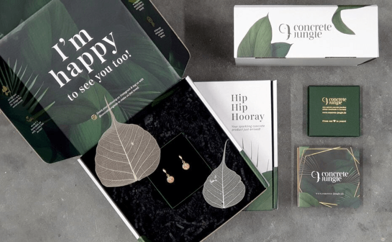
There's a pretty clear answer here.
Armed with a well-planned and branded unboxing experience, any review or unboxing video on your products will start on the best possible note.
You'll also be automatically increasing the desirability of your product amongst people that are close to committing to the purchase.
Unboxing & sustainability
Throughout this article, you've seen images and read descriptions about an unboxing experience being more - more emotion, more wow, more of a statement.
But that's not always the case.
The old addage 'less is more' often riungs true when creating experience-driven packaging.
Sustainability and sustainable packaging are paramount for so many brands, big and small.
Adding more packaging supplies into the mix is simply counterintuitive.
But an unboxing experience isn't about more.
It's about designing each step of the process, claiming each step and moulding the emotion around it.
Replacing tissue paper with wood wool to match the natural earthy texture of your mailer box is part of that design process.
Having a simple greeting or 'thanks' printed on the inside of your box is enough to create an experience during the unboxing process.
Adding a thank you note into a mailing bag with the clothing you sell is an experience designed around packaging.
Ultimately, making a conscious decision to use something is as much of the design process as the decision not to use it.
Unboxing experiences aren't about more - it's about the designed experience you provide.
Designing an unboxing experience
So what goes into an unboxing experience?
Well, there's a lot more to it than throwing a whole lot of discount vouchers and stickers into your customer's orders.
Clever packaging design, from a physical and visual point of view, come together to plant a seed in your customer's mind.
That seed blooms into a thought that is 'wow, this is really nice, I got a lot more than I thought I would'.
This concept is value-added selling, and is the foundation of experience-driven packaging.
First of all, there are three types of packaging commonly used by e-commerce brands.
Primary packaging is the one that makes physical contact with your product.
Secondary packaging is the packaging that your customer first interacts with.
Tertiary packaging is the packaging used to move multiple units of your product at mass.
For many brands and products, primary and secondary packaging are often the same.
For example, cosmetics packaging usually consists of the packaging that holds the cosmetic product (primary packaging) and then the 'box' that those products are placed into.
Packaging for clothing on the other hand may consist of nothing more than a folded sweater placed inside a mailer bag.
It's at this point you should note that packaging, the foundation of your unboxing experience, is more than just a box.
Clothing in mailer bags, jewellery in cardboard tubes, electronics in padded envelopes - your choice of packaging is just as much part of the unboxing experience as whatever you print on your packaging.
Examples, ideas & inspiration
Let's take a look at brands just like yours who are using unboxing experiences to leave that positive first impression.
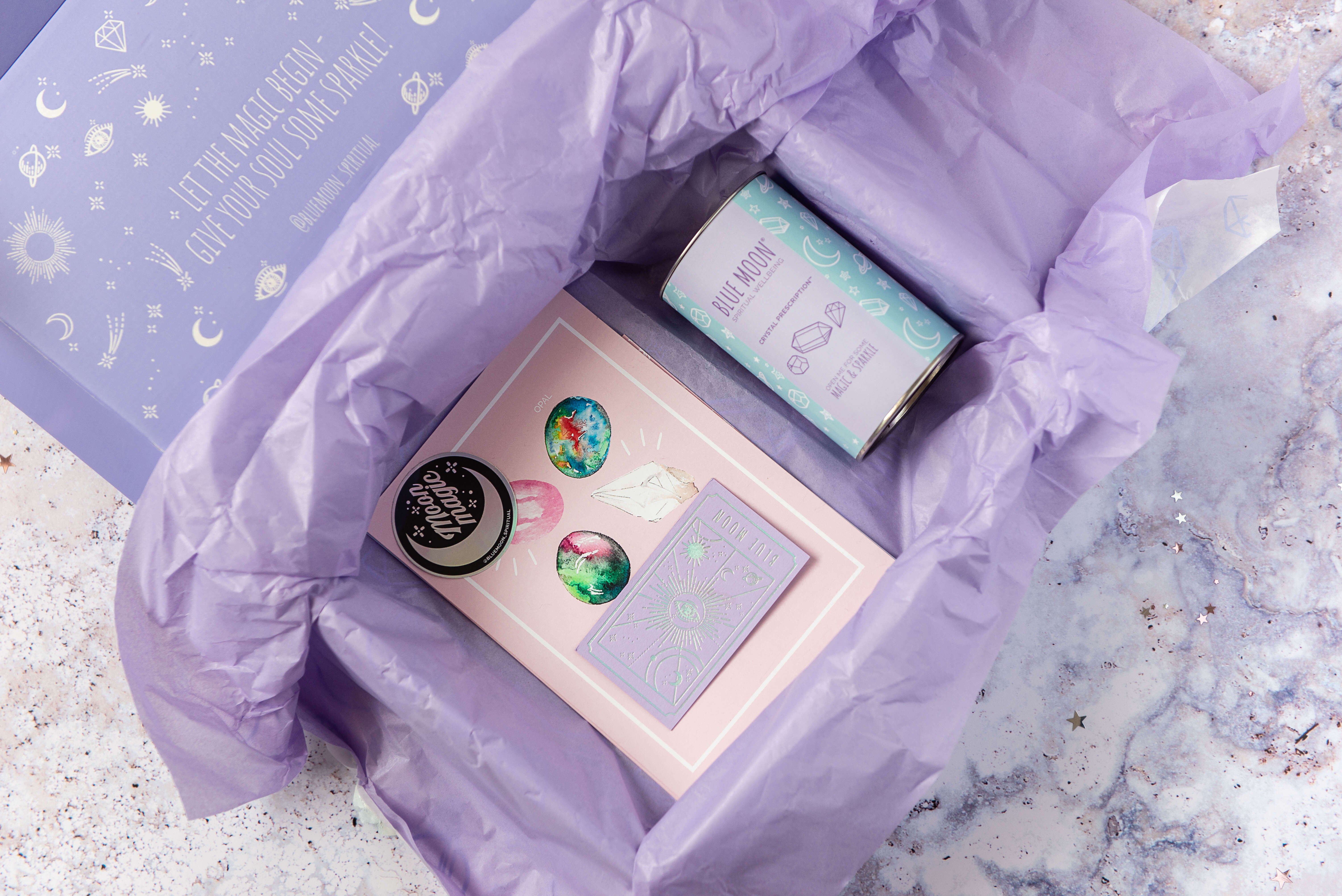
Blue Moon
Blue Moon is a subscription box company that doesn't hold back with its unboxing experience.

The use of colour theory echoes the way colour is used on the website.
This means that the moment the customer receives their box, they know what they're holding.
Upon opening it, they're presented with internal print, an elegant statement, quality products and it's all held together with custom tissue paper.

Blue Moon's unboxing experience makes the customer feel that they've got value for their money.
They could have sent products in a simple box or mailing bag.
But they didn't.
They went above and beyond and used the medium of packaging to make a statement.
Oase
Supplement brand Oase use rigid boxes to make the eye-catching first impression in their unboxing experience.
After opening the square box, you're presented with a round bottle.
This contrast of shapes makes the experience slightly jarring, but also more engaging.
Notice the colours used throughout the experience - black text, and the two other colours being pinks.
The pink of the jelly itself, but also a much more pale shade.
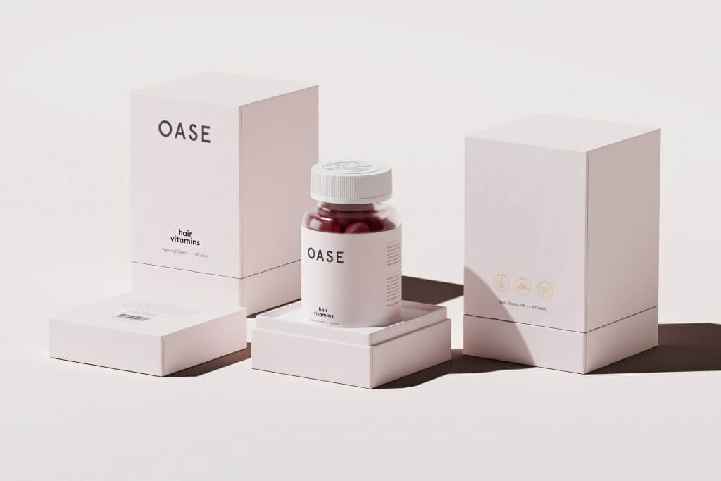
This choice of colour palette makes the product itself part of the branding and unboxing experience.
Learn more about Oase and their packaging design
Stay Cold
German apparel brand, Stay Cold, take the designs of their tattooists and uses them to create clothing.
View this post on Instagram
The brand has carried the same visual branding over to their packaging design to create something engaging, memorable and truly unique.

Inside the box, you can see how the brand encourages customers to create user-generated content by using Ikea's design system nonetheless!

Raylo
Raylo sells new and used mobile phones and other electronic devices.
In other words, they sell the products of other companies.
See how Packhelp helped Ralyo lower their packaging costs by 11%
Therefore, their unboxing experience is even more important, as they want the customer to remember the Raylo name, not necessarily Apple or Samsung.
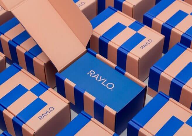
Its two-coloured design system does this incredibly well.

The addition of a thank you card and branded divider with an instruction manual helps create consistency for this D2C brand.
Scent by mail
Using a mailer box with internal print, Scent By Mail's greeting makes their customer feel welcomed and reminds them that they're holding something a little special.
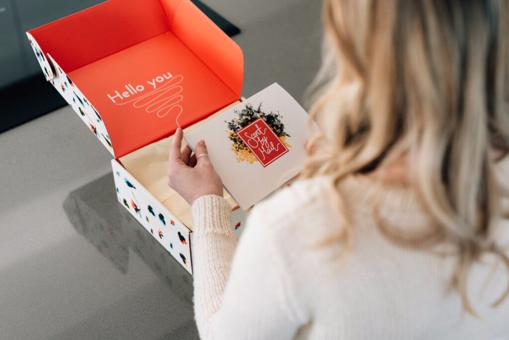
The use of branded tissue paper over the top of the products also delays that sense of satisfaction that we get when we see our product.
This delay makes us crave that satisfaction even more.
Yahmo
Yahmo, formerly Malimo, is a brand that sells upcycled clothing.
View this post on Instagram
At first glance, this is nothing more than a plain cardboard box held closed by a custom label.
And in truth, the inside doesn't look much different.

But this unboxing experience drills home the company's values. Nothing more than what's necessary.
Upcycled clothing that's delivered in an FSC-certified mailer box.
Unboxing a Yahmo product means interacting with its values. Nothing more than what's necessary.
Conclusion
You've just seen a deep dive and various examples of effective and memorable unboxing experiences.
It's important that you remember the role that design plays in an unboxing experience - less is more.
Armed with this knowledge, go forth and design an experience that leaves that positive affirmation in your customer's mind!


