CMYK vs. RGB, what’s the drill?

- 200+ templates & patterns
- Real time 3D packaging preview
- Upload logo and choose brand colours
Subscribe now! Receive 15% discount.
Don’t miss out – get 15% off your first order when you join the newsletter. It’s fast, free, and kinda smart.
You're now subscribed!
CMYK, RGB, WTF. What’s with the color spaces and why do they look different on paper and on the computer screen?
You surely came across „RGB” and ”CMYK” terms while preparing items for printing (not necessarily boxes – it could have been business cards or leaflets). You might have familiarized yourself with these terms in not very pleasant circumstances – i.e. when it turned out that the print looks completely different compared to what you’d designed on the screen.
Colours are a slippery subject as almost everyone sees colours in a different way. Remember the photo of the dress which spread virally? I still find it hard to believe that it was blue and black. It surely was white and gold!
The fact that people saw different colours of the dress derives, among other things, from the displays and their settings. A different image will be displayed on a MacBook, on an iPad, EIZO display and on a cheap display from electronics store. Even the same devices may have different color settings (for instance, depending from time of the day).
We can take all of the hassle out of printing and make your life easy! Get a quote!
The keyword here is „display”. A computer or a smartphone screen is a device which emits the light on its own. Paper, cardboard or an imprint doesn’t emit any light. How we see them and if we see them depends on the reflection of light. Paint, ink or toners are simply substances that absorb the visible light on a different level.
So what’s up with RGB and CMYK?
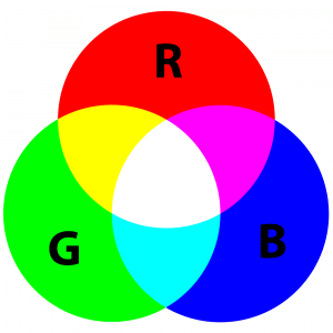
RGB is a colour space, created on the basis of receptive properties of the human eye. The colours in this space are created by mixing three bundles of light – red, green and blue. In this instance we’re dealing with an additive synthesis. All the colours are summing up until they reach pure white. A turned off display is black, and if we want to achieve white, we need to add R, G and B with a maximal intensity.
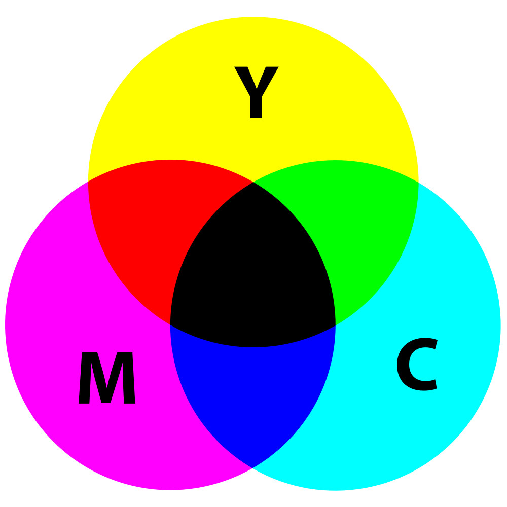
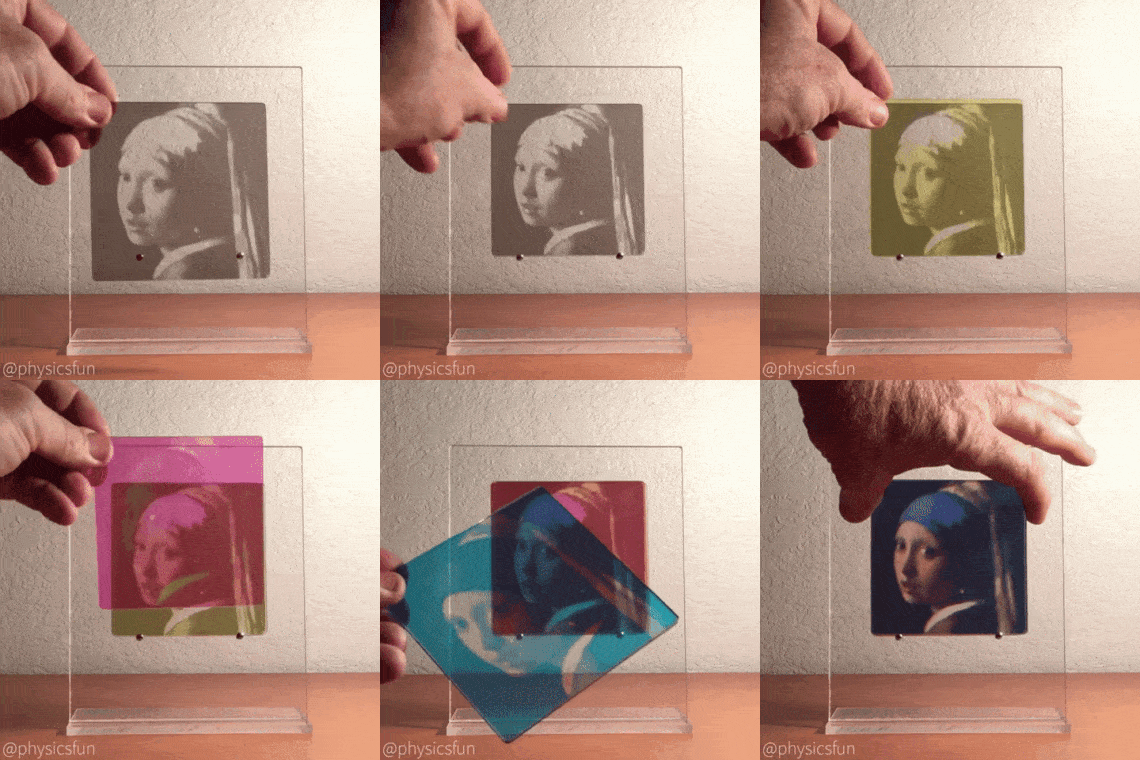
The matter is entirely different when it comes to print. Here, we’re dealing with a subtractive synthesis. The result of mixing the colours is a darker colour. Differently to the colours displayed on the monitor, the subtractive synthesis is about adding subsequent layers which increase the absorption of light.
In printed projects we use a set of colours named CMYK:
- C – cyan
- M – magenta
- Y – yellow
- K – kontur or key colour).

In theory, you can achieve a black colour if you mix CMY colours. In reality, it isn’t true black (which is a topic for an entirely different occasion). Moreover, keeping three colours in order to print a black text is purely uneconomical.
Below you can see the photo posted above which had been adjusted for printing purposes. On the left, CMYK with a full black exposure (and minimal use of other colours), on the right CMY.
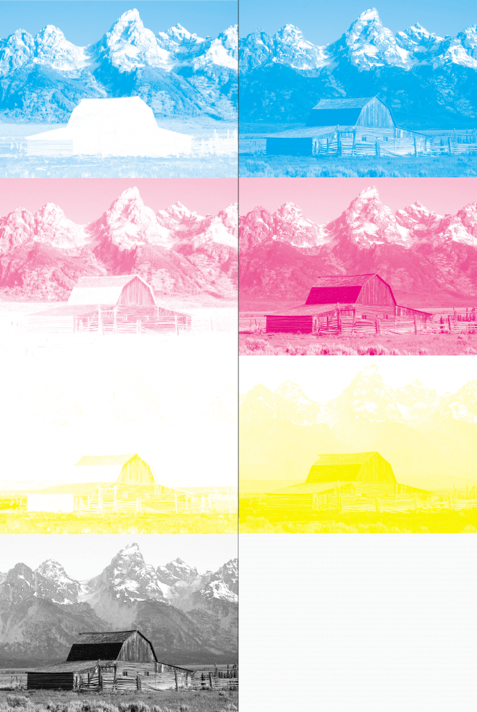
Mixing four colours listed above we may achieve a relatively full-colour spectrum. Surely, some differences to RGB may be spotted – in CMYK we won’t be able to generate some of the “shiny” colours, that we can create on our screen. A beautiful photo may lose some of its assets once it’s been printed. On the other hand, some shades of yellow and sky blue will look much better on paper. It can’t get too easy, can it?
For this reason, the files that are made for print are prepared in CMYK colour space. Such formats can be saved through Adobe Photoshop or Illustrator. Side note: graphics software convert the files from RGB space into CMYK, which are then... displayed on the screen in the RGB space. Quite complicated, isn’t it?
What about our Wizard? If you upload the files in the RGB colour space, you’ll see exactly what you uploaded on the screen. Before printing, we’re converting the files to CMYK, using the colour profile for printing machines.
Learn more about how our wizard works for all your printing needs.
If you upload to the Wizard the files in CMYK space, we’ll convert the files to RGB for visualization purposes. Internet browsers are not able to display CMYK colours in a correct way. All the imprints are prepared in reference to your original files. An alternative would be to use our cutter, on which you can create your design. Obviously, such a file must be prepared in CMYK space, but I guess you know that by now. An important note – if you’re using design mode in our cutter, don’t attach ICC profiles to it, as they will be omitted by our system.
TL;DR version: the files displayed on the screens (websites mostly) should be saved in RGB space. The ones aimed for print – in CMYK space. An RGB display will never be a point of reference for a press operator, but a well-calibrated monitor will provide you with an accurate printing preview.


