How To Create Lovely White Designs On Natural Cardboard

- 200+ templates & patterns
- Real time 3D packaging preview
- Upload logo and choose brand colours

Subscribe now! Receive 15% discount.
Don’t miss out – get 15% off your first order when you join the newsletter. It’s fast, free, and kinda smart.
You're now subscribed!
In this article:
A simple white text printed on kraft brings stunning results. In this article, we show you some ideas on using space on your cardboard box and spicing it up with a unique pattern.
Finding the right tone for your brand’s packaging isn’t an easy job. Did you think "exactly" when reading that sentence?
In fact, it influences many of your business areas - sales, brand awareness and even “shareability” of the images of your products on social media. In other words, it is a decision that requires some thought put into it.
Here ’s a solution that’s not only a safe choice but it’s eye-catching too. Let us introduce you to the white ink printed on kraft cardboard. Before we dig deeper into that concept, let’s clear up a simple question
What’s the advantage of using one colour over multiple?
There are several reasons.
- One colour is less of an investment than a design with multiple. That means that choosing to print in white can be a less costly choice for you.
- It looks elegant - just like dark print. Black is associated with elegance, but a white minimalistic design does the job as well, as you will see later.
- Natural cardboard gives your packaging design a warm, organic vibe.
Many brands choose minimalism over excessive designs as this is a great way of letting the natural colours, textures and tones do the talking, like white cardboard boxes.
But let’s get back on track.
White on kraft - how can you make the most out of it?
What ideas can you implement to make your boxes look stunning?
Informative & Logo-Focused
Cosmetics and food products are a little different than most products, as there's a lot of focus on the packaging, not so much on the product. There are elements included, that are not necessarily friendly to every designer.
What do we mean by that?
Take a look at the Young To The People packaging - it’s a gorgeous design, which looks great in images too. It smartly uses the necessary product information (seen on the side) and turns it into a crucial element of the design.

An unprecedented font
Minimalism fits many types of business, such as subscription boxes, HoReCa companies and many more. The universal beauty of simplicity work across many industries, products, and customers.
Ready to get the ball rolling on your own custom packaging? Get a quote!
Below, you can find an example of using white on kraft in the subscription service. Birchbox likes to try various things in its design quite often. One of their ideas was white on kraft as well - an original font that uses most of the upper-wall space. A handwritten-like print adds a personal touch to the box, which - in the case of subscription boxes - is a highly recommended technique, as people like to be treated specially.

This idea is not only applicable to packaging design. Kraft paper is often used for invitations too. Such invitations and thank-you notes can also impact your project of a branded box! Take a look at the example of DonutForget Lettering - a floral, reminding of a hand-painted design, which can surely give you ideas too.

Details in the design
Another idea is to use a tiny white imprint and let the organic brown cardboard speak for the brand. Such an idea was fabulously developed by a Swedish design studio Kurppa Hosk in cardboard boxes with a lid below. Such a minimalistic approach is a trademark of the Scandinavian school of design.

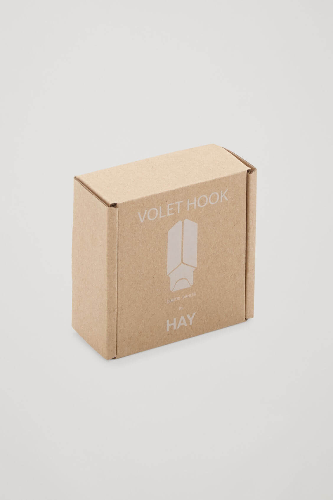
A similar approach was used by COS Stores, a brand selling clothes and clothing accessories.
In collaboration with Hay, the brand came up with a unique line of white-on-kraft boxes. Each project included a pictogram, which symbolized the product inside. That way, the project was also descriptive for the client.


Embrace the whole print space
While minimalism rocks the e-commerce industry, it’s not the only approach.
A design by dn&co from New York, made for the British furniture company Isokon Plus, seized the opportunity to create a universal imprint on varying sizes of the packaging. The modern font, white ink and adding a 3D effect by dissecting the company’s logo into two walls are the details worth appreciating.

Just like the packaging for Isokon Plus, the boxes created for Most Modest used a similar idea. A white imprint “broken” into several walls attracts attention to the logo. Forget that your company’s name is not so easy to decipher - it attracts attention and creates an intriguing shape.

As all of the examples above prove, white-ink imprint on the kraft cardboard boxes is quite powerful and inspiring. It can be applied to packaging for a vast range of products - from cosmetics and food to furniture. It actually might be something for you too!
If you are looking for a fresh look in the design of your boxes, a white imprint might be just the solution for you.
Interested?
Request a quote via Packhelp Pro and enjoy your brand-new aesthetics.
Request A Quote
The header image is taken from the Unit Portables project by Kurppa Hosk.


