5 Brand Inspirations For Your Packaging Design

- 200+ templates & patterns
- Real time 3D packaging preview
- Upload logo and choose brand colours
Subscribe now! Receive 15% discount.
Don’t miss out – get 15% off your first order when you join the newsletter. It’s fast, free, and kinda smart.
You're now subscribed!
In this article:
Apple, Acne Studios, Le Parcel, Happy Socks and Girlfriend Collective - all of these brands share something in common.
Modern packaging design is a challenge for branding. The emergence of subscription boxes and the growth of e-commerce both led to the increasing importance of packaging as a marketing channel.
As a consequence, box designs are turning into art now. Your packaging set now has to master the art of communicating, conveying messages and astonishing the customer.
#1 Acne Studios - Minimalism & Exposure
Acne Studio has developed a beautifully minimalist design of packaging for their products. The salmon colour is soothing, whilst the clean font in the logo fits the overall image.
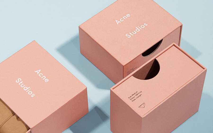
Additionally, the design includes a smart way to present the product. Apart from the small window in one of the walls, the box is expendable. Such simple trick provides a much better exposure of the product.

#2 Apple - The Pioneer
Apple is a company that has set new standards in business as we once knew it. The scope of this vast impact has also reached the packaging industry.
Apple’s packaging lies in its simplicity. White colour is dominating, with sharp lines and unusual elegance. This may sound ordinary, but that is the beauty and sheer genius behind it.
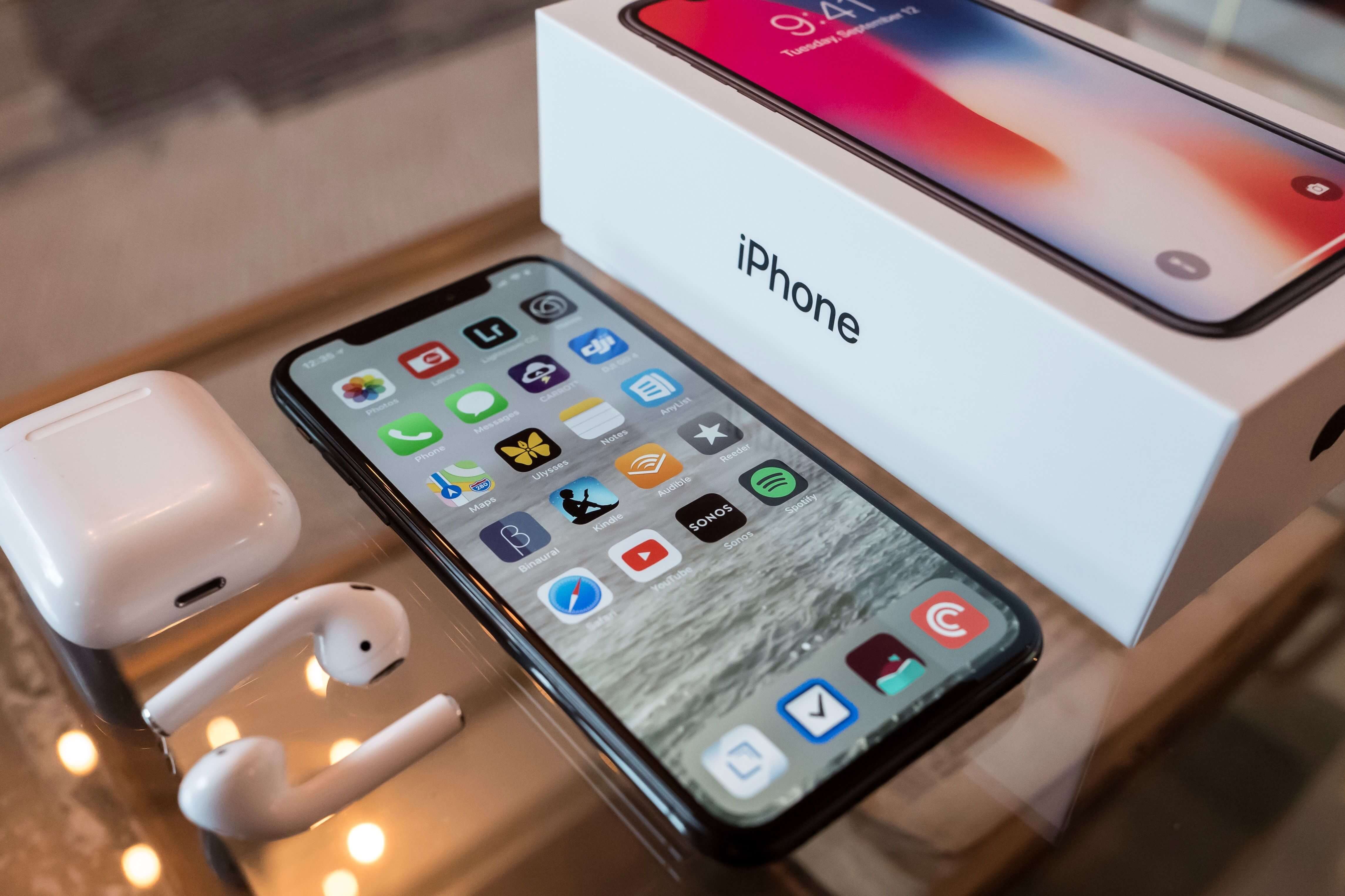
One may also say that it was Apple who sparked the idea of unpacking as a phenomenon. Whether it’s true or not, the iPhone X unboxing video reached nearly 10 million views. It’s a pretty solid result.
#3 Happy Socks - Lively And Attractive
Colourful, original socks are currently a trend.
Happy Socks implements its creativity into the packaging design. Their patterns are very lively, often inspired by the particular series of socks.

Happy Socks diversifies its packaging too. Some of the boxes are elegant, paper-made ones with imprint. They are designed to perfectly fit a pair of socks.

Bigger numbers of pairs come in a box with a transparent window.
The company’s smart packaging allows it to become a storing solution too.
#4 Le Parcel - Pastel Design
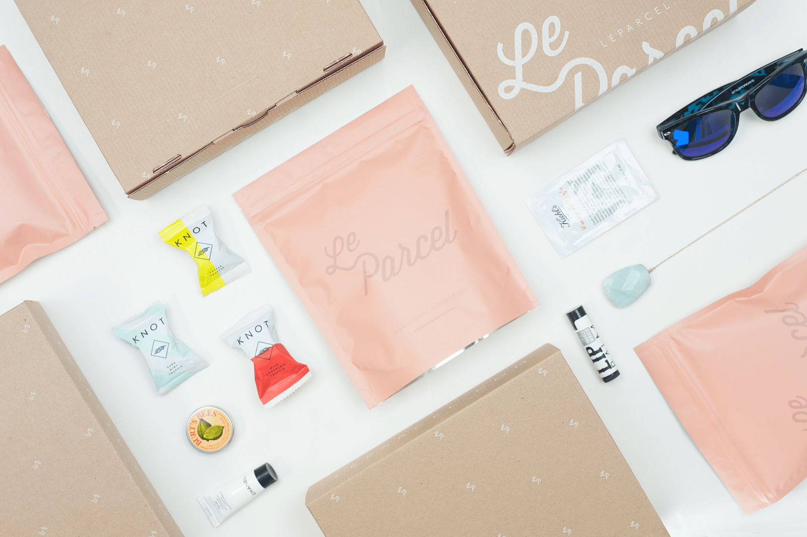
Le Parcel was a rather unusual subscription box. It’s a monthly package containing high-quality tampons, pads and other products for women.
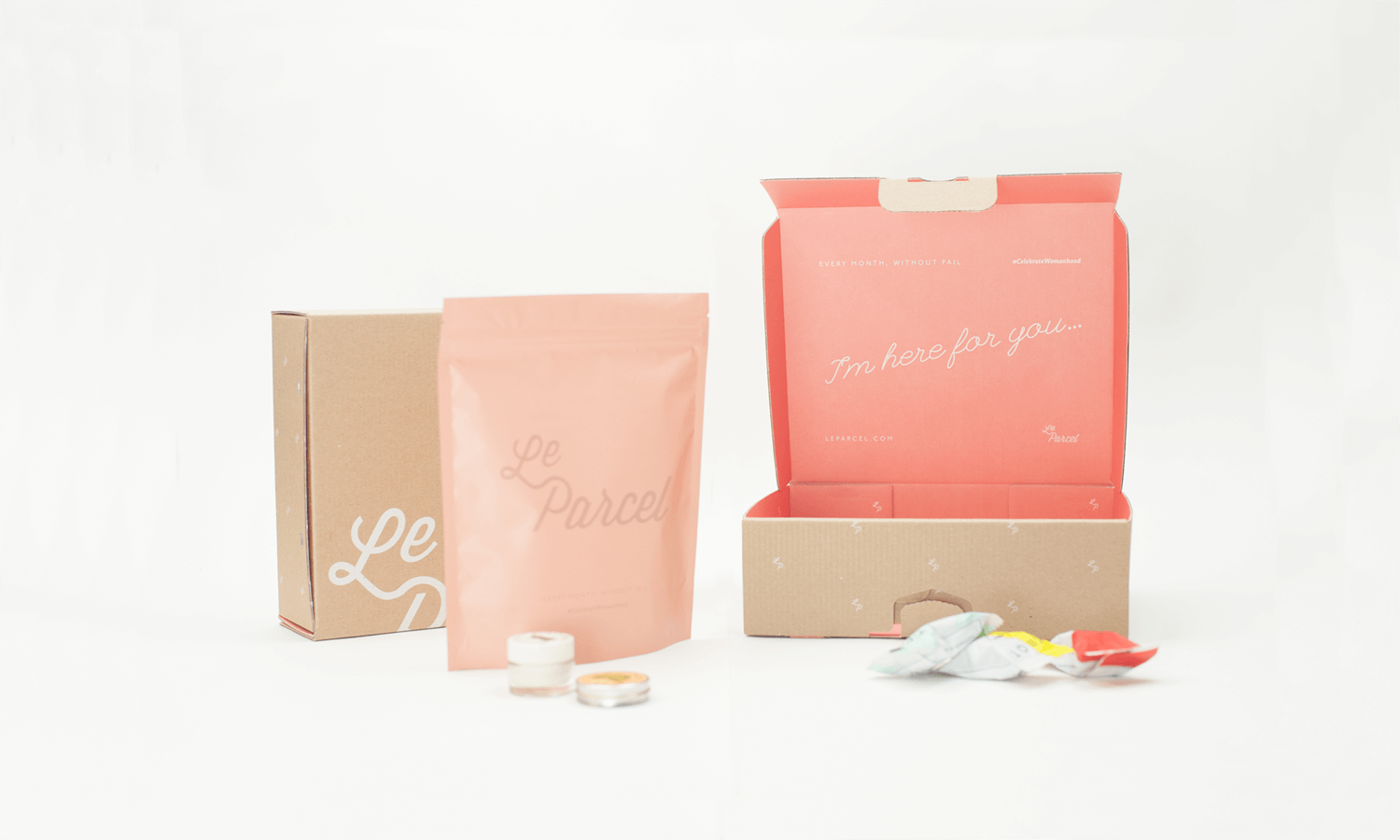
Such a sensitive product required an equally toned and classy packaging.
The design was created by Seven Fifty Five. Le Parcel’s packaging was immersed in pastel pink and salmon colours. There was also a variety of materials and sizes used - from branded polymailers to cardboard boxes.

Even though the company’s no longer in business, this packaging is still a great source of inspiration.
#5 Girlfriend Collective - Eco-Friendly Inspiration
Design also means inspiring use of materials.
Girlfriend Collective is a company producing high-quality clothing for women. The company’s unique value is the utmost care for the environment and the objective to produce clothes out of 100% recycled materials.

Girlfriend Collective teamed up with an agency CRP to develop packaging that meets the same requirement. The entirety of the packaging included a cardboard box and a cloth pouch, where even thread used for stitching was recycled.
The result is packaging for clothing, simple in its form, yet incredibly strong in the message conveyed.


