


Logos That Look Great on Your Packaging & How To Design Them Yourself

- 200+ templates & patterns
- Real time 3D packaging preview
- Upload logo and choose brand colours
Subscribe now! Receive 15% discount.
Don’t miss out – get 15% off your first order when you join the newsletter. It’s fast, free, and kinda smart.

You're now subscribed!
In this article:
In this article, I’m going to walk you through how to create a logo that looks great on your packaging.
Let’s start by understanding what branding means and what role a logo plays.
We’ll look at great logo examples for packaging and finally I’ll show you how to design a modern logo using a logo maker for packaging.
What’s branding?
Branding is what your customer thinks about you.
Behind good branding sits a marketing strategy that helps people differentiate you from your competitors.
The strategy includes your brand name, a visual identity (logo, colours, fonts), messaging, and marketing assets such as social media images and packaging.
3 Main Types of Logos
In modern branding, we use three main types of logos: logo symbols, wordmarks (sometimes called text logos), and combination marks (a symbol and a wordmark combined).
Wordmarks are logos made from type, which means that the company name is written in a specific font.
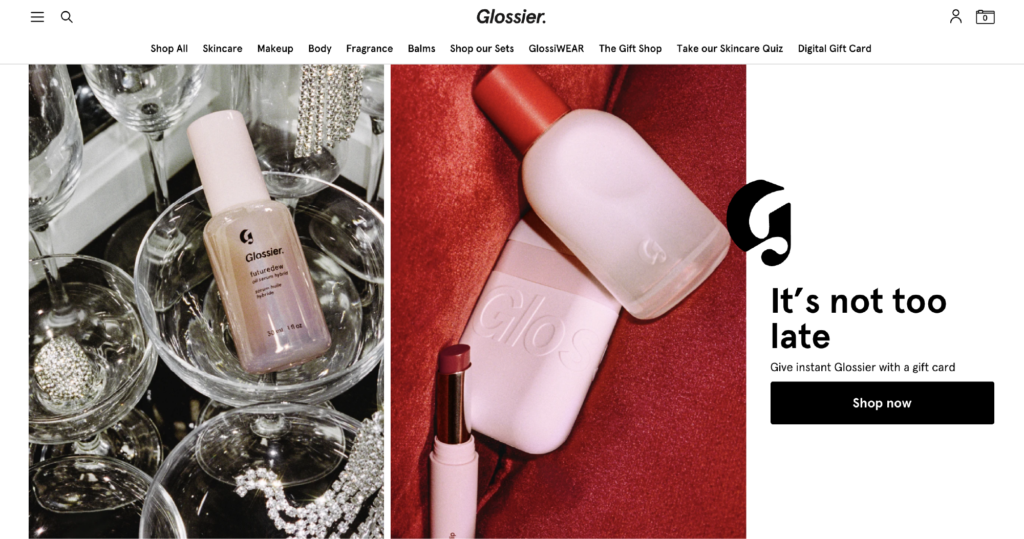
Popular examples are Google, Coca-Cola, L’Oréal, or Glossier.
Wordmarks or logo symbols?
Especially D2C brands often use simple wordmarks. For example, 78.7% of top beauty brands don’t use logo symbols, they only use wordmarks.
Logo symbols can be easier to remember but wordmarks often look less corporate and more modern.

In order to add personality to a type logo, it’s important to pick a font that has character–just make sure it fits within your brand’s tone.
Another way to add character and memorability is by customizing one or more letters.
Tip: Ideally, you customize the first letter of your logo so that you can use it as an avatar for social media too.
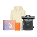
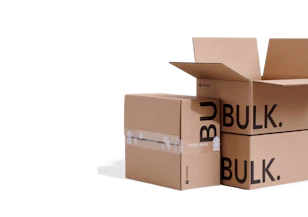
Logos That Look Great on Your Packaging
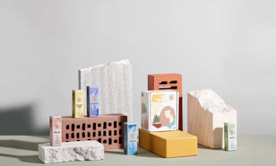
Packaging is one of the places where you can literally think outside the box with your visual branding!
Your customer will touch your product for the very first time after the purchase and you want to make sure they’re falling in love with your brand immediately.
Example 1:
Vitamom’s logo is a wordmark with a twist – the letter “o” is a heart.
This makes the brand feel “blissful” and less “corporate,” two aspects the founder Kiki is very passionate about.
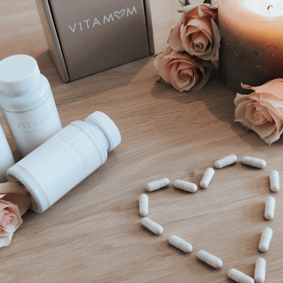
Learn more about Vitamom, the business and their packaging
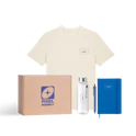
Example 2:
The shoe company Lolacruz uses a wordmark logo as well.
The type is set in a simple sans serif but a thick weight with a pretty tight letter spacing.
That makes the logo look “clean” and “powerful,” two aspects the founder Maria wanted to convey.

Learn more about Lolacruz and their branding
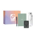
Example 3:
Feeling Felt creates products like laptop sleeves from felt.
All of their materials used are made up of recycled plastic.
That core promise comes across in their logo too – the first letter “F” looks like it unfolds into something new.

Discover more about what makes Feeling Felt unique
How to Design Your Own Logo for Your Packaging
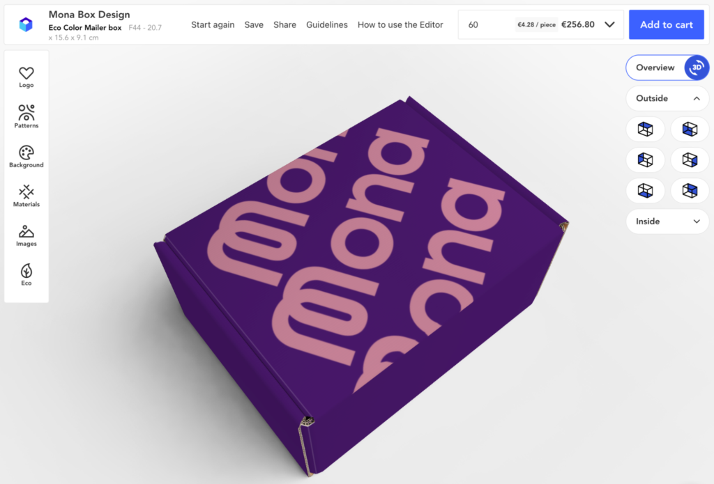
Firstly, let’s give our brand a name–we’ll call her “Mona.”
And before we can dive into logo design, we’ll need to do a little bit of strategic thinking.
While there are a lot of templates for brand exercises, a shortcut to brand strategy is to write down three adjectives that summarize your brand’s personality.
Let’s say these adjectives are “calm,” “quirky,” and “magical.” You can enter these into a company name generator to come up with a suitable brand name.
The next step is to type out our brand name in a graphic design tool or a free logo maker app.
Decide which one of the adjectives should be represented by the font style.
Then see which type communicates the adjective best: a sans-serif, a rounded or a serif font?

In our example, I’d like to have a font that means “calm.”
To communicate “quirky,” I’ll pick a unique starting letter that is memorable (and can serve as a logo symbol at the same time).
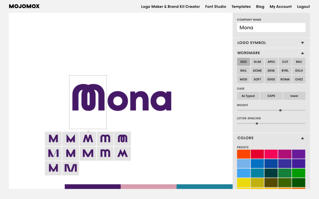
Lastly, as Mona’s main colour, I’ll pick purple, a colour that means “magical,” our third adjective.
The logo is now ready to be downloaded.
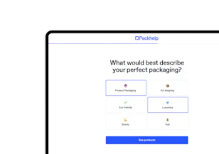
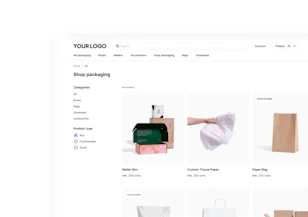
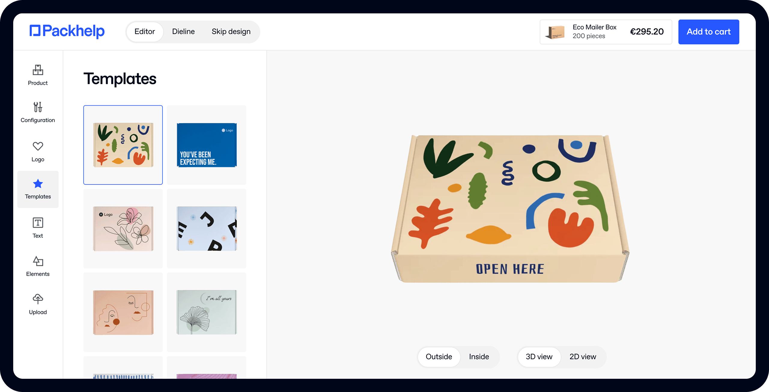
The Packhelp packaging designer makes it super easy to put everything together quickly.
Pick your box, choose your brand colour as the background colour and upload your logo.
See Packhelp's range of customisable packaging
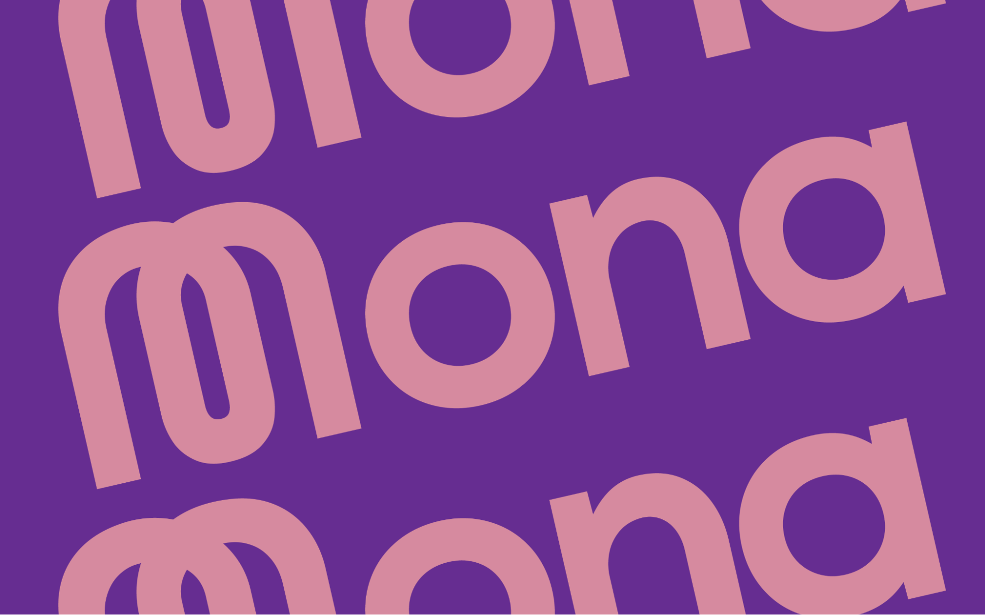
For a minimalistic but fun design, simply rotate your logo and duplicate it to create a pattern.
While your logo should get the most attention when designing your packaging, playing with patterns, picking a background colour, and trying different logo placements can change the perception of your packaging tremendously.
Conclusion:
Branding is a strategy and before starting with a logo, decide on three adjectives you’d like your customers to think of when they think of you.
Make sure to distribute the three adjectives across your visual identity: your logo’s font choice and your colour.
If you’re designing a wordmark, give your logo personality by choosing a memorable first letter that can also serve as your brand avatar.
Test your logo in the Packhelp package designer and have fun with it!
–––––––
Author profile:

Saskia Ketz is the founder of MMarch NY, an NYC-based branding agency that’s worked with world-class brands like Netflix, Ikea, Timberland, and Mojomox, a graphic design tool and online logo builder that allows small businesses on tight budgets to create dynamic, professional-looking logos themselves.
Photo by Lauren Damaskinos.


