Psychology of Colour – How To Use It In Your Packaging Design

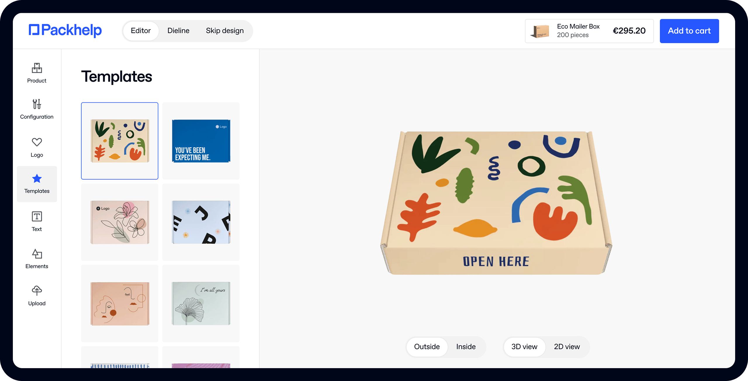
- 200+ templates & patterns
- Real time 3D packaging preview
- Upload logo and choose brand colours

Subscribe now! Receive 15% discount.
Don’t miss out – get 15% off your first order when you join the newsletter. It’s fast, free, and kinda smart.
You're now subscribed!
In this article:
If you’ve heard that 75% of pencils sold in the U.S. are yellow, would you instantly use this colour in your design to boost sales?
The psychology of colours can be a tricky matter. You see, some companies take months to create their “colour communication”, whilst others decide instantly. Some brands take it very seriously, whilst others don’t.
One thing is certain - there are no concrete answers here. Despite that, it’s better to have some sort of background. It might be helpful in deciding whether yellow is such a top-seller or it’s just a random fact.
Colours say more than we might think

Have you ever wondered why many airlines (KLM, United Airlines and Lufthansa to name a few) use blue as leading colour? The reason is simple - blue is a colour that conveys trustworthiness.
Or why Subway went with yellow & green? Whilst the first colour is cheerful (the brand wanted to target young people), the latter is a symbol of freshness.
What we basically mean is that your color design requires some thought into it. Here is what the most commonly used colors say to your client.
- Blue is the color of the sea and the sky. It’s known to be calming, associated with trust, efficiency, serenity, logic and intelligence. It’s also a common choice in brand design. Many worldwide known companies incorporate blue into their image - Facebook, Twitter, IBM and Vimeo to name a few. But take a look at Packhelp - we have also chosen a lighter shade of blue in our logotype.
- Red, on the other hand, is fierce, associated with zeal, passion, excitement, warmth and general strength. Red is common for lifestyle and entertainment companies. Here are some examples: Netflix, Coca-Cola, Disney, McDonald’s, Marlboro and Lego.
- Green is associated with Earth. It’s soothing, brings peace, balance, sustainability, harmony and restoration to mind. Green is used by a bunch of big companies - Subway, Spotify, Starbucks, Lacoste and Xbox.
- Yellow is extremely emotional and cheerful. It’s rarely used as a sole solution in branding though. Many companies use it to cheer up their designs like McDonald’s and IMDb.
- Black is often used in elegant, premium brands. It’s commonly mixed with white elements.

What helps in choosing the right colour palette?
The best course of action is to think from your customer’s perspective. When you wish to look very professional, but don’t want to be too “sociable” in the eyes of your clients, go for blue in your designs. Marketing agencies or companies, which wish to build trust with their packaging, can utilize blue.
When your brand is more cheerful, try finding a mixture of very light, warm colours. Red and yellow resonate with a lively image, perfect for a brand targeted at passionate people.
Whenever you target customers, who appreciate your care for the environmental issues, green and brown strengthen such perception. Cosmetics, fair-trade food products and even clothes - they all might benefit from green packaging design. However, use these cautiously - especially green, which can be boring if used in excess.
Eager to see how your branding can stand out from the rest? Get a quote!
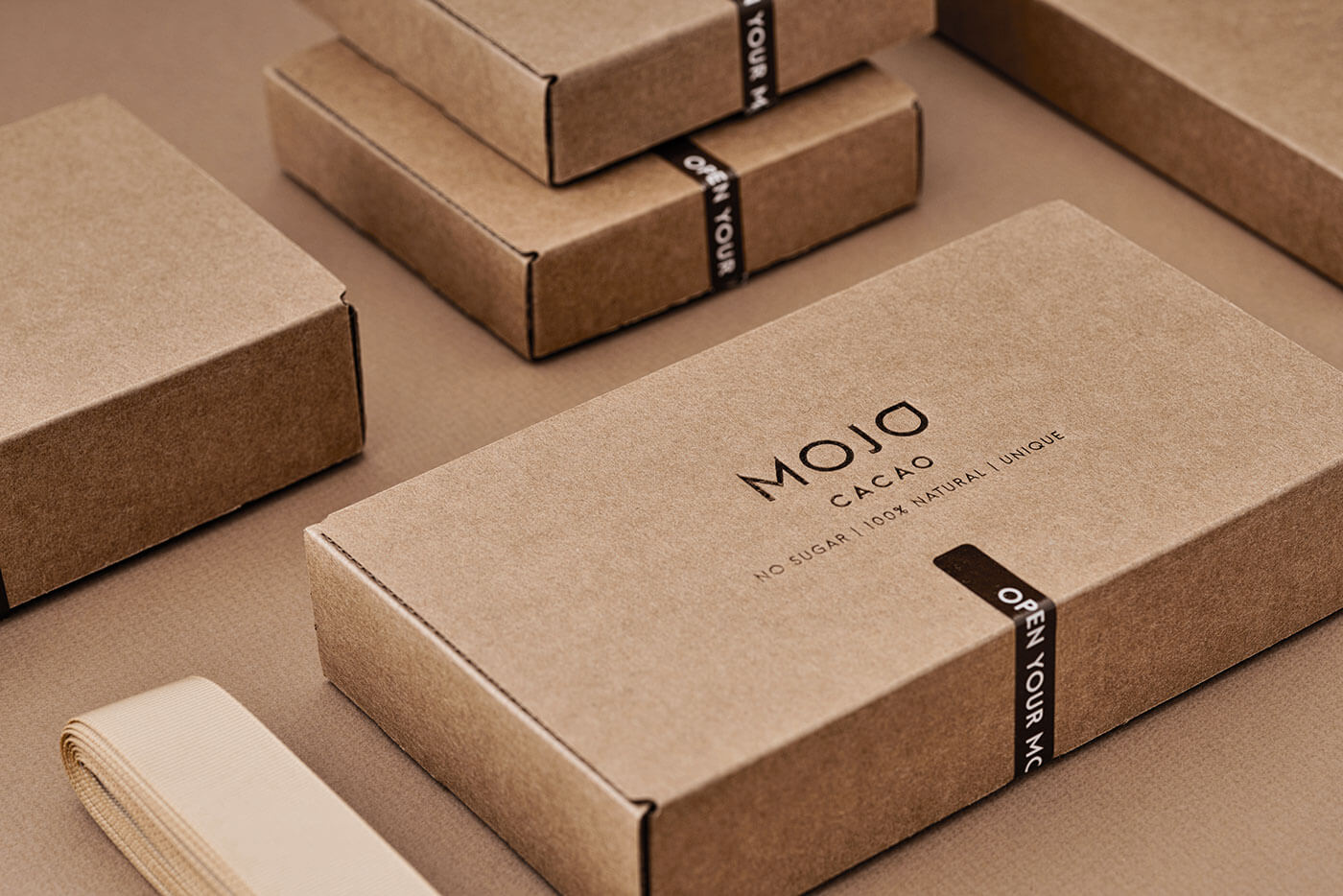
Finally, be sure to remember, that every packaging design relies on details. A delicate background - like kraft cardboard or white cardboard box - emphasizes the black imprints.
What else matters?
When designing your packaging set, bear in mind that colour preferences differ based on age and sex too. A study by Joe Hallock indicated that blue is by far the most liked colour, notwithstanding the age. If you are targeting kids, avoid red - your design should mostly be green and blueish. Teenagers and people in the 30s are prone to like purple, which can be a nice novelty in packaging design. Choosing black will appeal to younger people. And remember this golden rule - most people do not like orange.
When it comes to sex differentiation, men really like blue. More than 57% of them admit to liking blue the most. Green and black are also a good choice for a masculine brand. Women like blue too, but purple, red and green are also a good choice to be feminine-friendly.

What about the tonality and combinations?
If you recall the 90s, you probably recall the blatant colours used in clothes and the noisy designs that almost screamed at you.
The modern approach is different.
In the era of mellow Instagram filters and curated galleries from social media, there is a whole new trend of minimalism.
Minimalism in packaging design means the brown kraft carton, matched with a black imprint. Or white cardboard with the same imprint. It also means choosing very toned, delicate colours and small typography. What attracts attention are the details - smart, catchy phrase or a beautiful, artsy pattern printed.


The tones of your colours can be used to differentiate your brand further. A mellow, light blue can be closer to grey (which stands for psychologically neutral) than the cold, darker shade.
Sum up
Packaging design involves numerous elements, like shape, material and texture. But the colours are also crucial. With a well-researched strategy, you can resolve any doubts you have about your branding and your packaging. Evaluate what's being done in the market and in your industry and go from there. Define your values and make a decision on what elements will best showcase those values. This way you'll find the best combination that fits your brand.


