Using Black In Printing

- 200+ templates & patterns
- Real time 3D packaging preview
- Upload logo and choose brand colours

Subscribe now! Receive 15% discount.
Don’t miss out – get 15% off your first order when you join the newsletter. It’s fast, free, and kinda smart.
You're now subscribed!
In this article:
Black is a tricky colour to get right.
If you've ever tried to get your little black dress or a nice black tux looking just right, you know the struggle.
Black goes with everything, but also nothing.
But black also causes a world of headaches in printing houses, not just your wardrobe.
Which type of black do you want?
Not to mention, black also presents a headache for TV manufacturers - LCD screens especially.
Old-school CRT monitors present black much better than a traditional LCD screen. That's why many designers and artists hold onto their old CRT screens.
The blacks are simply better.
Defining 'pure' black
Let’s start with defining the colour black.
Unsurprisingly, black is the darkest of all colours and is created by 100% absorption of visible light and the reflection of none.
In theory, a black hole is a perfect definition of black, as its gravity is so strong, light can't escape it. But in reality, perfectly black entities almost do not exist.
Therefore, we consider objects "black” when there is an absence of reflected light.
cust

This is why it's hard to create a good black on an LCD screen - even when the black pixel is 'switched off' and has no light, the screen is still backlit. This turns the black into more of a grey colour.
The problem with blacks in printing
Black should be easy to obtain, right? Just slam all the colours up to 100 and be done with it, right?
Well, no. But also, yes.

The printing world runs on the CMYK colour palette - C - cyan, M = magenta, Y = Yellow and K = Key, or black.
These colours are mixed together as a percentage to achieve the desired colour.
For example, fire engine red is:
C - 0%
M - 84%
Y - 80%
K - 19%
Turning all these percentages up to 100% will give you black that's kind of dull, washed out and not very black at all.
There are a few other reasons that all values set to 100% aren't used:
- All values at 100 are a massive waste of toner, and therefore money
- Even waste from water-based and solvent-based inks has an impact on the environment
- Excess ink takes excess time to dry
- Printouts will be physically heavier from the excess ink
This results in some pretty bad packaging and adds unnecessary financial expenses to the end product.
Note: CMYK values set to 100% is called “Registration Black”. It's used to calibrate machinery and line up different print layers.
Using blacks in printing
The CMYK printing process is a summative environment - that is to say, the final colour is a blend of 4 others.
Black can be achieved in 2 different ways.
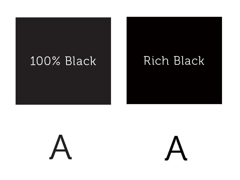
Regular black has CMYK values of: C = 0, M = 0, Y = 0, K = 100.
Rich black uses CMYK values of: C = 60, M = 60, Y = 60, K = 100.
Some print houses adjust their 60 to another value, usually between 40 and 70.
But if black is a result of all colours being absorbed, why wouldn't you just set all values in the CMYK colour range to 100?

When are Regular blacks and Rich blacks used?
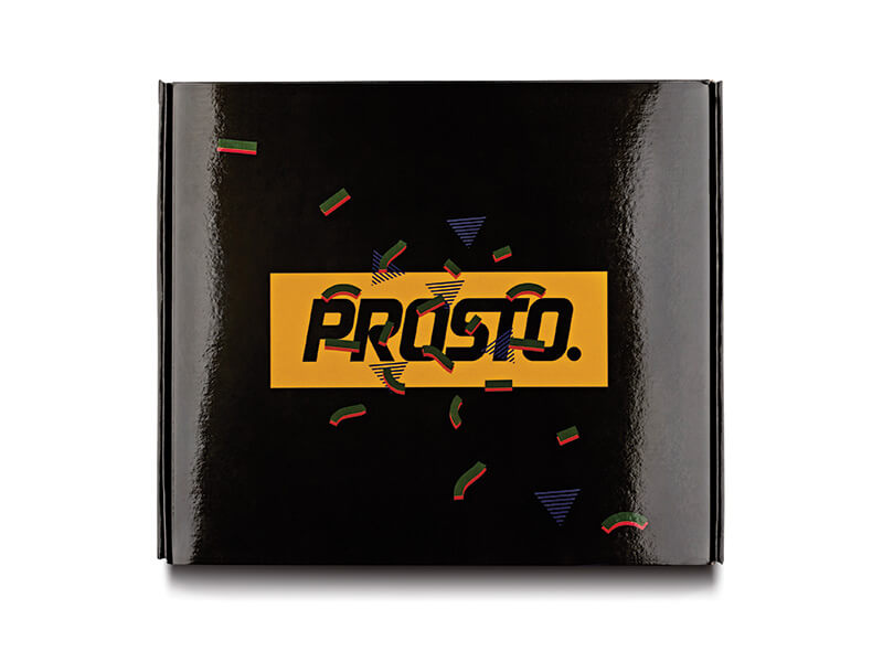
Regular black is used when it's in contrast against other colours.
For example on a full-colour mailer box, when there is a thin black line to separate two colours or the outline of a drawing, regular black will be used. The same goes for plastic containers. Regular blacks look blacker when they're seen in contrast to other colours.
Below, you can see a box that uses regular blacks:

Click here to learn more about the unique packaging used by Olivia Plum
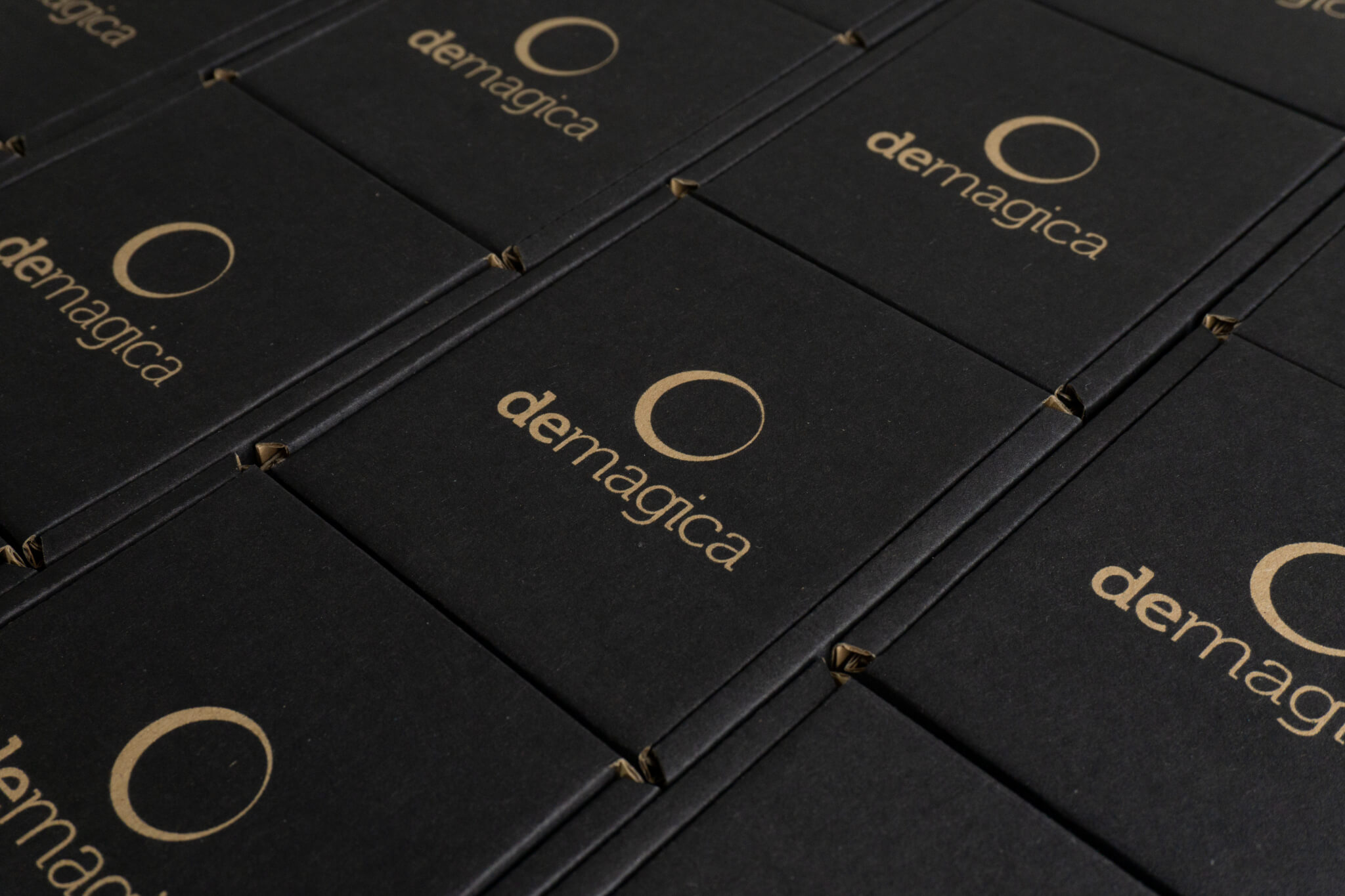
Rich Blacks are used to produce large black surfaces
For example, when you'd like to print the entire surface of a box black and use negative space as part of your packaging design:

Click here to see how Demagica used blacks and negative space in their packaging design
Our range of Eco and Eco White boxes is a little different. That's because these boxes have only black print.
Therefore as black is the only colour on the box, you want it to be the blackest black it can be. So the ink used on our Eco and Eco White boxes is Rich Blacks.

Click here to see how Sheyn used simple black print as part of their product-focussed branding.
When you're creating a box using the Packhelp online designer, your black values will automatically be converted from RGB to CMYK.
Tips when printing in black
If you plan on using black heavily in your packaging design, here are a few things to remember:
Always be consistent
There are many different shades of black, but using two similar shades of black next to each other only causes problems.
Pick one shade of black and stick to it.
This is especially true if your design uses a lot of greys and shades that aren't black, but close to it.
Regular blacks look blacker when they're seen in contrast to other colours.
When transferring information from the digital realm to the physical print world, blacks are the hardest to get right.
That's why it's important you reach out and tell us if the black in your packaging design isn't rich or regular black.
Over to you
Black is a powerful powerful colour. Versatile, it has the ability to either make your other colours pop and stand out, or overwhelm and be the centre of attention itself.
Either way, should you decide to use black in your packaging design, it's important to know that there are a few little things you can do to get your blacks just right!


