Packaging Design Inspiration That’ll Make Your Brand Stand Out

- 200+ templates & patterns
- Real time 3D packaging preview
- Upload logo and choose brand colours

Subscribe now! Receive 15% discount.
Don’t miss out – get 15% off your first order when you join the newsletter. It’s fast, free, and kinda smart.
You're now subscribed!
In this article:
Ready for a dose of packaging inspiration?
Packaging design is a form of craftsmanship.
Even a small e-commerce business can benefit from something unique, memorable and high-quality. Something as simple as custom tape can show that you've thought about your brand's image.
A product is one thing, but the way it's delivered is becoming increasingly important for customers. But it's not just a box, either.
Your brand's imagery can be carried over into smaller packaging supplies, gaining valuable real estate to put your name in front of your customers.
Take a look at brands just like yours that are using packaging design as a medium to stand out.
This attention to detail shows your customer that you care not just about your brand, but how your brand is perceived.
Perception of your brand is core to customer retention and standing out amongst the crowd.
In this article, you'll take a look at some small e-commerce, retail and D2C brands with inspiring packaging, that can help get your creative juices flowing.
Concrete Jungle
Jewellery brand Concrete Jungle doesn't hold back with its packaging.
Take a look at our unboxing video below to check it out up close:
Their double-sided mailer box is consists of a stunning colour palette of black, white, green and hints of gold.
These colours perfectly reflect the brand's website, giving the customer a consistent branding experience. Inside, a cute greeting message says hello, and black wood wool void filler adds an eye-catching texture.
But the company also takes sustainability into account. Their mailer box is fully recyclable and is made in a factory close to their European office, keeping transports emissions down.
What's the result?
We see inspiring packaging that invokes the sense of touch, not just sight. Multi-sensory packaging is an excellent example of blowing your customer's mind with an exceptional unboxing experience.
Read more about Concrete Jungle here
Alex Ko
When transitioning from model to fashion designer, Aleksandra Kołodziej knew that she wanted her new brand to use minimalism to the max.
Her creations are of a single colour, muted, and somewhat understated. Simplicity lets the shape and design of the garment do the talking.
And this simplicity is echoed in the brand's packaging:

The sleeved mailer box is also calm and muted and uses colours similar to those of the clothing that the brand creates.
The unique sleeve design around the mailer box also let's the dull white colour of the box act as a blank canvas. What's more, it doubles as a little extra security.

The durable but also delicate clothing is protected from the elements in a mailing bag. These backs also ensure that the integrity of the box stays in check.
Aleks Ko has managed to bring minimalism into her packaging design, as well as the branding of her entire business.
See more about Aleks Ko on our inspiration.
Moonsling
Moonsling is an excellent example of creative packaging inspiration.

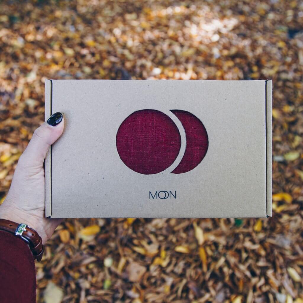
Using nothing more than a simple eco mailer box, Moonsling uses the texture and colour of their product by cutting the shape of their logo out of the box itself.
The only print on the box is the name of the logo, with the double-o being a mimic of the logo that's cut out.
The brand, selling baby slings, keeps its carbon footprint down by using mailer boxes made from recycled paper pulp.
A simple take on minimalism that uses the actual product itself to add a splash of colour!
See more about Moonsling and their packaging here.
OASE
Oase is an excellent example of premium packaging for a luxury product.
The setup box has a custom made base that holds the product in place as if it's on a pedestal being presented to the world. The sticker on the jar is the same colour as the box, as is the rest of the copy.
By mimicking the copy, colour and layout from one medium to the other, a consistent experience is had.
Whether you keep the product in its box or not, you're getting the same visuals.
The baby pink colour works incredibly well with the jet black hot stamped text, as well as the deep red of the actual vitamins themselves! Premium packaging at its finest.
Saucony
Saucony's packaging for it's limited edition shoe showcases interactive packaging perfectly.

By buying a pair of shoes, you received an eco white mailer box that was branded and labelled on the side, but the main surface was completely white.
By buying the box, you were automatically entered into a competition to design your shoebox, using your drawing skills.
Streetwear has long been associated with creativity, and Saucony used its packaging design to nurture and encourage this.
Check out Saucony's 'design your own box' idea in more detail here.'
POLŪ
Polu took a white on kraft mailer box and turned the design on its head completely.
Printing half the box white, and leaving the natural kraft paper texture on the other half created an eye-catching pattern.
But then using negative space on the white side for half of the copy made things interesting.
The brand that sells reusable coffee cups made from bamboo hold sustainable packaging very high in their values.
This plastic-free packaging complemented their reusable product correctly, and with a unique design on the box, really makes the brand stand out!
See more about Polu Eco Products here
Origin X
British Active Wear brand, Origin X know that their packaging had to eco the sustainable materials used in their products.

That's because nearly 60% of customers say that they'd change their mind if a product's packaging weren't sustainable.
Knowing that their product was durable and didn't need impact protection, Origin X opted for a biodegradable poly mailer bag as the best choice for their packaging.

Rather than petroleum-based plastic, these mailing bags use leftover plant byproduct as the main ingredient.
This means that once used, the bags biodegrade back into the earth, leaving no traces whatsoever.
Origin X, a brand that puts the environment at the forefront of what they do, saw the opportunity here.
They have now woven sustainable packaging into their DNA.
Learn more about Origin X and sustainability here.
Sheyn
3D printing has come along in leaps and bounds in the last decade, and many brands are using it to in the production process of their products.
Sheyn Jewellery is an excellent example of that.
Sheyn takes the 3D blueprint of their design and uses it as part of their packaging design.

By exploding outline of the 3D printed file onto their mailer box, shapes of the product inside are seen from the very first look.
This concept of bringing the product outside the box that it is in creates a unique experience, and one that keeps the product in the mind of the customer for a long time coming.
See how else Sheyn uses their packaging design.
Monday's Child
When discussing packaging sustainability, often the materials themselves are spoken about. But sustainability can be seen in products that have secondary uses designed into them.
Monday's Child has taken this concept and used it in their product packaging.

The British brand sells handmade dresses aimed at young girls. Knowing that their user (young girls) often play with dolls, they've decided to make their mailing boxes double dollhouses.
Mum or dad just has to cut the door open, and then the little princesses have a new place to live!
Monday's Child has found a unique way to add value to their packaging by turning it into a completely new product. This keeps the product in use for longer by giving it a second purpose.
Learn more about Monday's Child here
Unique packaging inspiration for your brand
Packaging inspiration can be found in many places. Even simple coffee packaging is a blank canvas to reflect your brand and what makes it different.
How you use your packaging is an indication of your brand's creativity and a reflection of how you value your product.
But packaging design isn't easy, so calling in the help of experienced packaging engineers and designers is advised if you want to get the most from your packaging.
If you've got an idea for packaging, head over to our shop or request a competitive quote!
Need more inspiration?


