All You Need To Know About Designing Wine Labels

- 200+ templates & patterns
- Real time 3D packaging preview
- Upload logo and choose brand colours
Subscribe now! Receive 15% discount.
Don’t miss out – get 15% off your first order when you join the newsletter. It’s fast, free, and kinda smart.
You're now subscribed!
In this article:
There is hardly a better example of the selling power of packaging design (label in that case) than wine labels. In this article, you will see some great examples of wine labels done right, great wine packaging solutions and tips on how to cater to your customers by choosing the right wine label aesthetic.
At least once in your life, you had to face the reality of buying a bottle of wine. Hundreds of options, various labels, bottles and prices and you’re at the centre of it all.
Dazed and confused.
Even with a specific budget in mind, there’s still so much to choose from.
Hence, there’s no surprise that both a label and wine bottle packaging determines the buyer’s choices.
This article is your guide to targeting the right audience with the right wine labels. You’ll find here the important information concerning:
- main functions of wine labels
- popular styles of wine labels
- special finishing options for wine labels
- packaging corresponding to wine labels

Let’s crunch some industry’s numbers first.
Although some difficult weather conditions have hit the industry a few years back, it’s thriving worldwide once again. The global wine production was estimated to be somewhere around 282 million hectolitres in 2018, with Italy, Spain and France leading the pack. While Europe tops the production worldwide, some other large exporters of wine are the U.S., Chile, Australia and Argentina. And, with less clear estimations, there is Russia and China.
So, given these optimistic forecasts, establishing a wine shop or your own vineyard might just be the business idea you can sink your teeth into.
Before you see some examples of killer wine labels, let’s quickly review what you need to look at when designing your own label.
What are the main functions of wine labels?
When it comes to wine bottles, the saying “judge a book by its cover” is more than accurate. The choice of wine is heavily dictated by the bottle’s appearance.
This leads to the first function of the label - design.
The first part of a wine brand’s look is defined by its packaging. In many cases, it is just the bottle (however, in the latter part of this article, you’ll see the benefits of packing the bottle in a branded box). A vast majority of these bottles are regular 0,7l ones, with a simple shape that optimizes the logistics side.
However, there are exceptions.
A bottle design of Blood of Grape is heart-shaped, made with an “anatomical” eye for detail. It’s an extremely eye-catching project and one that’s often quoted as the ultimate benchmark when it comes to creative wine bottles.

Blood of Grapes is a unique example, but most wineries choose bottles with more regular shapes, because it reduces the issues with outer packaging, as well as the logistics mentioned before.
So, since bottle shapes aren't the key feature, it’s the labels that catch the customer’s attention.
As the design goes, a label needs to communicate whether the wine is targeted at young people who like fresh, original tastes or fans of traditional products with a long history.
The above is reflected in research. A website wine.net conducted research concerning wine labels and consumer behaviour. As found in the report:
"Regardless of a wine's actual price, bottles with certain features—for instance, embossed labels, gold foil, high-end graphics, or fancy font—may tend to look more expensive. And for someone who needs to quickly choose a bottle of wine to pour at a last-minute dinner party or give as a gift, choosing a bottle that appears elegant and pricey is appealing."
There you have it - a smart wine label design sells better.
The second important feature of a wine label is the general description, usually located on the back side of the bottle.
While many buyers get the fancy looking wines, not all of us judge the book by the cover. Some customers possess more in-depth knowledge of wines and spend the time to find products meeting their requirements.
Such a customer wants to find every vital information about the wine - like how strong it is, what’s the grape variety, is it more fruity or toasty etc. This is related to the “subliminal message” too - is this product premium? Can you enjoy it over dinner or is it a dessert wine? Can you give it as a gift?
The general question is - how can you appeal to that more demanding group of customers?
By mastering descriptions.
When it comes to descriptions, many labels are very floridly written. Apart from the basic information, they often tell the story of the production process, carefully selected grape varieties and floral scents. It's the story of your product.
And there’s a perfect explanation for that.
“The elaborate information level evoked higher expectations before tasting the wines, plus resulted in higher liking ratings and elicitation of more intense positive and less negative emotions.”
Description needs to engage the customer - it’s an equivalent to great copy on a website. It’s where the brand’s promise becomes stronger (after the initial touchpoint - label and packaging design).
In the next part, you will find out about the best visual inspirations of wine bottles and see a handful of great examples.
Styles of wine label designs
Just like packaging design in general, wine labels vary a lot in terms of styles. The four most popular style ideas are:
- wine labels that create a connection with history and tradition
- wine labels that use abstract art and design
- wine labels that implement minimalism
- wine labels that refer to modern trends or use a funny, cocky design
Let’s see what these four styles look like in detail.
Playing with tradition in wine label design
Tradition in winemaking plays an incredibly important role. Imagine the value of the oldest winery that’s dated to function since the 10th century (Château de Goulaine in France). This is an asset that the producers can leverage when adjusting the prices of wines. In the case of that particular winery, you can expect these prices to be… high.
Therefore, the older wineries like to play the card of tradition. And it’s often reflected in the label designs.
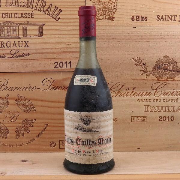
Take a look at the 1957’s bottle of a French premium wine Nuits St. Georges Cailles Morin.
And here's a wine label design of a 2009’s bottle:

They are quite similar, right?
The vintage labels are often made with typography that mimics handwriting, with a lot of text gathered around or beneath a simple (also hand-drawn) picture. There isn’t much negative space (the "free" space in the background"), mostly due to the abundance of information present on the label.
Moreover, vintage often means using golden finishing called hot-stamping (explained later on in this article).
As this example of 2009’s Chateau De La Ligne shows, modern wine labels tend to be based on vintage feeling. It ‘s often associated with a premium character and elegant look.
Abstract forms in wine label design
An abstract wine label design is a fantastic way to catch a lost shopper’s attention. Among many labels that "attack" the buyer with foreign names, pictures and abundant designs, an abstract form is much more unexpected.
Generally speaking, abstract designs mean using asymmetrical shapes, artistic graphics and typography that uses contemporary fonts.
A fantastic example of an abstract label design is an Australian brand Jake Busching. The blueish label, with the colour palette that reminds of grapes, leaves little space for text. Instead, it engages the consumer with the terrific imprint.

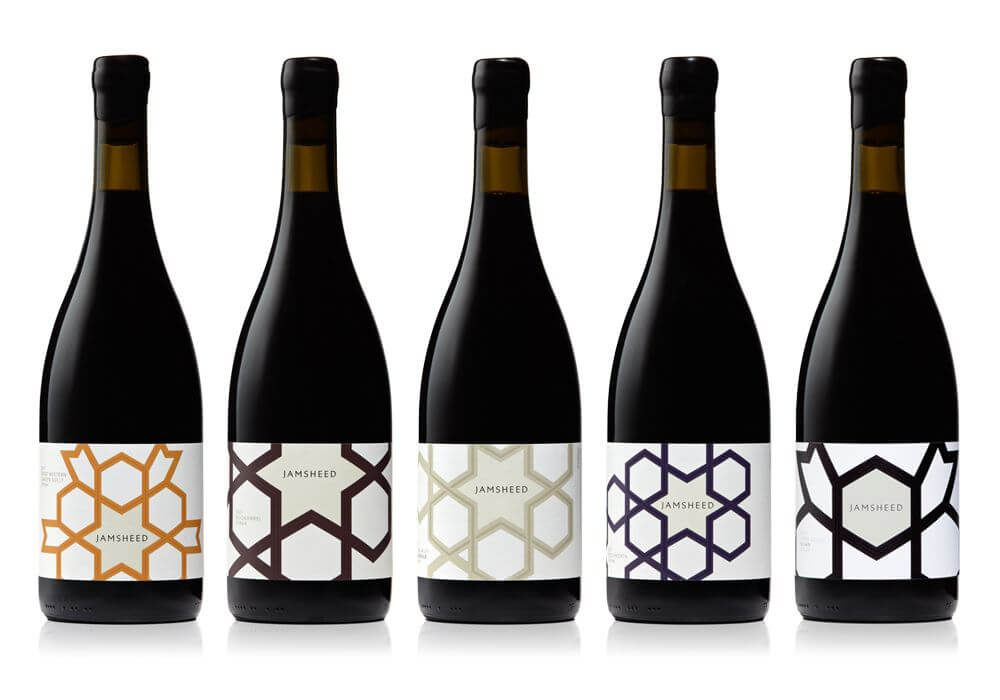
A similar, abstract take is represented by a wine brand Jamsheed.
The series of Jamsheed Beechworth Syrah from 2013 was a collection of inspiring designs, with one visual concept adapted to 5 different types of wine. It's the visual connection between all the bottles that's most inspiring here.
An even more asymmetric feeling can be found in the design of Csetvei Pince by Lili Thury, a Hungarian wine with a label design presented on Behance. It plays with the shape of the label and moves all the product information onto a tag.

Minimalism in wine labels
Minimalism might be one of the most popular design trends nowadays, and it’s implemented everywhere - from interior design to basic, unbranded packaging.
Minimalist wine labels tend to reduce not only the graphics and text printed, but also the shapes of the labels themselves.
Saramago wine label design (below) is basically four dots and the brand name - however, this simplicity makes it unique.

Minimalism is also understood as bold colour mashups and contrasts.
The design of Extenso (below) draws its power from the iconic contrast between white and black. With nothing else in the background of the unusual label, this bottle defines a modern approach.
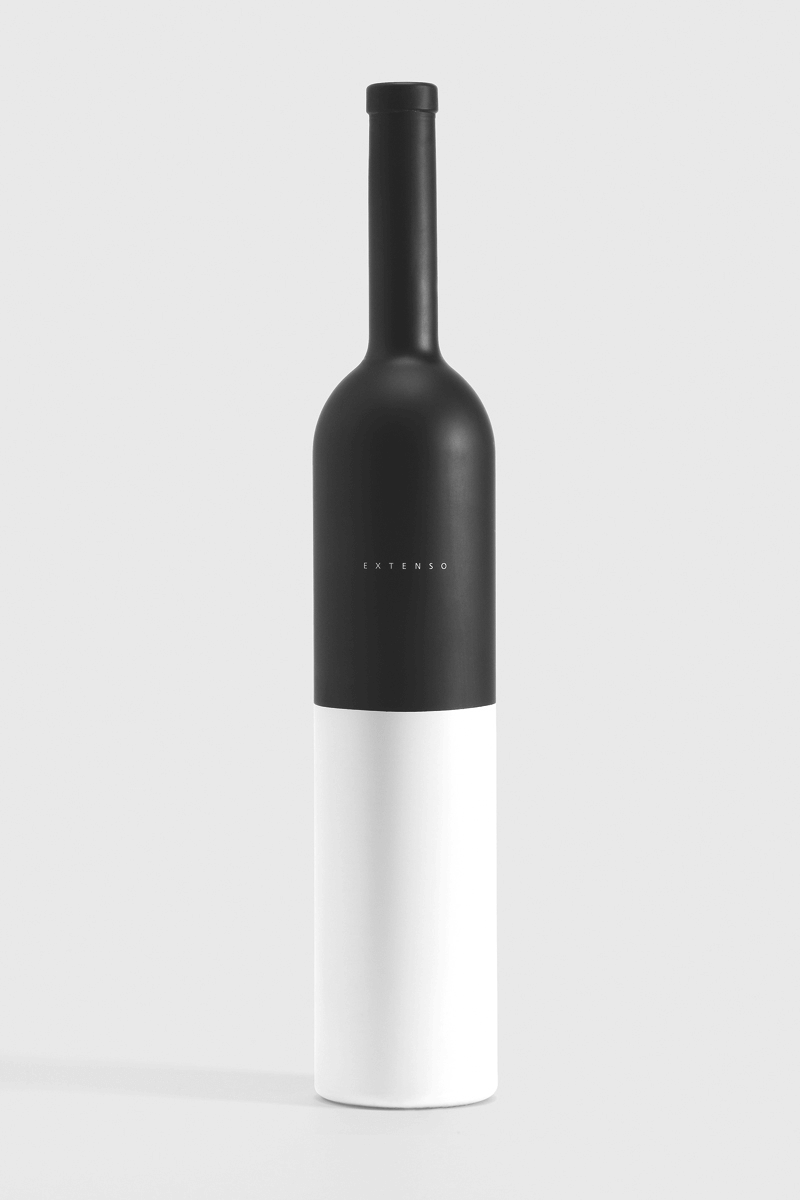
Minimalism can also mean reducing the graphic design to its bare minimum, but including name and key brand identity tools (like a logo).
If you saw the Extenso or Saramago bottle on a shelf, it wouldn’t be the typography that draws your attention.
A great case of minimalist typography was also published on Packaging of The World, where a few bottles inspired by worldwide known artists were shown.

Modern approach: be funny or be intriguing
The last, but certainly not least, is the broad category of contemporary designs of wine labels. This huge bag of concepts includes all the ideas that try to grab the client’s attention by being cocky, funny, cheeky or memorable in some other way.
A few examples will help you understand the idea.
An Australian brand called Elderslie Hill has based the wine label design on the artistic portraits of its founders. The portraits, however, were then “shattered into pieces” to form a mosaic. The deep, dark colours and a subtle, silver print of the brand’s name make up for one of the most excellent wine label designs.

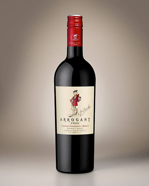
Some wine producers tend to lean towards something funny - like cheeky one-liners, pictures or sketches.
One wine brand used a drawing of a dressed frog and - by changing its appearance - indicated various types of wine. The range of products included Arrogant Frog, Elegant Frog or even special selections - like Arrogant Frog Reserve.
Other brands push even more out-of-the-blue ideas.
Boarding Pass Shiraz, an Australian red wine, turns its label into the boarding pass and the back label as a funny take on ob-board safety card. That’s what creative thinking is all about!

Designing a wine label - what are the ways to spruce up the project?
Sometimes you will want to add a novelty to your label.
Issuing a reserve edition of your finest wine deserves a proper celebration. Do that by sprucing up your wine label design with hot-stamping or embossing.
Ho-stamping is a method of adding a layer of coloured foil onto a layer of cardboard or paper in the printing process.
While this method is quite often used in the production of packaging, wine labels can be finished with hot-stamping too.
The delicate glow of silver or gold (most popular choices of foil) adds a more premium character and can be successfully used in wine label typography - letters or logos are best to be hot-stamped. An example of Shirah wine label represents hot-stamping used in silver, gold and purple.

Usually, hot-stamping is matched with embossing.
It is another printing method that means printing a certain graphic element in a convex or concave way, creating a more intricate experience when touching the label.
When discussing wine labels, you should also think of other aspects like using negative space, and fonts to choose. While they were mentioned in the article already, let’s take a more in-depth look at these elements too.
Negative space
Negative space refers to all of the background parts of your wine label. In other words, all elements that are not graphics, typography trends or product details can be called negative space. Negative space plays a key role in minimalist and abstract designs.
There is great importance to the colours you choose in your wine labels’ negative space too
Most wine brands choose toned colours - either black or darker shades of blue or alternatively - light, beige, mellow yellow or white. Colours that aren’t common are orange, red or grey.
Fonts are also defining the customers that your wine label will attract
Handwritten letters look more personal and upscale, and probably look more appealing to shoppers looking for a premium brand. On the other hand, a survey that tackled wine shopping habits of millennials proved that more original design is more likely to gain their attention. And frankly, nobody really bothers to read the product details.
Wine packaging - a necessity to a fine bottle
While the cheaper wines are often sold in supermarkets, cramped on shop shelves, the true experience comes with a special type of wine packaging.
Years before, wine packaging used to be mostly wooden caskets, filled with wood wool to give an even more premium character.
However, with the vast problem of waste and wood cut down, many wine producers turn to cardboard packaging. Choosing the right packaging provider helps you to choose packaging that’s both sustainable and looks great.
The wine boxes made from cardboard can be made in two textures - white, glossy and kraft (without any foil lamination).
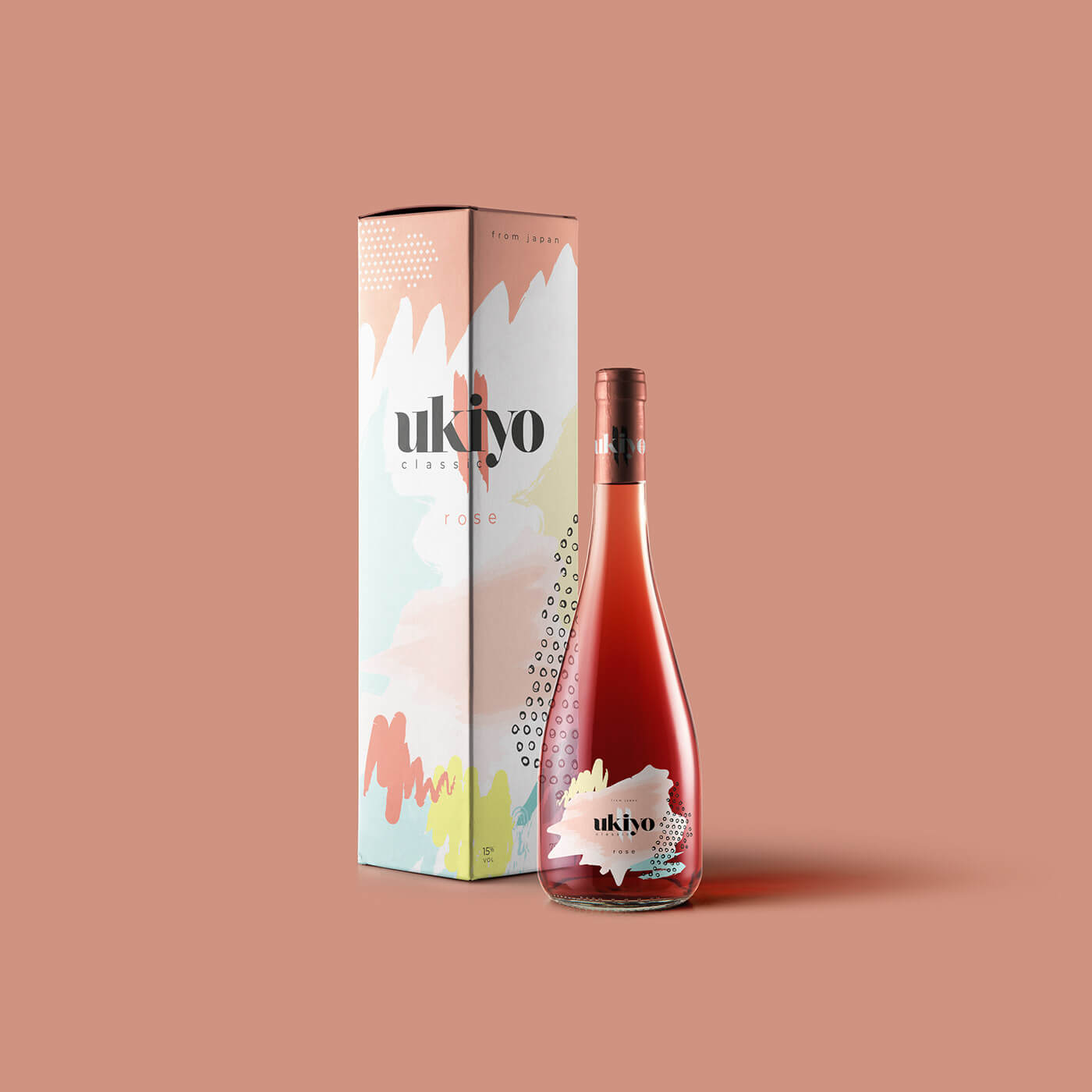
A box is the first element of a great unpacking experience. Many brands use external packaging to fully showcase the artistic potential of the label. A design of Ukiyo Rose by Busra Degirmenci captures this idea - a label design that reminds of a splash, with its mellow rose colours, is beautifully expanded onto the box.

Wine packaging can also be branded with the logo of your winery shop.
If you sell many various brands from all over the world, you should obviously look for branding opportunities elsewhere.
Treat packaging for bottles as your best shot. Wines are often bought as gifts and while some clients will choose colourful gift bags from a supermarket, others will prefer an elegant, eco, brown paper bag.
If you’re up for a bag like that, you can design one by clicking the button below (after clicking, choose the size B63 at the bottom of the page).
By combining a customized wine box with a branded paper bag, you create a much richer experience for your customer. And if you need big packing boxes to ship many bottles, just click here.

Final Notes
The production of wine depends on many variables, but even the best product will not sell with an unoriginal and boring wine label.
In this article, you’ve seen some great examples of wine label designs - from contemporary and minimalist to vintage and abstract. As a producer of wine, you can take all of these tips into consideration.
And if you own your own wine store (or want to create a more upscale look to your exported bottles), create your own branded boxes and paper bags.


