Embossing & Debossing: Adding An Extra Dimension to Design

- 200+ templates & patterns
- Real time 3D packaging preview
- Upload logo and choose brand colours

Subscribe now! Receive 15% discount.
Don’t miss out – get 15% off your first order when you join the newsletter. It’s fast, free, and kinda smart.
You're now subscribed!
In this article:
Embossing and debossing are two common yet effective printing techniques that give any medium a high-end look.
These processes make an image stand out, adding an extra layer of depth - not just visually, but physically, too.
This added element of class creates a more memorable touchpoint with your consumer.
Great for calling attention to a logo or name, embossing is regularly found on luxury packaging, wedding invitations, business cards and more.
Embossing is commonly used with foil hot stamping
Here at Packhelp, we're a custom packaging supplier with a range of products that can be embossed, debossed, hot-stamped and much much more.
We can create your embossed gift boxes, elegant boxes for jewellery and many other forms of premium packaging.
In this article, you'll see:
- What is embossing?
- Embossing in graphic design
- Embossed boxes and other packaging solutions
How is embossing done?
Embossing is done by pressing the substrate (paper, cardboard etc) into a female die that has your design etched into it.
Underneath the substrate is the male version of the same design.
The two dies are mated under immense pressure and a little bit of heat with the substrate being squished in between.
The result is the design being embossed into the substrate.
For debossing, the substrate is simply turned upside down and pushed below the surface.
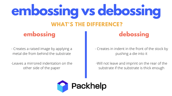
But there are a few more differences between embossing and debossing:
What's the difference between embossing and debossing?
In its most basic form, embossing creates an imprinted design in the surface whereas debossing raises that design up.
Embossing in packaging design
Embossing adds a unique dimension to your packaging.
As packaging is handled and touched, the small yet subtle differences in surface texture create something interested to feel.
The sense of touch on a product's packaging adds elegance, class and luxury.
Kind of like how we associate a leather couch with being more 'luxurious' than a simple cotton couch.
The beauty of embossing lies in the fact that it's so subtle.
Take a look at the packaging for hair care supplement brand, Oase:
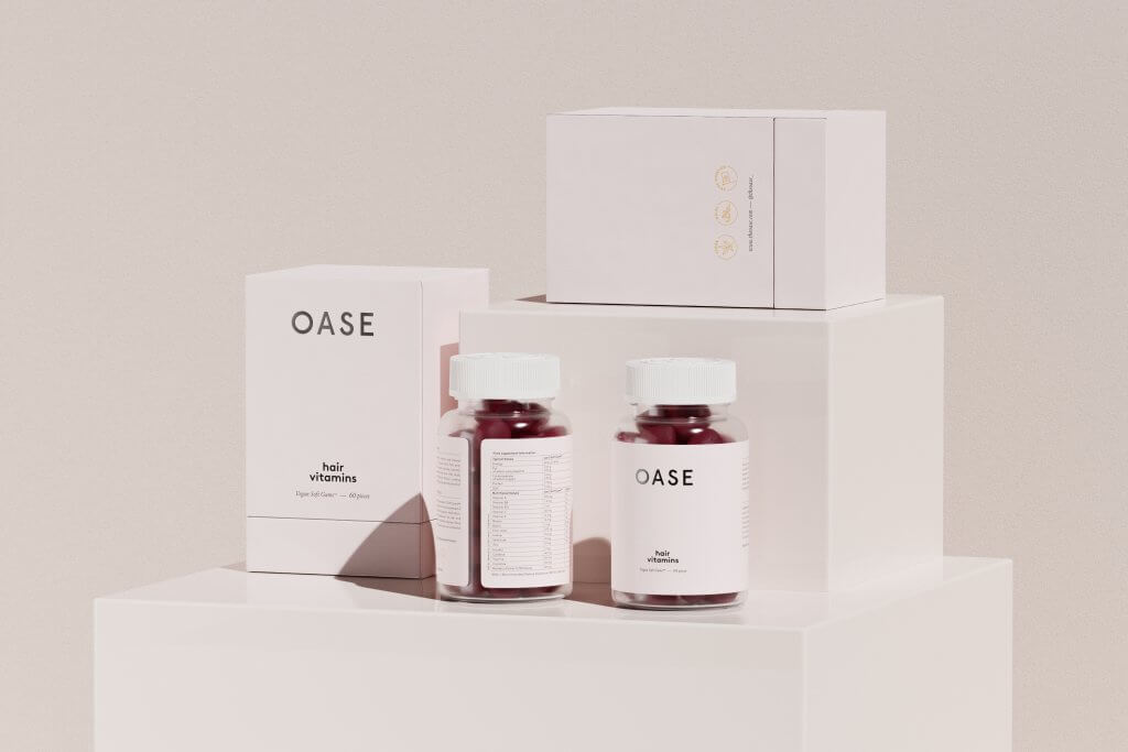
Here you can see the embossed name of the brand on the front of their custom rigid box.
A custom box with embossing isn't something that most supplement brands use.
Therefore, by using such a design, Oase makes a statement about their brand and the quality of their product.
Want to learn more about Oase? Click here to see the role custom packaging plays in their brand
In the example below, you'll see debossed letters are enriched with hot stamping with a gold foil, designed by Deutsche Und Japaner

Using a plain kraft mailer, pink custom tape and gold debossing, this elegant yet simple packaging design turns heads and adds a sense of grandeur.
Embossing adds an extra element to a minimalistic design.
Below is an example of Grand Deluxe (a Japanese Design Studio), which used this technique in the patterns of Miu, a premium soap brand.

Even projects with the most toned designs can benefit from using embossing.
The photo below captures the simplicity with a glimpse of novelty.
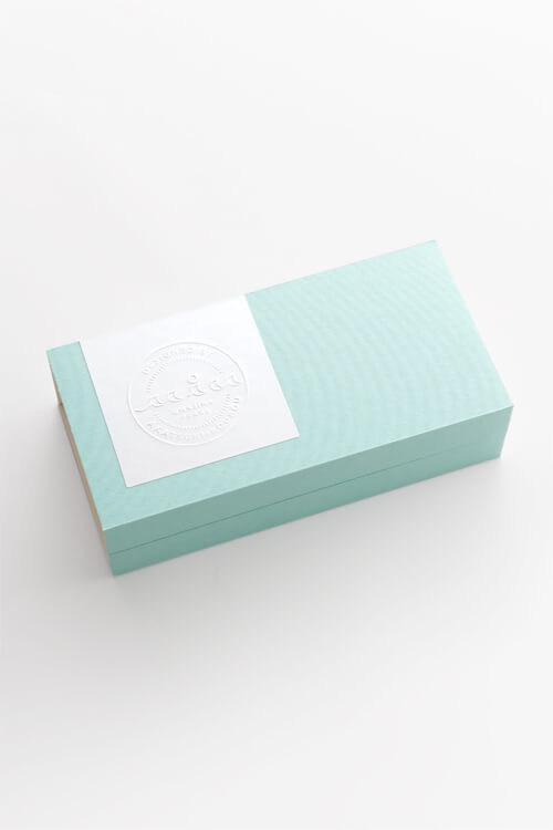
Embossing and debossing are great for logos, especially circular ones.
Embossed logos give a sense of authority, stemming from wax melt seals that were used to seal closed letters.

The wax seal represented a sign of integrity and trustworthiness, that whatever was inside was intact and untampered.
An embossed logo gives the same sense of quality and assurance.
Designing with embossing and debossing
It should come as no surprise that not all images and designs emboss well.
Here are a few things to keep in mind when designing with embossing and debossing:
Vector art
Vector files, rather than raster files are best suited for designs with embossing and embossing.
That's because the data used in these files allow it to extrapolate into a 3rd plane, above and below, without compromising on quality.
This means this data will translate onto your stamping die much better.
Watch your back
Consider the back of your substrate, or surface.
Depending on the thickness of the substrate being used, embossing may leave an imprint on the back of your material. Thicker materials are less prone to this imprint showing through.

As debossing is pushing the design into the substrate from behind, you'll be left with the opposite design on the back of it no matter what.
If this is a problem, consider putting a laminate on the back, or working it into your design.
Thicker is better
Heavier gauge paper stock is best for embossed pieces. The thicker (heavier) the paper stock, the more details that will show up from the die press.
Multi-level embossing adds complexity
Embossed designs that have multiple levels look absolutely stunning but add complexity both in terms of design and production.
Too much depth on too smaller areas increases the likelihood of a tear - and that's not good. Use multi-level embossing designs for larger areas.
Keep it simple
As mentioned earlier, embossing adds another dimension to your packaging design.

Don't overdo it, and keep it simple.
Embossing is best done on:
- Brand names
- Slogans
- Simple images & logos
- Watermarks
- Initials
- Small, simple patterns
Overly-complicated embossing designs and busy designs that use embossing often overshadow the embossing itself and subtract more than they add.
Consider using colours next to embossing as a design method to add complexity, rather than embossing a complex design in the first place
Embossed gift boxes
Everyone is familiar with Tiffany's gift boxes.
But what's the difference between a simple green gift box with a bow:

...and a real Tiffany gift box?
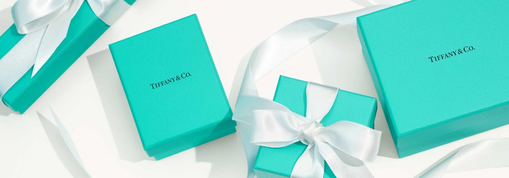
Answer: The embossed name!
Embossing on gift boxes can really give that little sense that you're holding something special.
It's small and it's subtle, but it's the last thing someone reads as they open up a two-piece box.
On a gift box, embossing is best used in small doses.
A logo, a slogan, part of a simple design, and so on.

Embossing & debossing design ideas & inspirations
Looking for a little inspiration for your embossing designs? Take a look at these examples below to see the versatility of embossing:
Embossed wine labels
Wine is a product that we associate with socialising, enjoying ourselves and relaxing - all times that we like to indulge and be a little 'classy', so to speak.
Many wineries use embossing on wine bottle labels and wine bottle boxes to associate their brand with that same type of class.
Why?
Because these wineries want their product to be associated with the type of people that pick up a bottle of wine, look at it, feel it, smell it, all before buying it.
The embossing of its packaging makes it a little more 'special'.
In fact, many high-end whiskey bottle designs actually have embossing on the bottles themselves
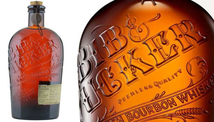
Here are some great examples of wine brands that use embossing on their packaging:

Soreq wines use both foil print and embossing on their wine label.
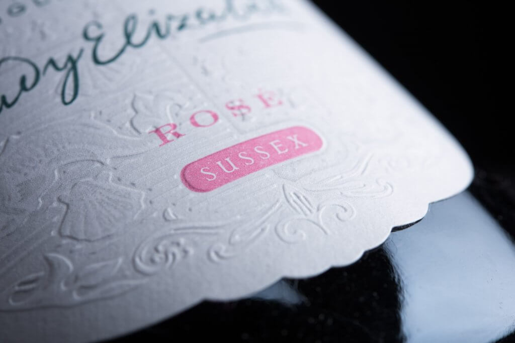
Coolhurt Estate uses both a custom shape label, colour digital printing and embossing to create a wine label that you want to touch and feel.
Conclusion
As you can see, embossing and debossing as printing techniques are versatile, effective and relatively easy to execute.
If you'd like to make embossing part of your custom packaging, check out the Packhelp Shop or request a quote and tell us more about your project!


