Food Packaging Design: How To Do It With 5 Tasty Examples

- 200+ templates & patterns
- Real time 3D packaging preview
- Upload logo and choose brand colours
Subscribe now! Receive 15% discount.
Don’t miss out – get 15% off your first order when you join the newsletter. It’s fast, free, and kinda smart.
You're now subscribed!
In this article:
Whether water or wine, food is classified as a fast-moving consumer good (FMCG).
It's consumed quickly after purchase and restocked not long after. It's in the FMCG category where consumers are loyal to a brand because they buy it so regularly.
So how do you, the food entrepreneur, sway your customer and get them to try your product rather than reach for their favourite, again and again?
By using your food packaging design.
In a convenience store or supermarket, it's your food packaging that will take the first step in swaying a consumer's decision-making process.
But there's more to creating an eye-catching packaging design than using attention-grabbing colours, especially when you're selling out of your own home.
Packaging design is a medium that should resonate with your existing branding while also explaining your brand identity, the uniqueness of your food and the value of the product.
It's a challenging but also truly creative medium that can make all the difference.
In this article, we'll you'll see:
- Food packaging design goals
- Safe packaging options for common foods
- Examples of effective packaging design for foods.
Let's get into it.
Getting started with food packaging design
You have your own preferred type of milk, your favourite kind of pasta, and when you indulge in some ice cream, you've got a handful of favourites that you'll go to, no questions asked.
But what would it take you to try a new type of milk, pasta or ice cream? Flavours, of course, the nutrition behind the product, or perhaps the ingredients?
Whatever swings your decision, the food packaging design needs to convey and explain why the product is different to a consumer's current favourite.
There are some fundamental questions to ask yourself when designing your food packaging, whether you're the designer or not.
- How will consumers use/eat my food?
- How will consumers use the packaging it comes in?
- Where will they first physically interact with this packaging?
- Should the food itself be on the packaging?
- What will the consumer learn by picking up the packaging?
- How will your packaging physically feel in hand?
These questions don't so much tell you how to design your packaging, but they're the best place to start when thinking about the job your food packaging has to do.
Packaging design is marketing.
Your packaging design is always doing one of two things
- Telling a consumer that 'this is why you should buy this product
- Telling a customer that purchasing this product was the right decision.
Packaging design is a long-forgotten marketing medium.
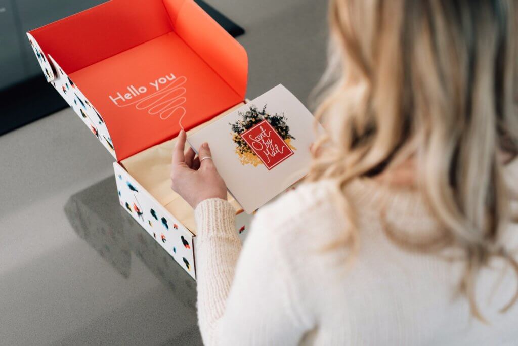
Whether it's retail packaging or an ecommerce delivery box, the design of your packaging communicates values with your consumer.
Keep this in mind when deciding on the colours and imagery you'll use and the materials and shape of your food packaging design.
Food Packaging Design 101
When it comes to sitting down and designing food packaging, there's a lot to remember. These great food packaging design tips don't reinvest the wheel, but need to be considered when designing packaging that will be in contact specifically with food.
Food security
Keeping the external environment out and keeping your food as sterile as possible is the be-all and end-all of designing food packaging.

Food safety standards for products sold in-store are stringent.
Be sure to adhere to the laws of where your product will be sold.
Packaging material
Whether corrugated or cardstock, cardboard is a standard solution for dry goods, meaning the cardboard is your blank canvas to work with.
Liquids and condiments are safe in glass jars, plastic bottles or similar.

This means the product labels you adhere to the packaging is the blank canvas for your design.
Printing Options
Your packaging material will limit how your packaging can be printed - that is, if you decide to print some form of custom packaging solution at all! Nearly all printing options are available to a product's packaging in the food industry.
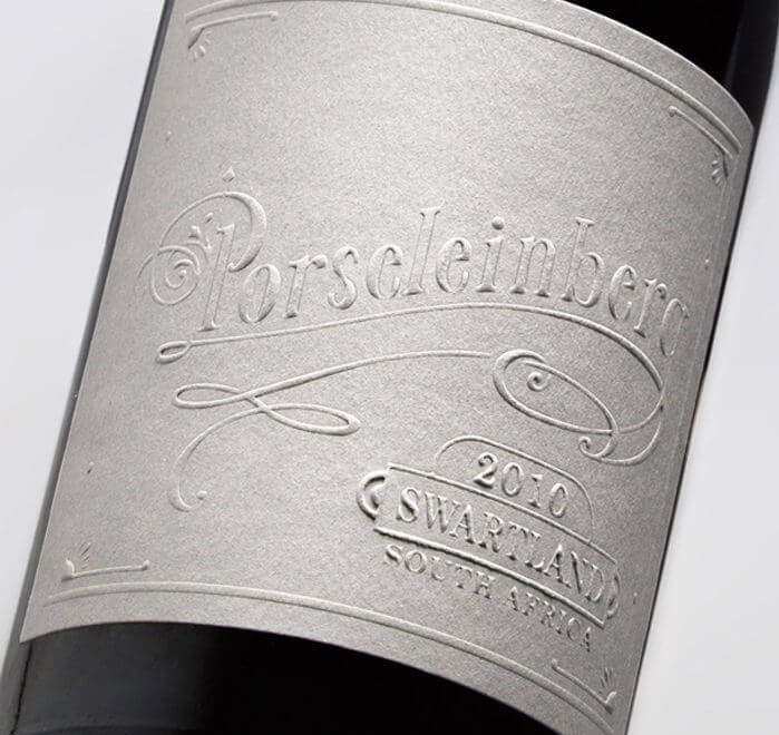
Labels are the go-to solution for glass jars and can be printed in just about any way. Wine labels can have extra finishes like embossing or debossing.
Bakery boxes can be printed like any type of standard pulp-based packaging, and in most cases, it is safe to come in contact with food.
Takeaway paper bags can also be customised but are usually limited to a single type of print colour.

Sustainability
The sustainability of your packaging plays a vital role in influencing your customer's decision.
74% of Americans say that they're willing to pay more for sustainable packaging. Therefore, your food packaging needs to be part of a sustainable lifecycle.
That doesn't mean it needs to be made from cutting-edge materials and form - no.
Without question, opt for products that are not made from mineral-based, single-use plastics.
Fibre-based materials, like paper pulp, are usually a safe option for great packaging.

Biodegradable packaging is an even better option, ensuring that no trace is left behind once it has decomposed.
Security
There is a reason eggs come in a carton designed specifically for them rather than a milk carton.
Keeping your food intact while it goes from the store back home is another role of your packaging, and the material you choose is essential. Design is very much about functionality, not just form.
Rice, nuts and grains don't need much protection, but eggs, crisps and cakes do.
Shapes & storage
Coffee packaging comes in many forms, often being as varied as the bean itself. Custom packaging for this socially acceptable drug can make or break a small roastery. Coffee is a product we firstly consume with our nose, so effective food packaging design for coffee has to entice the smell.
A coffee pouch is a very different shape from a glass bottle of oil. This determines how your product can be stored in a fridge or pantry, and therefore has a massive bearing on the convenience of your product.
Take a look at the minimalistic design of Dak Coffee Roasters and their product packaging:

See more about Dak Coffee Roasters in the video below
If your food products are fast-moving, convenience is of the utmost importance. The packaging of your product needs to sit on the shelf or in a fridge comfortably.
The types of packaging available to your food may help or hinder the overall look, feel and design of it.
Food safe imagery
Now we're getting into the visual design of your packaging.
Depending on your local laws and regulations, you may need to indicate that your packaging is ok to come in contact with food by using the following logo.

Similarly, if your food meets any medical or cultural guidelines, it's essential to communicate this information on the packaging.
Consider if your product is:
- Halal
- Kosher
- Vegan/vegetarian
- Organically certified
- Diabetic-friendly
- Salt/Lactose/Fat-free
These are things that are often overlooked but can help sway a consumer who's considering buying your competitor's product. Again, they can usually be communicated with a standardised logo.
Ingredient & nutritional information
Laws and regulations of certain markets usually stipulate that to sell a food product, a list of ingredients and/or nutritional information about your product needs to be present.
On most types of food packaging, this nutritional information is placed on the back or out of sight.
However, if your product packaging is nothing more than a label, you won't have a 'back' to place this information on.
Graphic & visual design
Now, at long last, we come to the actual creative process of the graphic and visual design of your food brand - the part that makes you stand out from the crowd and get your consumer's attention.
This is where your branding, value propositions and unique selling points can help guide you.
Let's talk design ideas.
Does your brand feature clean lines and minimalism? Does it have a pastel or watercolour-like palette? Is it a more traditional packaging design? Are you a brand that uses big, clear cut fonts?
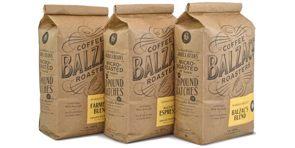
Answer these questions to appeal to your ideal customer in a unique way, but stay consistent with your brand message.
Remember to use the elements mentioned above to meet any legal requirements and stand out and distinguish your brand from competitors.
Need some graphic design inspiration? Take a look at the following examples of packaging design for products other than food.
Colourful

Natural

Patterns

Minimalism

Rustic

Floral
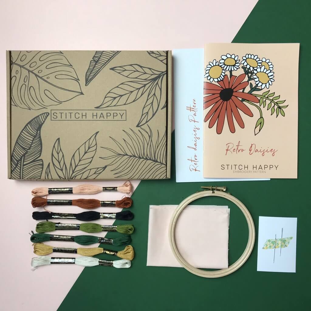
Read the interview with Stitch Happy
Got an idea, but can't make it come to life? Hire a designer, or work with a package design company for a specific product or an entire range.
Packhelp's expert Packaging Engineers can get the ball rolling, and keep your costs down.
Food Packaging Design Examples
You've just read all there is to know about designing food packages.
Now, it's time to look at a great example of a food packaging product or two.
Vassae
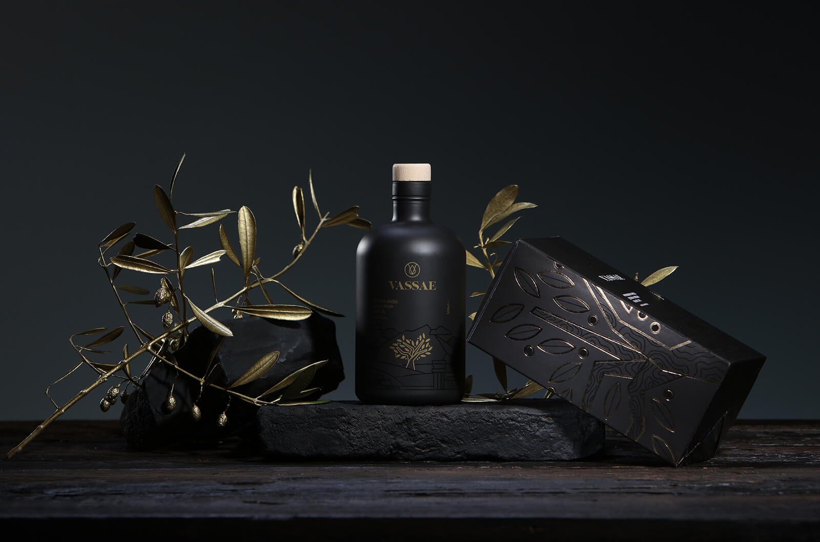
This brand of premium Greek Olive Oil is one of quality, elegance and opulence, stemming from the source of the olives used to produce it.

These values were ones that the brand asked packaging designer Mike Karolos to replicate during a rebranding and relaunch of the product.

Why we like it: The overall design rests on the use of colour to deliver that feeling of class and quality.
White on black with gold highlights. Textures also complement the use of colour, with a black UV print on the bottle to outline the mountain ranges behind the gold print of the olive tree.
The bottles design is topped off with the logo being branded into the cork.

The box design echoes the same motifs. Having to sit on shelves and draw attention, the bottle box uses embossing and debossing to encourage the consumer to touch, feel and pick up the box and explore it.
Movida
The main ingredient of Movida's products is Moringa, a 'super food' with a wide range of health benefits.
This is a theme that's prevalent over the packaging design of all of the brand's products, all of which are based around the health benefits of Moringa.

Why we like it: The brand's main products are soups and smoothie mixes based around the main ingredient.
We like this food packaging design because the design doesn't differ much between products, except for the coloured swipe at the bottom of the pouch.
Humans process colour differences quicker than text, so we can quickly see a difference between these two products.
The brand later went on to expand its product range into protein bars. This 'swipe' colour was replicated on the protein bar packaging.

We like this design because of its versatility.
Whether on a stand-up pouch or bar wrapper, the branding and messaging is consistent and helps the user navigate the product range and make an informed decision quicker.
Breakfast en Bread
The COVID pandemic meant that many, if not all, eateries in London were locked down, preventing locals from getting their essential brunch.
The founders of Breakfast en Bread knew this and launched a meal kit that delivered the same, high-quality meal to your door, ready for you to prepare in just 20 minutes.
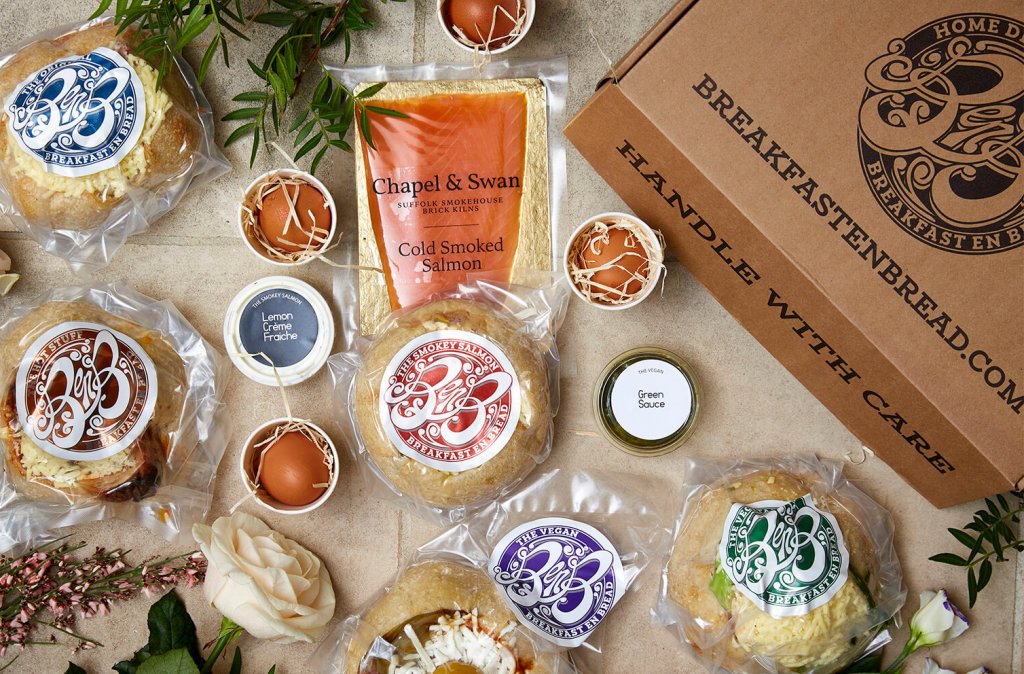
Why we like it: The local eatery took its existing logo, and with a few colour tweaks, made it the focal point of their shrink-wrap and mailer box.

As a 'luxury', or a 'nice to have', rather than an FMCG, Breakfast en Bread's food and its packaging behave a little differently from store-bought food. The food and the way its packaging is part of an unboxing experience, as is the process of creating the meal yourself.
The branded boxes and shrink wrapping add to that experience.
Learn more about Breakfast en Bread in our case study
Morozoff
The Stan Branding Agency team was responsible for creating packaging for Morozoff, a line of Russian-inspired food as it entered the US market.
The food itself is a range of stews and dumplings that can be frozen and cooked by boiling.
The pot that the food is boiled in is the central theme of this packaging design.

Why we like it: The Morozoff brand knows that their food is the kind of food that's eaten at family meals. It's the type of food that's handmade and is core to a family gathering.
The shape of the pot and the use of traditional Slavic patterns help push that feeling of 'family'.
The use of black and gold add a touch of class and elegance to the product.

The peel and seal function on the bag means that the product's shelf life is extended and doesn't have to be used in one serving.
Mushroom Crisps
Pixenite worked on the food packaging design concept for Mushroom Crisps, a new healthy snack to hit the Indian market.
The packaging is the standard foiled bag used for most crisps, but the visual design and communication make this product memorable.

Why we like it: The concept of dried mushrooms as a snack is quirky.
The branding, and therefore design reflects this sentiment well.
The deep purple and vivid red do a great job at getting customers' attention, while comic-like font and typography clearly say what's unique about the product and do so in a quick, playful way.
The company name is located top and centre, while the back of the packaging has ingredients, nutritional information and all other required information.
Conclusion
Designing food packaging isn't unlike any type of design. Due to food safety standards, there's likely to be more information required, and the materials in use will differ vastly.
But ultimately, the goals are the same: get attention, inform, educate, and convince.
Established brands and new ventures alike need to use their packaging to communicate their values.
When done effectively, products move off shelves quicker, and sales start to grow!


