How To Design Great Board Game Packaging

- 200+ templates & patterns
- Real time 3D packaging preview
- Upload logo and choose brand colours
Subscribe now! Receive 15% discount.
Don’t miss out – get 15% off your first order when you join the newsletter. It’s fast, free, and kinda smart.
You're now subscribed!
In this article:
If you were asked who Uncle Milburn Pennybanks is would you know? Unless you’ve got a mind for fun facts, the answer is, probably not. And yet his face is recognisable the world over. This is all down to great board game packaging. To you and me, he is more commonly known as ‘The Monopoly man.’
When it comes to a board game; packaging is everything. The entire brand of a board game rests upon its (usually) colourful box and unique design. And in Monopoly's case, on a well-known game character.
Monopoly's red and white logo and fictional brand ambassador, have become a huge part of the overall image of the Monopoly brand. It is integral that a game's packaging helps to create that brand.
On that note, let’s discuss how to design a great board game box...


Source: Pinterest
The basics of boardgame packaging
When it comes to board game packaging, essentially you need to be assessing three main criteria:
Appropriate box style:
The box is usually as small and compact as possible, while still being able to hold all of the contents of the game and the board itself. After all, why have an unnecessarily big box if it can be made smaller? However, some box styles will suit better to particular types of game; like Jenga for instance, where the box reflects the tower of bricks.
Attractive/ unique design:
The design and motif have to be as attractive or unique as possible to entice the game player in. Whether on a bookshelf at home, or on the shelf of a toy store; if the box looks dull, people's gaze will pass over the game.
Be Informative:
The board game box has to convey a certain amount of information about the game. A catchy tagline, a recommended age and the number of players needed, for instance. It also has to convey information about the theme of the game itself.
Once it has ticked those 3 boxes, your board game packaging can pretty much take on any form.
And yet, most seem to adhere to two very basic box styles: games that come in cardboard boxes with lids, and games that come in small cardboard boxes with fold ins.
The second option is perfect for travelling editions of games. Usually containing a set of cards as opposed to a full board. More on that later.
Choosing the right board game box
Two-piece product boxes
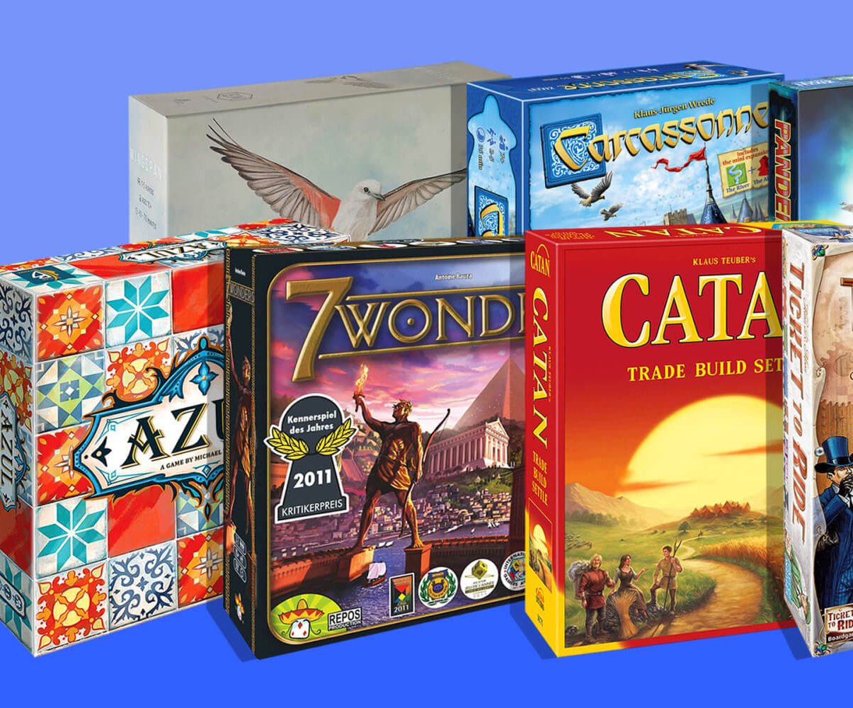
Cluedo, Monopoly, Scrabble; a lot of the classic board games have used the same simple packaging set-up for years. A, usually, rectangular box, with a thin cardboard lid.This is perhaps the most well-known set-up for a board game box.
The classic games are all packaged in cardboard boxes with lids.
These boxes are (two-piece) product boxes with lids. A base box containing your board, instructions and game pieces. With a lid, that has the name of game and your main design, printed onto it.
The cardstock material of these boxes makes them fairly light- and cheaper than more heavy-duty boxes. These boxes are also great for children’s games, where the card is softer and lighter for little hands.
Two-Piece Rigid boxes
Some games, however, have fancier packaging, as a way to distinguish them. The games that want to give off an air of elitism. Sophisticated games, for sophisticated players. Which of course, need sophisticated packaging to match.
In this category, we put ‘Trivial pursuit’, ‘Articulate’ and ‘Who Wants to be a Millionaire?’ Games that require intelligence on the part of the player, in order to win. These games are often packaged in a more durable, heavyweight box. Something which (quite literally) adds weight to the game itself.
Furthermore, games that require knowledge rather than luck or cunning, often arrive in square boxes as opposed to rectangular boxes. A further way to distinguish them.
This variety of cardboard boxes with lids are usually Custom rigid boxes.
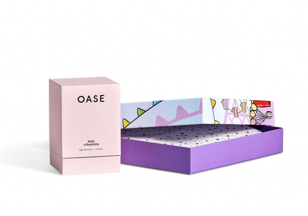
If you want your board game to really stand out, then the two-piece (box and lid) rigid box, is a good choice.
It’s made of thicker card than with the two-piece product box, and it shows. This box is elegant and more durable. It’s made from premium quality cardboard and more likely to still look the part even after the game has been played time and time again.
The rigid box with a lid is also a popular model for ‘board’ games that are entirely card-based. Those that do not require a board at all, in the case of ‘Cards against humanity.’
In the case of ‘Trivial pursuit’, ‘Who Wants to be a millionaire’ and most question-based games that also require a board, there is usually secondary packaging inside the main box. A two-piece rigid rigid box for instance, that holds the question cards. Packed inside a larger (main) rigid box that holds the board and the playing pieces.
If you’re designing your own board game packaging, these are all important factors to consider.
Read how to choose the right box for your product
Mailer boxes
The world of board games is changing. More and more games are being created in bitesize, travel versions. Almost as if their creators have realised most people have more time to play games when travelling or on holiday! People don’t want to have to drag large, heavy board games on holiday with them.
Think card-based games like ‘Uno,’ ‘Monopoly Deal’ or the ‘Cards Against Humanity’ add-on packs. Even simpler, think of the box for a deck of cards. These are all perfect for gaming on the go and there’s a reason they’re all becoming very popular in recent years.
This kind of game packaging is where mailer boxes come into their own. If you’re looking to design your own board game packaging, this is another option to consider. The board game without the board. Remember our first rule when it comes to game packaging- it should be of minimal size.
Custom mailer boxes are perfect here. A one-piece box with no need for a separate lid. After all, when you’re travelling you need as few pieces to carry as possible.
Design your own full-colour mailer boxes now
Special boxes
These are custom boxes for unusual games. Bespoke designs for those games that cater to a niche market or niche gaming idea. Often ‘special edition’ versions of popular games are complement by special packaging.
Monopoly creators Hasbro are the masters when it comes to creating special edition versions of their game. With hundreds of variations on the original, including your favourite movie franchise, or TV show, different places and even a cheater’s edition.
When it comes to packaging though they tend to keep the original box shape and instead focus on elaborate designs to set each edition apart. Not always though. When they do mix it up a little with their Monopoly packaging, Hasbro cause such a stir that these boxes become collector’s editions.
Take a look at this Special edition Monopoly Box from Singapore.

source: Carousel
If you’re creating your own game packaging though, it doesn’t have to be as popular as Monopoly to warrant a special box.
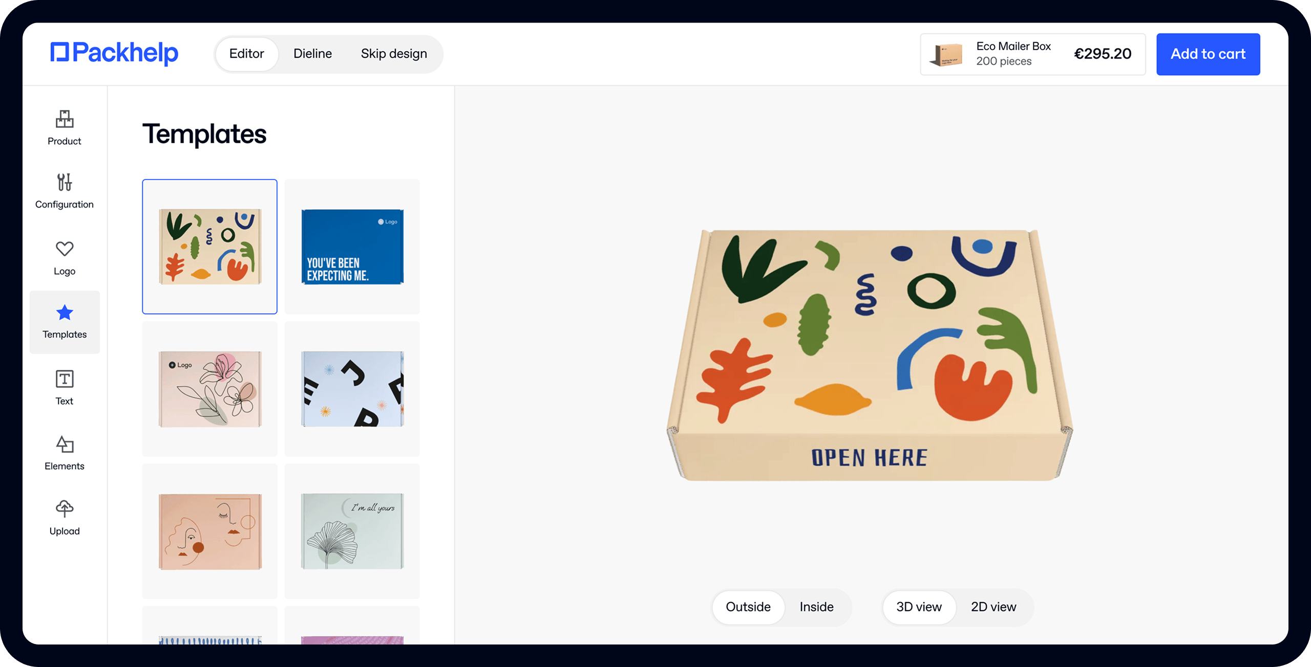
Packhelp create all kinds of one-off, unique designs for customers. And with our online editor, you can even add your own design to your packaging.
Your special box doesn’t have to be anything too elaborate to stand out either.
Take Chop Stix as an example. A simple stacking game where players use (you guessed it) chopsticks to stack pieces (that look like dried noodles) on top of each other. Think of it like the opposite of Jenga, where instead of removing pieces from the stack, you’re adding them.
The makers have created a game that resembles the set-up of simple oriental cuisine. So with their packaging, they haven’t just chosen any old game box. Instead, they’ve gone one step further and continued the Chinese food theme. Presenting their game in a small takeaway food carton, the kind synonymous with eating noodles.

The makers of Lord of the fries ‘takeout’ edition, also opted for something similar.

It’s important to note that these aren't hugely complex box designs; just original in their packaging style.
Learn how to design your own box with Packhelp's online editor
Choosing the right board game packaging design
Your board game box is an extension of your brand. It’s your chance to show off your company logo on your packaging. A chance to draw the potential game player in. It needs to be informative but also eye-catching. To a lesser extent, it should reflect the experience of playing the game itself.
For instance, a fun-filled family game will no doubt feature an image of a classic 2.4 children family, laughing during gameplay. Do you want your game to fit this kind of stereotype? Maybe you want the exact opposite?
Your packaging needs to be well thought out, but that doesn’t mean it has to be complicated. You don’t have to be a great graphic designer to come up with a great packaging idea. Some board game packaging designs are incredibly elaborate and colourful. Take Azul for instance:

source: hillscards
An elaborate design suits to Azul’s packaging because the game itself is about players collected pieces to decorate a beautiful Moorish palace. Not all games are set up this way, not all games warrant such elaborate packaging design.
Logos and unique board game branding
When discussing the Monopoly man, we are talking about Monopoly's image- its brand. An image it has created for itself through its packaging.
There have been hundreds, in fact, thousands of versions of monopoly, printed in different languages and depicting many different places; but a few aspects always remain the same.
The logo is integral of a board game's branding. It is what the Nike logo is to training shoes, or what the golden arches of Mcdonald's are to fast food.
In classic games, the board game logo is even a sign of assurance to the game player, that although there may be new editions, the game itself hasn't lost its classic values.
Monopoly's logo hasn't changed in decades. Despite the fact that the imagery on the box, changes depending on the edition, the red and white logo is ever-present.
Read: Why your brand needs to use packaging with a logo
 Source: Google images
The same can be said for scrabble. Here the cover and even font of the game have changed over the years, but the colours have remained consistent. To give the game player a sense of a timeless, classic game.
For many games, the images on the packaging can be updated, but the games' branding remains the same.
At other times, however, a game's branding can be so effective that as time moves on, its own image can be what holds it back. A game company wanting to ensure a classic game gets a new audience, might want to distance themselves from the game's older branding and update this from something more modern.
Take Trivial Pursuit for instance, whose classic gold, italic font is synonymous with the game's packaging.
However, the game's packaging designers must have decided that the classic font would no longer cut it in the 21st century. New editions of the game feature a much more futuristic, 21st-century font, to attract a new audience of game players.


Boardgame characters and branding
We already discussed the monopoly man, who is perhaps the most well-known board game character- even if not always by name. However, there are several others that help to add to a game's overall packaging.
Let's take the example of Cluedo, the murder mystery game whose classic characters are the murder suspects. The game's concept is so familiar that its characters are even commonly referenced through running jokes throughout popular culture- 'It was Colonel Mustard in the drawing-room with a candlestick!'
This of course has to do with people's experience of playing the game itself, but it also has a lot to do with how well the game has been branded over the years.
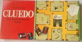
Compare, for instance, these two images of an original edition of Cluedo and a modern edition. See how the role of the game's characters has evolved in the game's branding.
From barely featuring in the vintage version's packaging, to being the centre-focus of the box on new editions. Indeed the characters' physical attributes and 'personalities' have also evolved through the decades.

Materials
It’s also worth thinking about the materials you’ll use when it comes to designing your board game packaging.
For instance, what better way for your board game packaging to stand out in 2021 than to create a box made from sustainable cardboard? With questions from the game printed on recycled card.
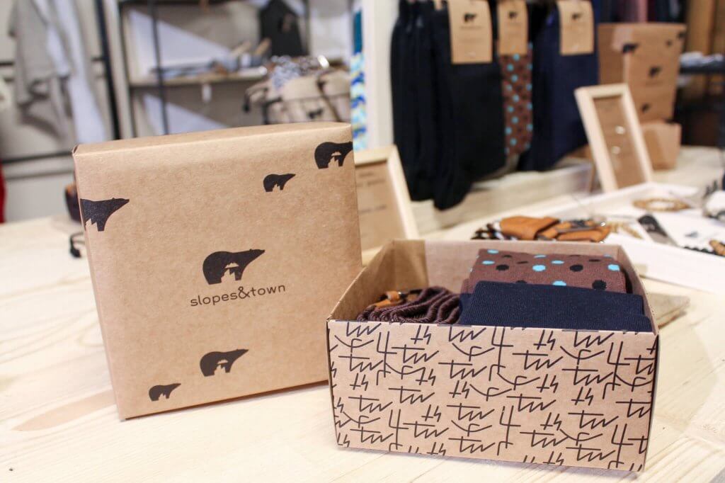
Maybe instead of going full-colour like Azul, you’ll choose a more organic, kraft look for your box? Most board game boxes are colourful, maybe you’ll stand out by being different?
And maybe you don’t need a box for your game at all. Packaging of some sort sure, but that doesn’t have to mean a box. The game ‘Who’s in the bag?’ wouldn’t work very well if it was presented in a box instead.
Whereas the game,’ Bang the Bullet!’ has cards and game pieces that come in a bullet-shaped container as opposed to a regular game box.

Image: Board Game Geek
You need to think about what makes your game stand out, and then design your packaging around those unique aspects.
Read Packaging Design: The forgotten Marketing Medium to learn more
Making your boardgame packaging informative
Tagline
Most board games come with a catchy tagline. Something that describes the experience of playing the game itself. A slogan that both sells and informs the reader about the game in one sentence.
In fact, some board game taglines are so ingrained in the minds of gamers that you can tell the game from the tagline alone. For instance, which game comes to mind when you read the tagline, the “Skill Game Where You Are the Doctor?”

image source: Spectrum
Let’s take the example of Cards Against Humanity, which we touched upon earlier.
Cards Against Humanity is a self-styled, “Party game for horrible people.” It involves players completing sentences laid out on the ‘question’ cards, by placing down appropriate (or very inappropriate) answer cards.
Already from the tagline, you know you’re not getting a ‘fun-game for all the family.’ Nor do you get any pictures. Because how do you depict a ‘horrible person’ without causing offence?
Equally how dull would the game look if the pictures showed players just laying down cards? It would be counteractive to include images. It’s better left up to the imagination.
Furthermore, your board game packaging should convey information about the topic your game covers. A quiz game will often have a teaser question on the box. Whereas you can expect a game about the wild west to feature an image of a cowboy or a sheriff's badge. This is all part of the game's branding. Its overall image has to be conveyed in a few pictures, or choice words.
Just as a Nike sportswear advert will no doubt feature someone taking part in a physical sporting activity, so must a game's box advertise what it is selling- the game itself. Board games, unless they're new or particularly related to a tv show or popular current theme, don't often get advertised as much as many other products do. So the box itself becomes the advertising.
Learn more about marketing strategies to implement into your packaging- here
Packaging your design to suit your game’s image

image source: Cards Against Humanity
Cards against humanity is an entire game that’s based around black and white cards. It’s text-only. Instead of using pictures, the packaging reflects the game’s style by also being text only.
The unique black and white layout of the CAH box is reflective of playing the game itself. Of laying down those distinctive cards. All you need to know about the game is conveyed by the packaging. Between the tagline and the box, it’s quite literally there in black and white.
The point here is that you need to make sure that whatever does or does not feature on your packaging, is there because it adds something to your game’s or brand’s image.
Cards against humanity’s box is not a complicated design by any means. In fact, it’s remarkably simple. It’s just a rigid box, like those discussed above, with the addition of some printed text. But it’s well thought out and that’s enough.
Conclusion
When it comes to designing board game packaging there is a lot to consider. Remember our three board game box criteria.
Choose the right box style for your game. When it comes to design, think about the kind of design that will suit the theme of your game.
Finally, think of a catchy tagline that not only sells but also informs the player about your game. Something that tells the reader exactly what to expect before they've even opened the box.
Start designing your own boxes now- Click here to get started
source: NBC news- Board games


